kaggle in Africa_Fig
1. Introduction
Helper functions
1.1 horizontal bar graphs
Graph의 code 의 경우 해당 data와 연동해서 한꺼번에 보기로 한다.
< plot의 종류 >
- plotly_hBar (df, q, title, height=400,l=250,r=50,b=50,t=100,)
- plotly_vBar(df, q, title, l=50,r=50,b=50,t=100)
- head_count(df, question_num, parts):
- df_with_percentages(df, q, n, region)
- plot_barH_percent(df1, df2, title, l=150, r=50, b=50, t=100)
- annotated_heatmap(df_w, df_a, title, width=850)
- categorical_scatter(df1, df2, title, l=150, r=50, b=50, t=100)
- annotated_heatmap_Trans(df_w, df_a, title, width=850, height=750, l=150)
- head_count_suf(df, question_num, part, n)
- df_with_percentages_suf(df, q, part, n, region)
위의 코드의 경우 쓰여지지 않은 코드도 있는 것 같지만, 일단 List UP 해 놓음.
1.2 grouping african countries
1.2.1 연도 별 Africa 국가 이름 df
1 | africa17 = ['Nigeria','Kenya', 'South Africa', 'Egypt'] |
- 아마도 직접 수기로 찾은 것 같다.
1.2.2 국가 이름 확인
- pd.isin(): List에 존재하는 요소가 대상 dataFrame, series에 존재 여부를 Boolean type으로 반환.
1 | africa = ['Nigeria', 'Egypt', 'South Africa', 'Algeria', 'Tunisia', 'Morocco', 'Kenya', 'Uganda', 'Ghana', 'Ethiopia'] |
‘africa’라는 배열을 만들어 df를 새로 정의
- 17’~21’까지 같은 내용이므로 21’의 내용만으로 정리
0> df21 data 확인
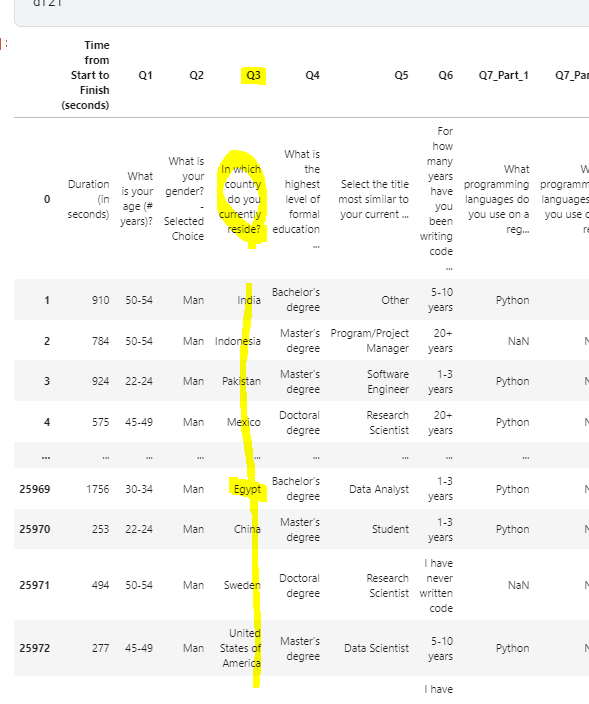
1> df21[‘Q3’]의 내용은 당신의 나라는 어디 입니까?
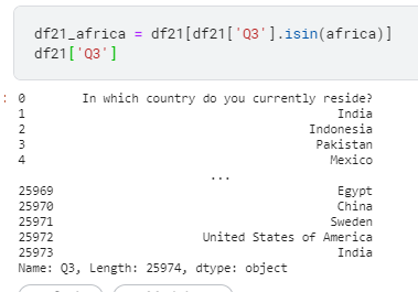
2> 따라서 “ df21[‘Q3’].isin(africa) “ 코드의 의미는 Q3의 대답이 africa 이면 True 반환.
3> 결론적으로 Q3의 대답이 Africa[]인 모든 대답을 추출 하게 된다.
4> 반대로 dfworld의 경우 ~ ( not )을 사용하여 Q3이 false인 data frame을 추출 할 수 있는것.
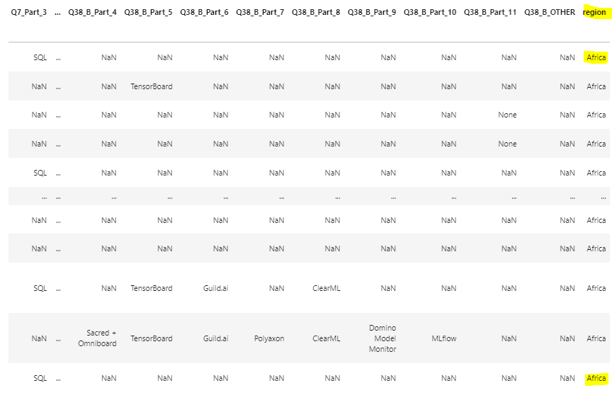
1.2.3 region column을 추가
1 | df21['region']=["Africa" if x in africa else "World" for x in df21['Q3']] |
df21 dataframe에 Region이라는 column 을 추가해 보자.
region 컬럼에 들어갈 값은
- List의 끝까지 반복하되, 만약 df21[‘Q3’]의 값이 africa에 해당하면 “Africa”, 그 밖의 경우는 world를 입력해라.
data science를 잘 하려면, python 문법도 잘 알아야 할 듯.
kaggle in Africa_Fig
You need to set
install_url to use ShareThis. Please set it in _config.yml.