kgg compete data 정리

data Import

1
2
3
4
5
6
7
8
9
10
11
12
13
14
15
16
17
18
19
20
21
22
23
24
25
26
27
28
29
import numpy as np
import pandas as pd
import seaborn as sns
import matplotlib.pylab as plt

import plotly.io as pio
import plotly.express as px
import plotly.graph_objects as go
import plotly.figure_factory as ff
from plotly.subplots import make_subplots
from plotly.offline import init_notebook_mode, iplot
init_notebook_mode(connected=True)
pio.templates.default = "none"
# import plotly.offline as py
# py.offline.init_notebook_mode()

import os
for dirname, _, filenames in os.walk('/kaggle/input'):
for filename in filenames:
print(os.path.join(dirname, filename))

import warnings
warnings.filterwarnings("ignore")
df17= pd.read_csv("/kaggle/input/kaggle-survey-2017/multipleChoiceResponses.csv", encoding="ISO-8859-1")
df18= pd.read_csv("/kaggle/input/kaggle-survey-2018/multipleChoiceResponses.csv", )
df19= pd.read_csv("/kaggle/input/kaggle-survey-2019/multiple_choice_responses.csv", )
df20= pd.read_csv("/kaggle/input/kaggle-survey-2020/kaggle_survey_2020_responses.csv", )
df21= pd.read_csv("/kaggle/input/kaggle-survey-2021/kaggle_survey_2021_responses.csv", )

질문 뽑는 법

18년도의 질문 frame을 확인 해 보자 .

1
2
questions = df18.iloc[0, :].T
questions

Question

질문 제거하기

이후 data에 질문이 들어가면 안되기 때문에 질문을 제거 해 준다.

1
2
3
4
5
df17= df17.iloc[1:, :].replace("People 's Republic of China",'China')
df18= df18.iloc[1:, :].replace('Republic of Korea','South Korea')
df19= df19.iloc[1:, :].replace('Republic of Korea','South Korea')
df20= df20.iloc[1:, :].replace('Republic of Korea','South Korea')
df21= df21.iloc[1:, :]

연도 추가하기

이후 연도별 data를 뽑기 위해서 data set에 연도를 추가 해 준다.

1
2
3
4
5
df21['year'] = '2021'
df20['year'] = '2020'
df19['year'] = '2019'
df18['year'] = '2018'
df17['year'] = '2017'

동아시아와 세계 나누기

1
df21['Q1'].unique()

unique

unique_Q3

[Q3]에 나라가 있다.

나라를 확인하여 East Asia만 region column을 새로 만들어 분류 해 준다.

1
2
3
4
5
6
7
8
9
10
11
12
13
14
15
16
17
18
19
20
21
22
23
24
25
26
27
28
29

EastAsia17 = ['China',"People 's Republic of China", 'Taiwan', 'South Korea', 'Japan']
EastAsia18= ['China', 'South Korea', 'Japan', 'Republic of Korea']
EastAsia19 = ['China','Taiwan', 'South Korea', 'Japan', 'Republic of Korea']
EastAsia20 = ['China','Taiwan', 'South Korea','Republic of Korea', 'Japan']
EastAsia21 = ['China','Taiwan', 'South Korea', 'Japan']
EastAsia = ['Republic of Korea','China','Taiwan', 'South Korea', 'Japan', "People 's Republic of China" ]

df21_Ea = df21[df21['Q3'].isin(EastAsia)]
df21_Wo = df21[~df21['Q3'].isin(EastAsia)]
df21['region']=["EastAsia" if x in EastAsia else "World" for x in df21['Q3']]


df20_Ea = df20[df20['Q3'].isin(EastAsia)]
df20_Wo = df20[~df20['Q3'].isin(EastAsia)]
df20['region']=["EastAsia" if x in EastAsia else "World" for x in df20['Q3']]

df19_Ea = df19[df19['Q3'].isin(EastAsia)]
df19_Wo = df19[~df19['Q3'].isin(EastAsia)]
df19['region']=["EastAsia" if x in EastAsia else "World" for x in df19['Q3']]

df18_Ea = df18[df18['Q3'].isin(EastAsia)]
df18_Wo = df18[~df18['Q3'].isin(EastAsia)]
df18['region']=["EastAsia" if x in EastAsia else "World" for x in df18['Q3']]

df17_Ea = df17[df17['Country'].isin(EastAsia)]
df17_Wo = df17[~df17['Country'].isin(EastAsia)]
df17['region']=["EastAsia" if x in EastAsia else "World" for x in df17['Country']]

lng()을 이용하여 % 그래프 그리기

1
2
3
4
5
6
7
8
9
10
11
12
13
14
15
16
17
18
19
20
21
22
23
24
25
26
27
28
29
30
31
32
33
34
35
36
37
38
39
40
41
42
43
44
45
46
47
48
49
50
51
52
53
# 수치 bar g = 사용자 수 비교.

Ea21 = len(df21_Ea)
Wo21 = len(df21) - len(df21_Ea)

Ea20 = len(df20_Ea)
Wo20 = len(df20) - len(df20_Ea)

Ea19 = len(df19_Ea)
Wo19 = len(df19) - len(df19_Ea)

Ea18 = len(df18_Ea)
Wo18 = len(df18) - len(df18_Ea)

Ea17 = len(df17_Ea)
Wo17 = len(df17) - len(df17_Ea)

years = ['2017','2018','2019','2020', '2021']

def percent (a, b):
result =a/(a+b)*100
result = np.round(result)
return result

def percentR (b, a):
result =a/(a+b)*100
result = np.round(result)
return result

percent = [percent(Ea17, Wo17), percent(Ea18, Wo18), percent(Ea19, Wo19),
percent(Ea20, Wo20), percent(Ea21, Wo21)]

# percentR = [percentR(Ea17, Wo17), percentR(Ea18, Wo18), percentR(Ea19, Wo19),
# percentR(Ea20, Wo20), percentR(Ea21, Wo21)]
fig = go.Figure()
fig.add_trace(go.Bar(x=years, y=[len(df17), len(df18), len(df19), len(df20), len(df21)],
base=[-len(df17), -len(df18), -len(df19), -len(df20), -len(df21)],
marker_color='#88BFBA',
name='World'
))
fig.add_trace(go.Bar(x=years, y=[Ea17, Ea18, Ea19, Ea20, Ea21],
base=0,
marker_color='#D9946C',
name='East Asia',
text= percent,
texttemplate='%{text} %',
textposition='outside',
hovertemplate='<b>KaggleUser</b>: %{x}<br>'+
'<b>Count</b>: %{y}',
textfont_size=14
))

fig.show()

다음과 같은 G가 그려 진다.

EastAsia_Kggcount

East asia와 world비교 _ kgg 사용자수

1
2
3
4
5
6
7
8
9
10
11
12
13
14
15
16
17
18
19
20
21
22
23
24
25
26
27
28
29
30
31
32
33
34
35
36
37
38
39
40
41
42
43
44
45
46
47
48
49
50
51
52
53
54
55
56
57
58
59
60
61
62
63
64
65
66
67
68
69
70
71
72
73
74
75
76
77
78
79
80
81
82
83
84
85
86
87
#data 정제하기
total17 = (
df17['region']
.value_counts()
.to_frame()
.reset_index()
.rename(columns={'index':'type', 'region':'respodents'})
.groupby('type')
.sum()
.reset_index()
)
total18 = (
df18['region']
.value_counts()
.to_frame()
.reset_index()
.rename(columns={'index':'type', 'region':'respodents'})
.groupby('type')
.sum()
.reset_index()
)
total19 = (
df19['region']
.value_counts()
.to_frame()
.reset_index()
.rename(columns={'index':'type', 'region':'respodents'})
.groupby('type')
.sum()
.reset_index()
)
total20 = (
df20['region']
.value_counts()
.to_frame()
.reset_index()
.rename(columns={'index':'type', 'region':'respodents'})
.groupby('type')
.sum()
.reset_index()
)
total21 = (
df21['region']
.value_counts()
.to_frame()
.reset_index()
.rename(columns={'index':'type', 'region':'respodents'})
.groupby('type')
.sum()
.reset_index()
)

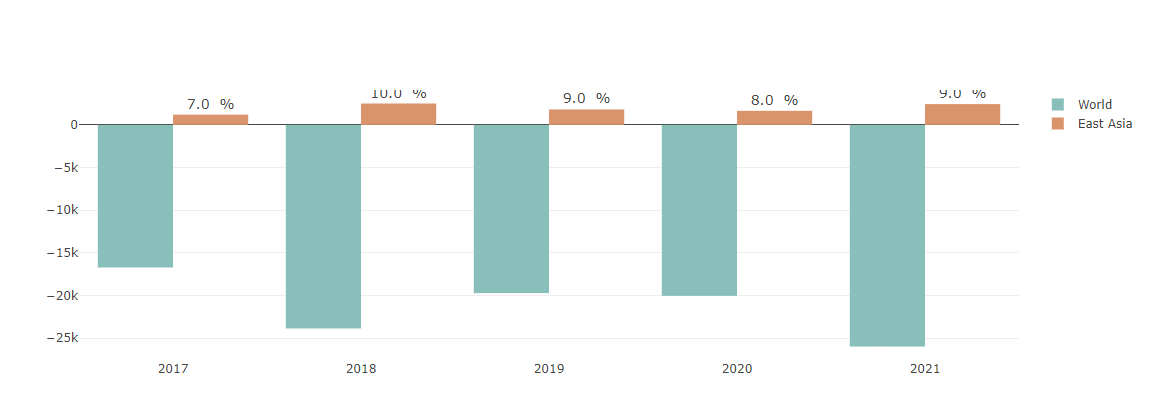
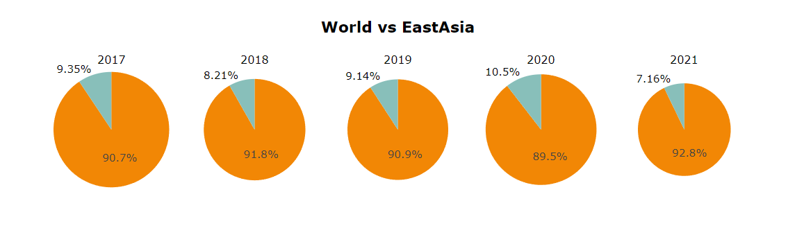
colors = ['#88BFBA','#F28705']


# Create subplots: use 'domain' type for Pie subplot
fig = make_subplots(rows=1, cols=5, specs=[[{'type':'domain'}, {'type':'domain'}, {'type':'domain'}, {'type':'domain'}, {'type':'domain'}]],
subplot_titles=("2017", "2018", "2019", "2020", "2021"))
fig.add_trace(go.Pie(marker=dict(colors=colors),labels=total21['type'], values=total21['respodents'], name="2021", scalegroup='one'),
1, 1)
fig.add_trace(go.Pie(marker=dict(colors=colors),labels=total20['type'], values=total20['respodents'], name="2020", scalegroup='one'),
1, 2)
fig.add_trace(go.Pie(marker=dict(colors=colors),labels=total19['type'], values=total19['respodents'], name="2019", scalegroup='one'),
1, 3)
fig.add_trace(go.Pie(marker=dict(colors=colors),labels=total18['type'], values=total18['respodents'], name="2018", scalegroup='one'),
1, 4)
fig.add_trace(go.Pie(marker=dict(colors=colors),labels=total17['type'], values=total17['respodents'], name="2017", scalegroup='one'),
1, 5)

# Use `hole` to create a donut-like pie chart
fig.update_traces(hole=.0, hoverinfo="label+percent+name",
textfont_size=15,)

fig.update_layout(showlegend=False,
margin=dict(pad=20),
height=100,
yaxis_title=None,
xaxis_title=None,
title_text="<b>World vs EastAsia</b>",
title_font_size=22,
font=dict(size=17, color='#000000'),
autosize=True)

fig.update_xaxes(showgrid=False)
fig.update_yaxes(showgrid=False)

fig.show()

subplot을 이용하여 원그래프 5개를 한꺼번에 묶어서 출력 할 수 있다.

Subplot_pie5

World map그리기

1
2
3
4
5
6
7
8
9
10
11
12
13
14
15
16
17
18
19
20
21
22
23
24
25
26
27
28
29
30
31
32
33
34
35
def world_map(locations,counts,title):
data = [ dict(
type = 'choropleth',
locations = locations,
z = counts,
colorscale = 'Blues',
locationmode = 'country names',
autocolorscale = False,
reversescale = True,
marker = dict(
line = dict(color = '#F7F7F7', width = 1.5)),
colorbar = dict(autotick = True, legth = 3, len=0.75, title = 'respodents',
max = 1000, min = 0)
)
]
layout = dict(
title = title,
titlefont={'size': 28, 'family': 'san serif'},
width=750,
height=475,
paper_bgcolor='#F7F7F7',
geo = dict(
showframe = True,
showcoastlines = True,
fitbounds="locations",
)
)

fig = dict(data=data, layout=layout)
iplot(fig, validate=False, filename='world-map')

z = df21_Ea['Q3'].value_counts()

## 메서드 호출
world_map(locations=z.index, counts=z.values, title= '<b> EastAsia Countries (2021 survey) <b>')

WorldMap_EastAsia_

bar mode를 stack으로 하여 G를 그릴 수 있다.

1
2
3
4
5
6
7
8
9
10
11
12
13
14
15
16
17
18
19
20
21
22
23
24
25
26
27
28
29
30
31
32
33
34
35
36
37
38
39
40
41
42
43
44
45
46
47
48
49
50
51
52
53
54
55
56
57
58
59
60
61
years = ['2017', '2018', '2019', '2020', '2021']

df21_Ea = df21[df21['Q3'].isin(EastAsia21)]
Ea21= (
df21_Ea['Q3'].value_counts().to_frame()
.reset_index().rename(columns={'index':'Country', 'Q3':'21'}))

df20_Ea=df20[df20['Q3'].isin(EastAsia)]
Ea20= (
df20_Ea['Q3'].replace('Republic of Korea','South Korea')
.value_counts().to_frame().reset_index()
.rename(columns={'index':'Country', 'Q3':'20'}))

df19_Ea=df19[df19['Q3'].isin(EastAsia)]
Ea19= (df19_Ea['Q3'].replace('Republic of Korea','South Korea')
.value_counts().to_frame().reset_index()
.rename(columns={'index':'Country', 'Q3':'19'}))

df18_Ea=df18[df18['Q3'].isin(EastAsia)]
Ea18= (df18_Ea['Q3'].replace('Republic of Korea','South Korea')
.value_counts().to_frame().reset_index()
.rename(columns={'index':'Country', 'Q3':'18'}))
Ea18.value_counts()
#df18 열에 taiwan = 0을 추가 해야 합니다.

df17_Ea = df17[df17['Country'].isin(EastAsia)]
Ea17= (df17_Ea['Country'].replace("People 's Republic of China",'China')
.value_counts().to_frame().reset_index()
.rename(columns={'index':'Country', 'Country':'17'}))

#data를 합쳐서 하나의 dataframe으로 만들어 줌.
df5years = pd.merge(Ea17, Ea18, on='Country', how='outer')
df5year =pd.merge(Ea19,Ea20, on='Country', how='outer')
df5year=pd.merge(df5year, Ea21, on='Country', how='outer')

df5years = pd.merge(df5years, df5year, on='Country', how='outer')

fig = go.Figure(data=[
go.Bar(name='2017', x=df5years['Country'], y=df5years['17']),
go.Bar(name='2018', x=df5years['Country'], y=df5years['18']),
go.Bar(name='2019', x=df5years['Country'], y=df5years['19']),
go.Bar(name='2020', x=df5years['Country'], y=df5years['20']),
go.Bar(name='2021', x=df5years['Country'], y=df5years['21'])
])

fig.update_layout(barmode='stack',
showlegend=True,
margin=dict(pad=20),
height=500,
yaxis_title=None,
xaxis_title=None,
title_text="<b>연도별 동아시아 Kaggle 사용자수</b>",
title_x=0.5,
font=dict(size=17, color='#000000'),
title_font_size=35)
fig.update_xaxes(showgrid=False)
fig.update_yaxes(showgrid=False)

fig.show()

# Text : percent

오늘은 여기까지 정리

Author

YoonHwa

Posted on

2021-11-19

Updated on

2021-11-19

Licensed under

You need to set install_url to use ShareThis. Please set it in _config.yml.
You forgot to set the business or currency_code for Paypal. Please set it in _config.yml.

댓글

You forgot to set the shortname for Disqus. Please set it in _config.yml.