East Asia, Data Scientist (kaggle in East-Asia)
Data scientist in East Asia
Data scientist로써 East Asia 에서 살아 남아보자 !
Data Import
East asia data에서 DS(Data scientist)뽑아내기
1 | # 21년 EastAsia 의 Data Scientist |
replace.()
- replace.()를 data를 뽑아 내면서 사용 하면, 편하다.
- 다음 project 부터는 그렇게 사용하자!
- 순차적으로 적용 하더라도 replace.()는 맨 앞에 사용하자.
- data를 정제할 때 구획을 어디서 나누느냐는 presentation에 중요한 구성 요소이다.(강조할 부분이 바뀐다.)
Ds의 연봉 뽑아내기
1 | df21_Ea_DS_= df21_Ea_DS.loc[:,['Q5','Q25']].reset_index().rename(columns={'Q5':'Data_Scientist', 'Q25':'Salary'}).fillna('etc') |
뽑아낸 data를 합쳐서 하나의 표로 만든다.
Excel에서 하는게 더 편하고 익숙하지만,
python을 능숙 하게 다룰 수 잇는 언젠가가 오지 않을까 싶다.
Ds의 연봉 bar graph 만들기
1 |
|
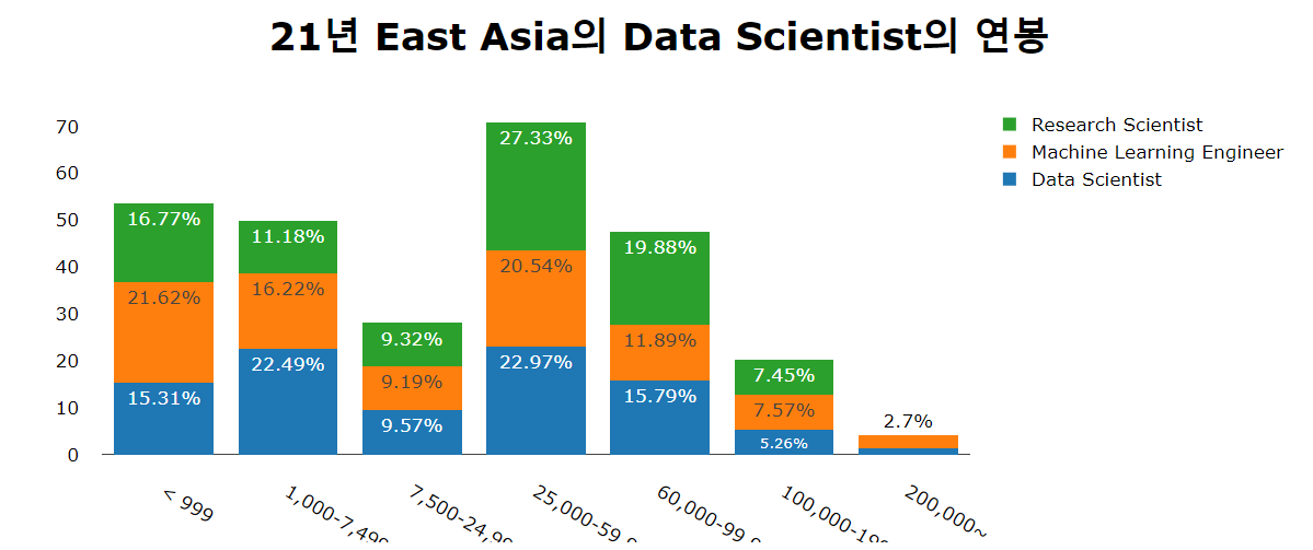
- [25,000-59,999] 이 구간이 East asia의 data scientist 들의 빈도가 가장 높은 연봉 구간이다.
- [7,500-24,999] 이 구간을 없애버리고 싶지만 (편입), 우선은 그냥 두기로 한다.
HeatMap을 그려보자
East asia의 DS들의 연봉과 경력간의 관계를 알아보고자 한다.
1 | df21Ea_DS_ExSal = df21_Ea_DS.loc[:,['Q6','Q25']].reset_index().rename(columns={'Q25':'Salary', 'Q6':'Exp'}).fillna('etc') |
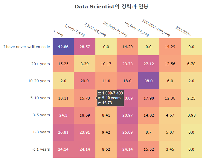
- data Scientist의 경력과 연봉 상관관계를 Heatmap으로 그렸다.
- 정말 재미있는 사실은 [7,500-24,999], [60,000-99,999] 등의 구간이 비어 보인다.
- 혹시 연봉이 반올림되는 구간이 아닐까 생각한다.
- 다음에 연봉 구획을 다시 나눈다면 이런 부분을 신경쓰면서 나누어야 할 듯.
- [<999] 구간은 생각보다 비율이 높은 걸을 알 수 있는데 이는 survey의 오류인듯 하다.
- 연봉인데 월급으로 생각했다던가…
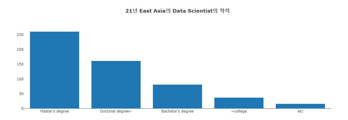
1 | df21_Ea_degree = df21_Ea_DS['Q4'].value_counts().to_frame() |
1 | df21Ea_DS_EduSal= df21_Ea_DS.loc[:, ['Q4', 'Q25']].rename(columns={'Q4':'Edu', 'Q25':'Salary'}) |
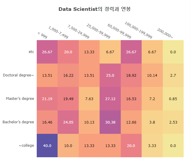
- East Asia의 ds들의 연봉은 거의 [25000-60000] 구간에 들어잇는 것 같다.
- 학위랑은 많이 상관 없어 보이며
- 심지어 200,000~$를 받는 학사학력자가 있다. 몹시 바람직하다.
1 | df20_Ea_DS = df20_Ea[df20_Ea['Q5'].isin(Data_Scientist)] |
이 plot은 강사쌤의 도움을 많이 받았다.
2017, 2018년도도 넣고 싶었으나 data 찾는데 너무 시간이 많이 걸리는 것이
대회 마감이 얼마 남지 않은 이 시점에서 바람직 하지 못한 계획이라는 생각이 들어
이쯤에서 만족 하기로 했다.
비록 이 대회에서 우승 하지 못하겠지만,
나에게 있어 이번 대회는 의미가 크다.
내 경력에는 큰 의미가 없을지언정 ㅎㅎ
1 | import numpy as np |
1 | ds_pc=df21_Ea_DS.loc[:, ['Q5','Q25','Q6','Q4','Q8']] |
East Asia, Data Scientist (kaggle in East-Asia)
https://yoonhwa-p.github.io/2021/11/23/kgg/Kgg_EastAsia_DataScientist/
You need to set
install_url to use ShareThis. Please set it in _config.yml.