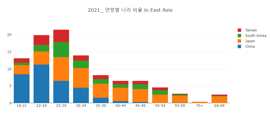
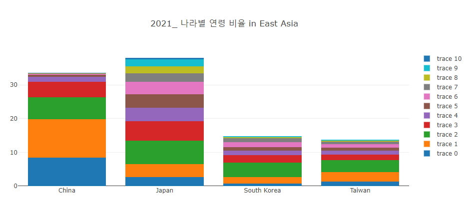
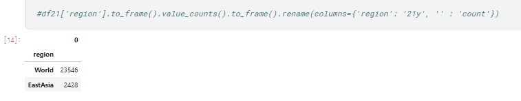
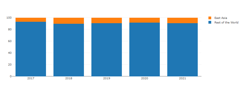
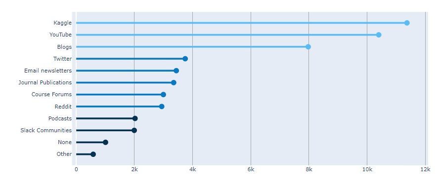
Stacked Bar (kaggle in East-Asia)
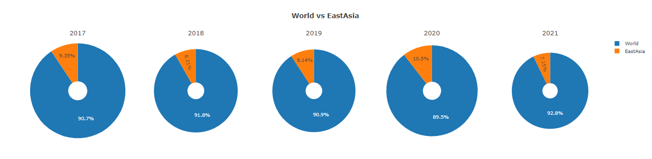
World Vs East Asia
##python을 이용한 plotly Library로 plot 그리기
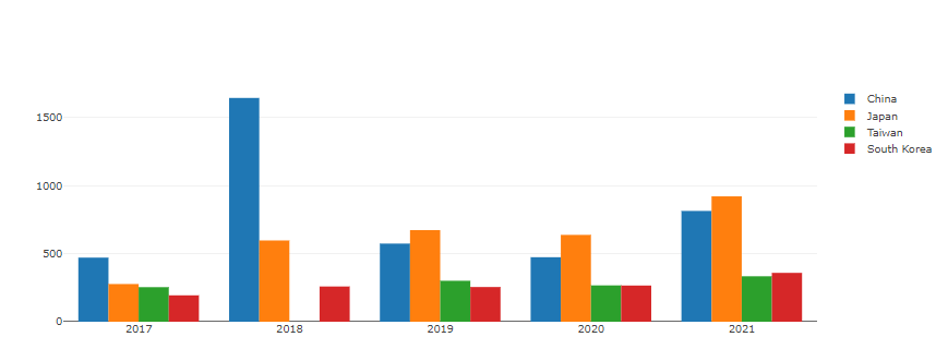
subplots 를 이용하여 다중 그래프를 그려 보자.
python Library Import
1 | import numpy as np |
data import
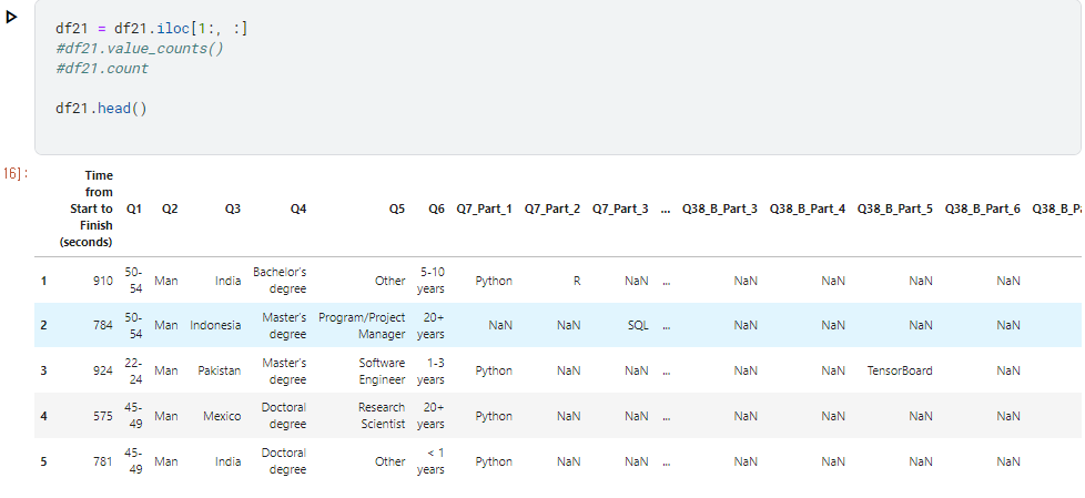
1 | df17= pd.read_csv("/kaggle/input/kaggle-survey-2017/multipleChoiceResponses.csv", encoding="ISO-8859-1") |
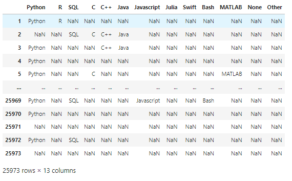
data frame 전처리
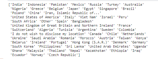
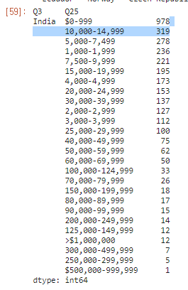
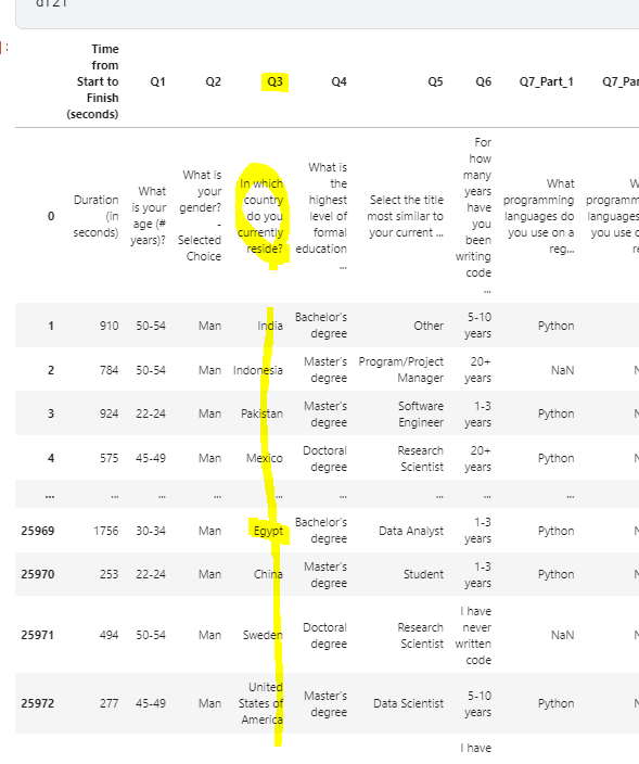
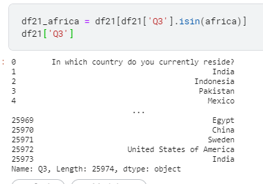
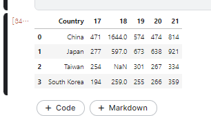
i) Q3를 기준으로 EastAsia에 속하는 나라만 연도별로 뽑아냅니다.
1 | df21_Ea=df21[df21['Q3'].isin(EastAsia21)] |
ii) data를 합쳐서 하나의 dataframe으로 만들음.
이 과정에서 pd.merge()를 사용 해 주었기 때문에 18’ taiwan data가 Nan으로 추가 되었다.
1 | fig = go.Figure(data=[ |
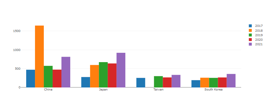
1 | #Change the bar mode |
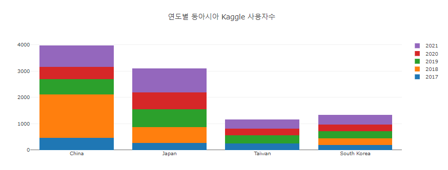
- stacked bar로 할까말까 고민중.
- dictation 할 때 까지만 해도 bar 그래프 그리는 것이 뭐그리 어렵겠나? 했다.
- 그냥 복사 붙여넣기로 만드려고 했는데
- 그게 참 안되네 ㅂㄷㅂㄷ
1 | df5years_ =df5years.transpose() |
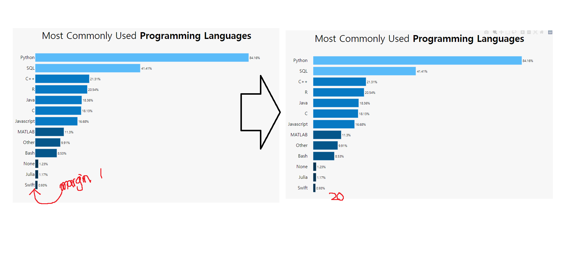
- 축 reverse로 할까말까 고민중.
- 어떤게 더 잘 보여 줄 수 있을까 … ㅜㅜ