kaggle dictation (03)
plotly.graph_objects as go: 를 이용한 bar graph
HorizontalBar plot /가로 막대 차트
0. data set
https://www.kaggle.com/miguelfzzz/the-typical-kaggle-data-scientist-in-2021
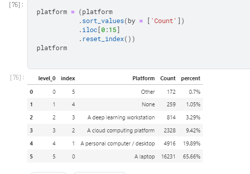
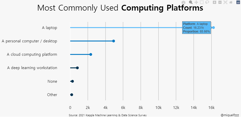
Subject : 어떤알고리즘을 선호 하는 지 알아보는 Horizontal bar
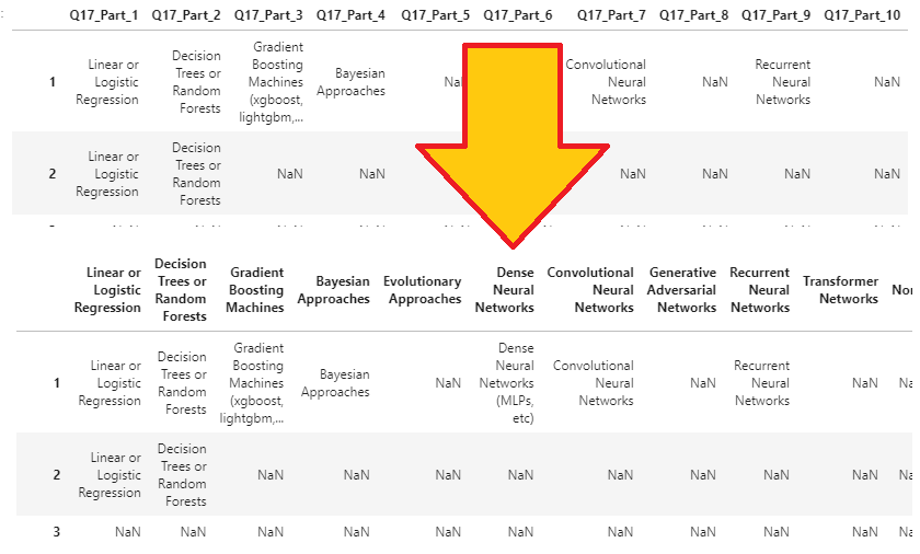
1. data 읽어오기
algorithms_cols에 data frame을 먼저 만들고 시작.
잘 모르겠지만 아마도 Q17이 붙은 data를 선택 하기 위한 code
algorithms_cols = [col for col in df if col.startswith(‘Q17’)]
col 1부터 df 끝까지
Q17로 시작하는지 확인하여 true일때만 데이터 가져오기
ref.
How to select dataframe columns that start with *** using pandas in python ?
1
2
| algorithms_cols = [col for col in df if col.startswith('Q17')]
|
2. data Frame 만들어 주기
algorithms 에 data frame을 씌워서 표를 만들고, 이름을 다음과같이 바꿔줌.
1
2
3
4
5
6
7
8
|
algorithms = df[algorithms_cols]
algorithms.columns = ['Linear or Logistic Regression', 'Decision Trees or Random Forests',
'Gradient Boosting Machines', 'Bayesian Approaches', 'Evolutionary Approaches',
'Dense Neural Networks', 'Convolutional Neural Networks', 'Generative Adversarial Networks',
'Recurrent Neural Networks', 'Transformer Networks', 'None', 'Other']
|
3.표 설정.
1
2
3
4
5
6
7
8
| algorithms = (
algorithms
.count()
.to_frame()
.reset_index()
.rename(columns={'index':'Algorithms', 0:'Count'})
.sort_values(by=['Count'], ascending=False)
)
|
- .count() :coulumn 수 세기
- .to_frame() : frame 생성
- .reset_index() : 원본과 상관없는 Index 생성
- .rename()
- columns의 이름을 지정 : ‘index’:’Algorithms’, 0:’Count’
- .sort_values()
- by=[‘Count’], ascending=False
- Count 기준으로 내림차순으로 정렬
3. percent 추가
1
2
| algorithms['percent'] = ((algorithms['Count'] / len(df))*100).round(2).astype(str) + '%'
|
표에 ‘percent’를 추가
algorithms의 count에 df의 length로 나누고 *100을 하는 전형적인 % 나타내기
값자체에 %를 입력하여 나중에 %를 추가 입력하지 않아도 됨
소숫점 자리 2까지 반영(반올림).
type 자체를 String으로 하여 추가 계산은 불가능.
4. 색 지정
1
2
3
4
5
6
7
8
| colors = ['#033351',] * 12
colors[0] = '#5abbf9'
colors[1] = '#5abbf9'
colors[2] = '#066eb0'
colors[3] = '#066eb0'
colors[4] = '#044a77'
colors[5] = '#044a77'
colors[6] = '#044a77'
|
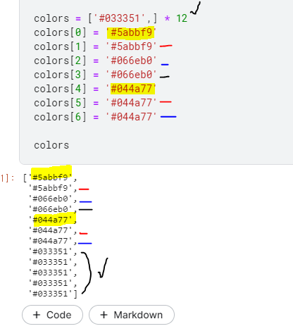
색 깊이는 12단계, 0~6까지는 정해주고 나머지 5개는 #033351을 default로 한 것을 알 수 있다.
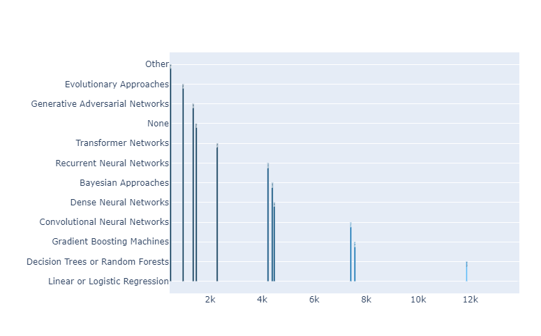
5. bar Graph 만들기
1
2
3
4
5
6
7
| fig = go.Figure(go.Bar(
x=algorithms['Count'],
y=algorithms['Algorithms'],
text=algorithms['percent'],
orientation='h',
marker_color=colors
))
|
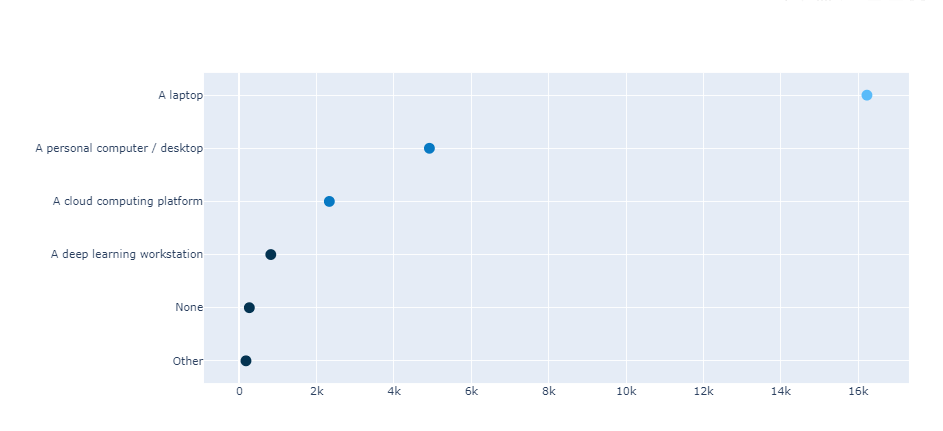
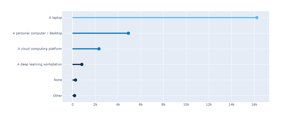
horizontal과 vertical Graph의 차이는 x, y axis를 바꾸어 주는 것과
orientation=’h’ 을 넣어 주는 것의 차이.
<orientation 없음>
<orientation H 있음>
6. update_traces()
traces() 수정 : Trace에 대한 설정
1
2
3
4
5
6
| fig.update_traces(texttemplate='%{text}',
textposition='outside',
cliponaxis = False,
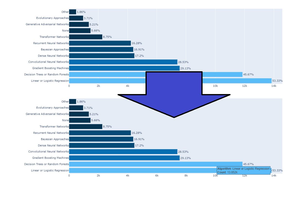
hovertemplate='<b>Algorithm</b>: %{y}<br><extra></extra>'+
'<b>Count</b>: %{x}',
textfont_size=12)
|
- texttemplate : text type
- textposition : ‘outside’ _ 설정 해 주지 않은 경우 칸에 따라 적당히 들어감.
- cliponaxis = False : text가 칸이 작아서 짤리는 경우를 막아주는 기능 (off)
- hovertemplate :
- 마우스 On하면 (커서를 위에 대면) 나오는 Hovert에대한 설정.
- textfont_size : 폰트 size
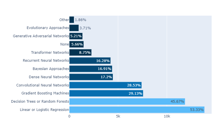
7. Design
1
2
3
4
5
6
7
8
9
10
11
12
13
14
15
16
17
|
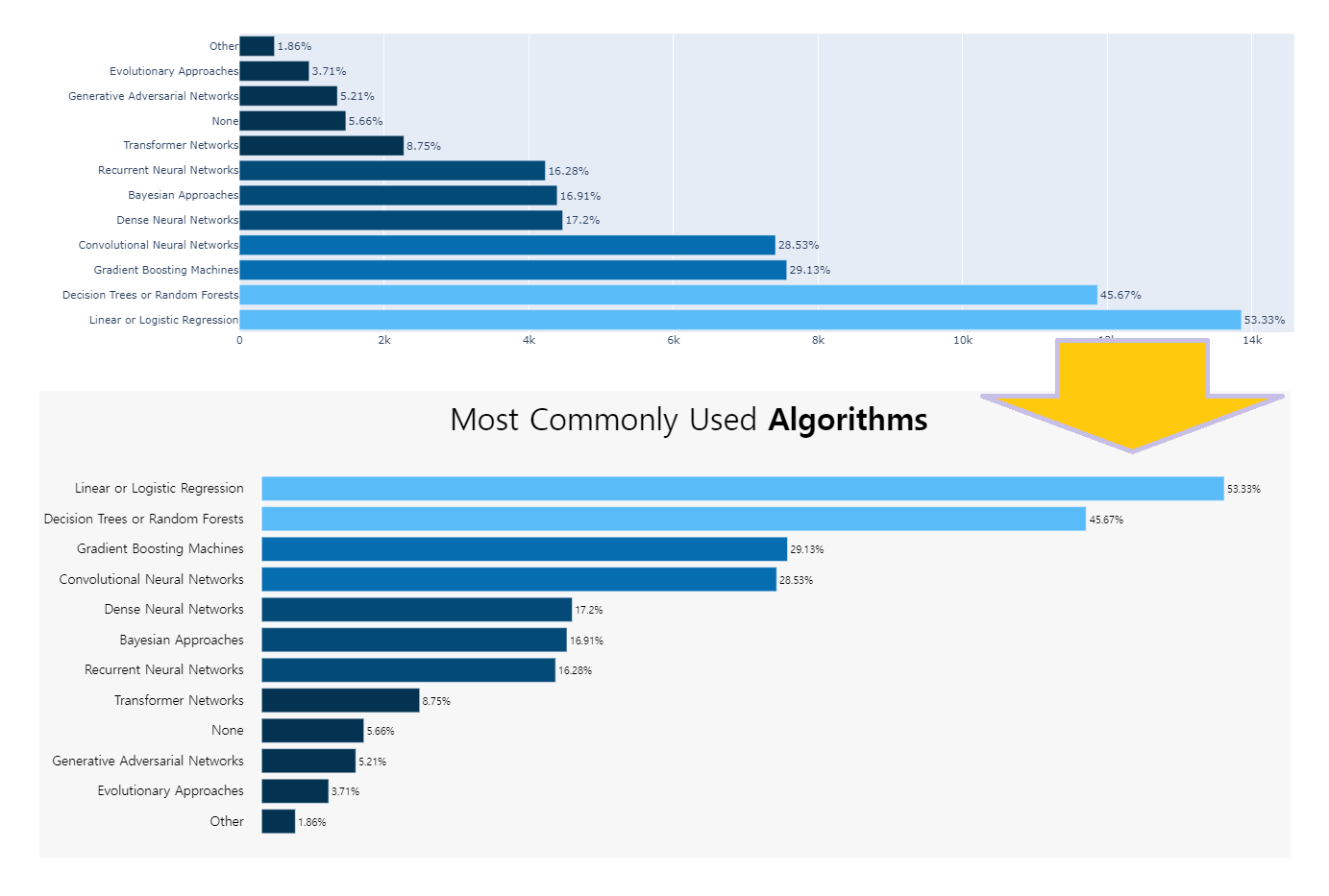
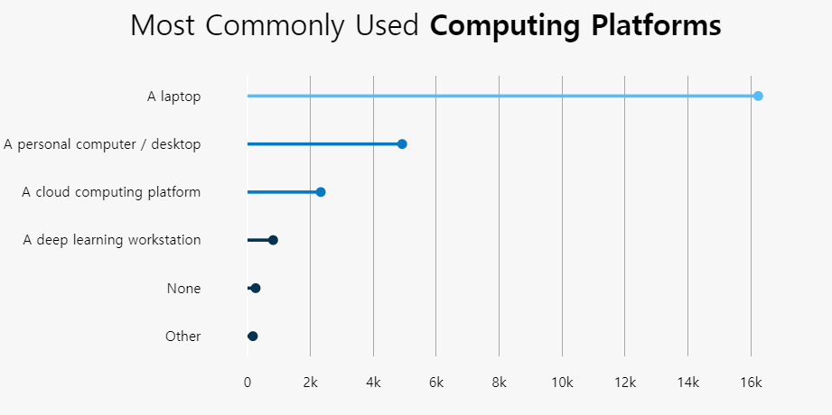
fig.update_xaxes(showgrid=False)
fig.update_yaxes(showgrid=False)
fig.update_layout(showlegend=False,
plot_bgcolor='#F7F7F7',
margin=dict(pad=20),
paper_bgcolor='#F7F7F7',
xaxis={'showticklabels': False},
yaxis_title=None,
height = 600,
xaxis_title=None,
yaxis={'categoryorder':'total ascending'},
title_text="Most Commonly Used <b>Algorithms</b>",
title_x=0.5,
font=dict(family="Hiragino Kaku Gothic Pro, sans-serif", size=15, color='#000000'),
title_font_size=35)
|
- Grid Delete
- update_layout
- showlegend=False,
- plot_bgcolor=’#F7F7F7’
- margin=dict(pad=20),
- paper_bgcolor=’#F7F7F7’,
- xaxis={‘showticklabels’: False},
- x 축 labels을 삭제.
- yaxis_title=None,
- xaxis_title=None, yaxis={‘categoryorder’:’total ascending’},
- y 축 title을 categoryorder
-
- Automatically Sorting Categories by Name or Total Value
- layout-xaxis-categoryorder
- title_text=”Most Commonly Used Algorithms“,
- title_x=0.5,
- font=dict(family=”Hiragino Kaku Gothic Pro, sans-serif”, size=15, color=’#000000’),
title_font_size=35)
이미 앞서서 충분히 설명 했기 때문에 본 posting에서 설명되지 않은 부분은
basic bar Graph 에서 확인
8. Annotation
1
2
3
4
5
6
7
8
9
10
11
12
13
14
15
16
17
18
19
20
| fig.add_annotation(dict(font=dict(size=14),
x=0.98,
y=-0.17,
showarrow=False,
text="@miguelfzzz",
xanchor='left',
xref="paper",
yref="paper"))
fig.add_annotation(dict(font=dict(size=12),
x=0,
y=-0.17,
showarrow=False,
text="Source: 2021 Kaggle Machine Learning & Data Science Survey",
xanchor='left',
xref="paper",
yref="paper"))
fig.show()
|
.png)