Python Class and function
day 1 Lecture (01)
1. 새로운 Project 시작
- python project를 새로 시작 해 보자.
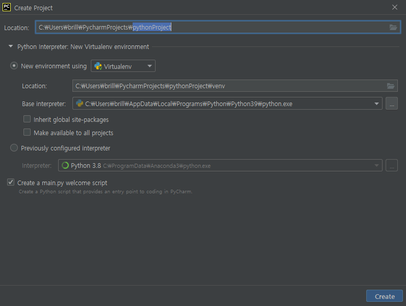
pycham을 실행하여 project file을 만들어도 되지만, 원하는 directory에 file 을 만들고, 그 file에서 pycharm을 실행 해도 된다.
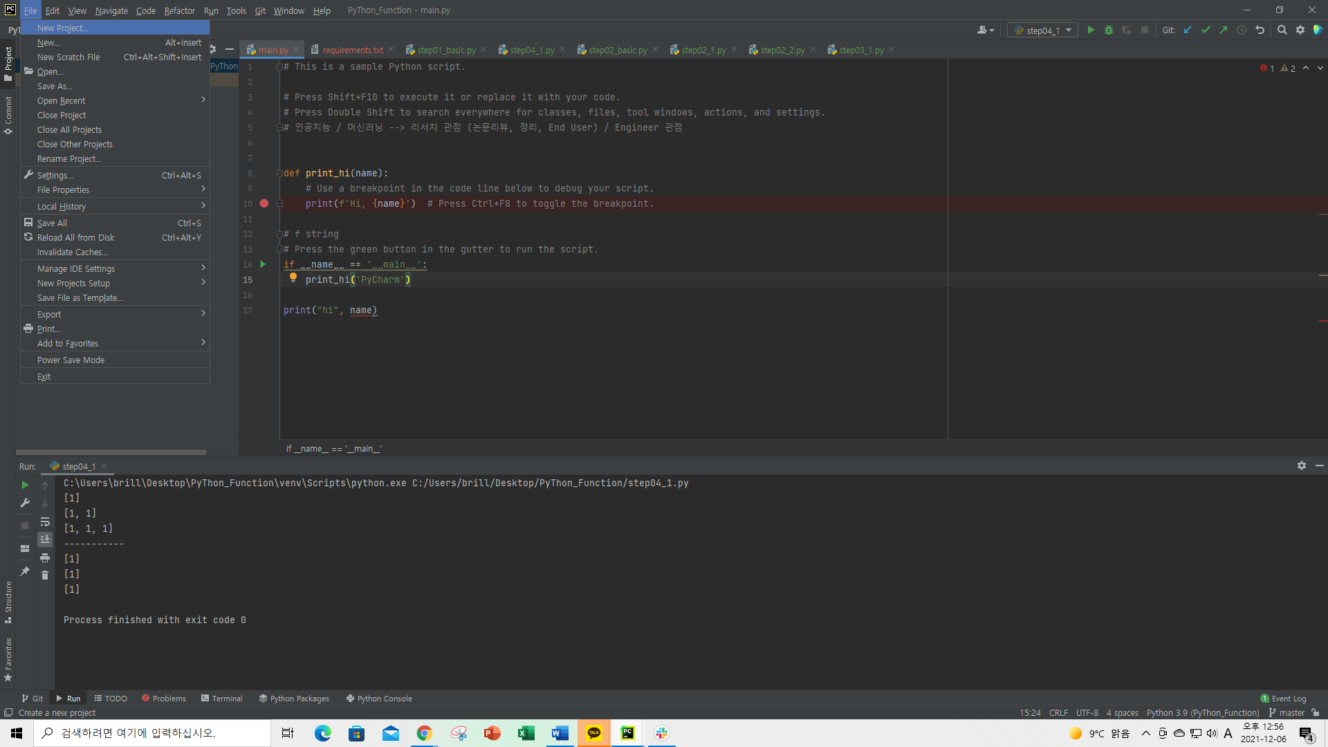
2. main.py :
stop point
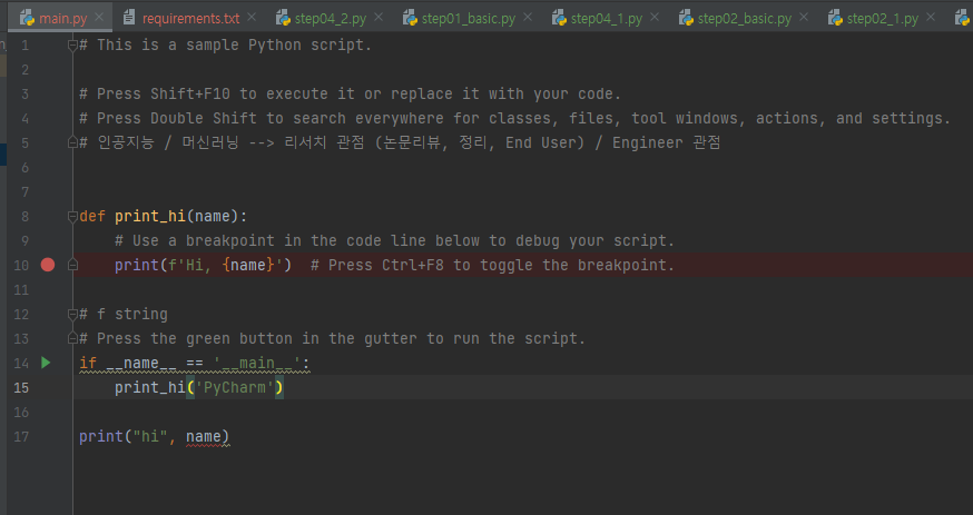
1 | # This is a sample Python script. |
def name(name): 함수 정의 하기
1 | def print_hi(name): |
- Ctrl + shift + F10 : Run
def 로 함수 정의 이름(print_hi), 인수(name)을 설정 :
- 원하는 동작(print(f’Hi, {name})) 넣기
함수 실행 : 왜 이렇게 해야 하는가를 공부 해 오자.
- if name == ‘main‘:
print_hi(‘PyCharm’)
- if name == ‘main‘:
print(“hi”, print_hi(‘YH’))
Hi, PyCharm
Hi, YH
hi None
3. Import.
1 | numpy == 1.21.4 |
가상환경 설정을 하는 이유
Python PKG : 20~30 만개 있다.
- 라이브러리 : 종속성이 있다.
- 범용성이 좋아서 data analysis, web site development, 앱, 게임 등 개발, GUI, 개발 그 외 여러가지 가능
- Matplotlib (기초가 되는 라이브러리, 3.5.0)를 참조하여 seaborn, plotly, …
- 버전 관리 불가.
- data 분석을 위한 가상 환경
같은 Local machine 위에
Game 개발을 위한 가상 환경 조성 (다른 버전을 사용 할 수 있다. )
PKG 설정:
https://pypi.org 에 들어가서 PKG 버전을보고 설치 하면 된다.
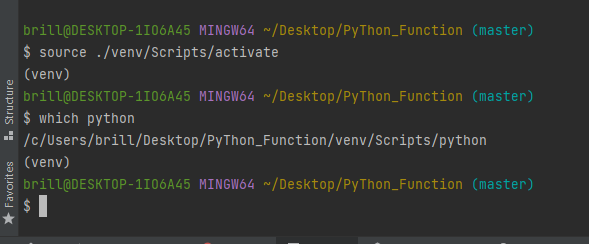
4. venu : 가상 환경 설정
1 |
|
가상환경 설정
$ which python
/c/ProgramData/Anaconda3/python$ source ./venv/Scripts/activate
(venv)
$ which python
/c/Users/brill/Desktop/PyThon_Function/venv/Scripts/python
(venv)
(venv)
가 있어야 가상환경 설정이 된것이다.
terminal에서 pandas import 하는 방법
1 | brill@DESKTOP-1IO6A45 MINGW64 ~/Desktop/PyThon_Function (master) |
Requirement already satisfied: pandas in c:\users\brill\desktop\python_function\venv\lib\site-packages (1
.3.4)
Requirement already satisfied: pytz>=2017.3 in c:\users\brill\desktop\python_function\venv\lib\site-packa
ges (from pandas) (2021.3)
Requirement already satisfied: numpy>=1.17.3 in c:\users\brill\desktop\python_function\venv\lib\site-pack
ages (from pandas) (1.21.4)
Requirement already satisfied: python-dateutil>=2.7.3 in c:\users\brill\desktop\python_function\venv\lib
site-packages (from pandas) (2.8.2)
Requirement already satisfied: six>=1.5 in c:\users\brill\desktop\python_function\venv\lib\site-packages
(from python-dateutil>=2.7.3->pandas) (1.16.0)
WARNING: You are using pip version 21.1.2; however, version 21.3.1 is available.
You should consider upgrading via the ‘C:\Users\brill\Desktop\PyThon_Function\venv\Scripts\python.exe -m pip install –upgrade pip’ c
ommand.
(venv)
pandas 등을 하나씩 install 하는 방법도 있지만, file(requirements)
를 만들어 install 하는 방법도 있다.
1 | # /c/Users/brill/Desktop/PyThon_Function/venv/Scripts/python |