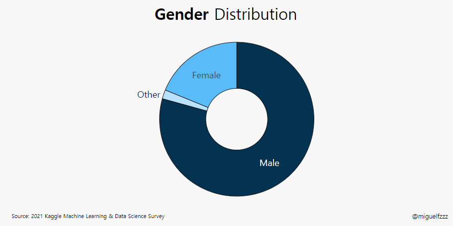
kaggle :Donut Chart Graph (Q2)
kaggle dictation (07)
plotly.graph_objects as go: 를 이용한 Donut Chart(pie graph)
###pie plot / 파이차트, 도넛차트
파이차트는 원그래프를 일컫는 말
전체에 대한 각 부분의 비율을 백분율로 나타내어 전체적인 비율을 쉽게 파악 할 수있다.
fig = go.Figure(data=[go.Pie(labels=labels, values=values, hole=.3)])
원그래프에 ‘hole’을 추가하여 생성 할 수 있다.
그 hole 안에 domain(make_subplots())을 추가하여 차트 제목을 추가 할 수도 있다.
같은 원리로
fig = go.Figure(data=[go.Pie(labels=labels, values=values, pull=[0, 0, 0.2, 0])])
조각이 떼어진 pie chart 를 생성 할 수 있다.
pieChart/En : pie chart
Sunburst Chart/En : 다중 pie 차트
plotly.graph_objects as go: 를 이용한 Donut_Chart
Donut_Chart /도넛 차트 (pie chart의 일종)
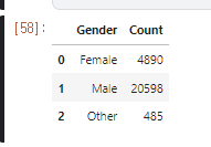
0. data set
https://www.kaggle.com/miguelfzzz/the-typical-kaggle-data-scientist-in-2021
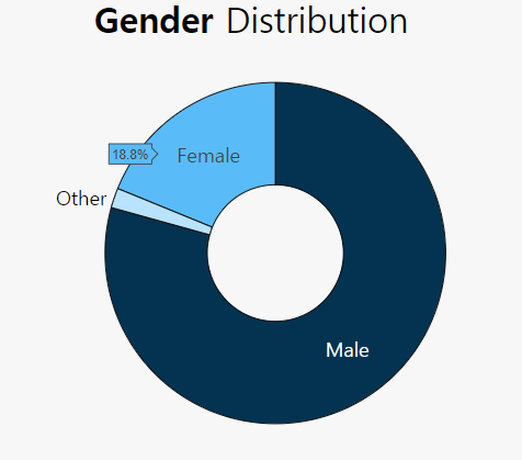
Subject : 성별의 분포_
1. data 읽어오기 , data Frame 생성
1 | gender = ( |
2. 색 지정
1 | colors = ['#5abbf9','#033351', 'b9e2fc'] |
3. Figure 그리기
1 | fig = go.Figure(data=[go.Pie(labels=gender['Gender'], |
- labels=gender[‘Gender’]
- 컬럼 이름
- values=gender[‘Count’]
- 컬럼값
- hole=.4
- 도넛형태로 만들어 주기 위한 hole
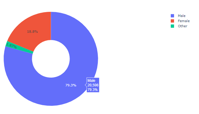
default 값으로 legend 가 들어 있는 것을 볼 수 있다.
4. update_traces()
1 | fig.update_traces(hoverinfo='percent', |
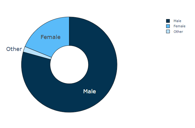
5. update_layout()
표의 layout 바꾸기
1 | fig.update_layout(showlegend=False, |
- showlegend=False,
- Legend 없앰
- plot_bgcolor=’#F7F7F7’,
- BG 회색, 하지만 바꿔도 안보임
- paper_bgcolor=’#F7F7F7’,
- plot이 놓여있는 paper bg
- title_text=”Gender Distribution”,
- 제목 설정
- title_x=0.5,
- 제목의 위치
- font=dict(family=”Hiragino Kaku Gothic Pro, sans-serif”, size=25, color=’#000000’)
- font 종류, 제목의 size, 색
6. Annotation
1 | fig.add_annotation(dict(font=dict(size=14), |