visualization by python
Visualization _python으로
[1103 학습]
시각화 연습 및 작성 코드 깃헙 블로그 및 깃헙에 올리기, 개인별로 공유
시각화 올릴 때, 전체 코드 올리지 마시고,
나눠서 올리세요. 설명 글 추가하시고여~ (예시 하단)산점도: 산점도란 무엇인가? 언제 쓰는가? 코드 작성 및 간단 설명
박스플롯: 박스플롯이란 무엇인가? 언제 쓰는가? 코드 작성 및 간단 설명
오후 1시까지 1차로 한번 올려서 개인별로 공유해주세요. 홧팅요
Intro
python에서 visualiztion 하기 위해서는 많은 방법이 있다.
data Analist들은 시각화를 위해 많은 tool을 사용 하는데 우리는 Seaborn과 Matplotlib을 이용하여 시각화를 할 예정이다.
코드 기반(python)의 data visualiztion의 장점
- 여러 그래프 동시 작성 가능
- 기존의 코드 재활용성
- 데이터 그기의 제한이 없음 (RAM등의 제약조건 없을때)
Matplotlib 는 이미지 데이터와 정형 데이터(정적 그래프)를 시각화 할 수 있는데 나와 같은 비전공자들에게 시각화 문법이 조금 어렵다고 한다. 하지만 pandas data frame에서 쉽게 시각화 구현 하며, 통계(회귀선) 그래프 등을 쉽게 구현 할 수 있기 때문에 이를 배워야 한다.
seaborn의 경우 그래프가 예쁘게 나오지 않지만 비교적 간단한 코드로 시각화를 할 수 있다. 하지만, 세부 옵션을 수정 하고 싶다면 Matplotlib를 알아야 한다. 이는 내부 원리를 파악 할 수 없기 때문에 내가 감당하기 힘들다.
때문에 지금 단계에서는 Matplotlib과 seaborn의 장점을 적절하게 섞어서 시각화를 진행 해 보자.
아래와 같은 Tutorial을 진행 하면 세부 옵션을 조정 하기 쉽다고 한다.
https://matplotlib.org/stable/tutorials/index.html
matplotlib
matplotlib를 이용하여 visualiztion을 해 보자.
제일 먼저 해 주어야 할 일은 Import하여 matplotlib를 불러오고 이를 plt등의 객체에 저장 해 주는 것이다.
1 | import matplotlib.pyplot as plt |
위의 data는 강사님의 data를 가져 온 것이다.
data를 시각화 자료로 만들어 보자,
1 | fig, axes = plt.subplots(nrows=1, ncols=1, figsize=(10,6)) |
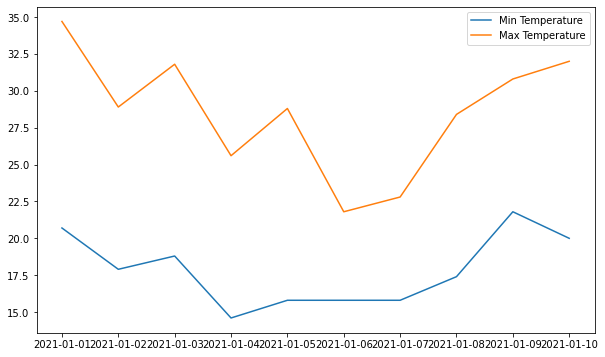
위의 표는 legend가 있고, 날짜별로 Min Temp와 Max Temp가 있는 그래프 이다.
먼저 fig, ax = plt.subplots()를 이용하여 표를 생성 한다.
이때 figure에대한 정보를 함께 생성 할 수 있는데, (nrows=1, ncols=1, figsize=(10,6)) 가 의미하는 것은 (행의 갯수 =1, 열의 갯수=1, fig size는 10X6)이다.
ax를 통하여 plot 형태의 그래프를 그리는데, (x축, y축 , label = “[name]”)의 형태로 plot을 추가 해 준다.
이때 Legend 를 생성 하고 싶다면, ax.legend()함수로 추가 해 줄 수 있다.
마지막으로 plt.show() 를 사용하여 마무리 해 준다.
물론 마지막 코드를 넣지 않아도 보여 주지만, 넣어주는 것이 인지상정이라고 한다.
1 | print(fig) |
Figure(720x432)
AxesSubplot(0.125,0.125;0.775x0.755)
위의 표인 fig의 정보를 알 수 있게 print 함수로 뽑아 봤는데 이건 무슨 말 인지 잘 모르겠다.
matplotlib로 선 그래프 그리기
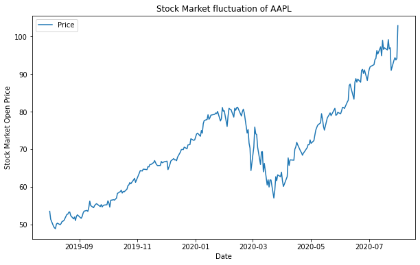
아직 data를 어디에서 받을 수 있는지 잘 모르기 때문에 강사님이 다운받은 표를 그대로 가져와 보자
참조: https://pypi.org/project/fix-yahoo-finance/
1 | !pip install yfinance --upgrade --no-cache-dir |
Collecting yfinance
Downloading yfinance-0.1.64.tar.gz (26 kB)
Requirement already satisfied: pandas>=0.24 in /usr/local/lib/python3.7/dist-packages (from yfinance) (1.1.5)
Requirement already satisfied: numpy>=1.15 in /usr/local/lib/python3.7/dist-packages (from yfinance) (1.19.5)
Requirement already satisfied: requests>=2.20 in /usr/local/lib/python3.7/dist-packages (from yfinance) (2.23.0)
Requirement already satisfied: multitasking>=0.0.7 in /usr/local/lib/python3.7/dist-packages (from yfinance) (0.0.9)
Collecting lxml>=4.5.1
Downloading lxml-4.6.4-cp37-cp37m-manylinux_2_17_x86_64.manylinux2014_x86_64.manylinux_2_24_x86_64.whl (6.3 MB)
[K |████████████████████████████████| 6.3 MB 7.7 MB/s
[?25hRequirement already satisfied: python-dateutil>=2.7.3 in /usr/local/lib/python3.7/dist-packages (from pandas>=0.24->yfinance) (2.8.2)
Requirement already satisfied: pytz>=2017.2 in /usr/local/lib/python3.7/dist-packages (from pandas>=0.24->yfinance) (2018.9)
Requirement already satisfied: six>=1.5 in /usr/local/lib/python3.7/dist-packages (from python-dateutil>=2.7.3->pandas>=0.24->yfinance) (1.15.0)
Requirement already satisfied: urllib3!=1.25.0,!=1.25.1,<1.26,>=1.21.1 in /usr/local/lib/python3.7/dist-packages (from requests>=2.20->yfinance) (1.24.3)
Requirement already satisfied: chardet<4,>=3.0.2 in /usr/local/lib/python3.7/dist-packages (from requests>=2.20->yfinance) (3.0.4)
Requirement already satisfied: idna<3,>=2.5 in /usr/local/lib/python3.7/dist-packages (from requests>=2.20->yfinance) (2.10)
Requirement already satisfied: certifi>=2017.4.17 in /usr/local/lib/python3.7/dist-packages (from requests>=2.20->yfinance) (2021.5.30)
Building wheels for collected packages: yfinance
Building wheel for yfinance (setup.py) ... [?25l[?25hdone
Created wheel for yfinance: filename=yfinance-0.1.64-py2.py3-none-any.whl size=24109 sha256=25a6e16cba240e66cb4999d0947a231b790b2b96766767434407e09149ec9302
Stored in directory: /tmp/pip-ephem-wheel-cache-a8wml444/wheels/86/fe/9b/a4d3d78796b699e37065e5b6c27b75cff448ddb8b24943c288
Successfully built yfinance
Installing collected packages: lxml, yfinance
Attempting uninstall: lxml
Found existing installation: lxml 4.2.6
Uninstalling lxml-4.2.6:
Successfully uninstalled lxml-4.2.6
Successfully installed lxml-4.6.4 yfinance-0.1.64
1 | import yfinance as yf |
[*********************100%***********************]  1 of 1 completed
<class 'pandas.core.frame.DataFrame'>
DatetimeIndex: 504 entries, 2019-08-01 to 2021-07-30
Data columns (total 6 columns):
 #   Column     Non-Null Count  Dtype
---  ------     --------------  -----
 0   Open       504 non-null    float64
 1   High       504 non-null    float64
 2   Low        504 non-null    float64
 3   Close      504 non-null    float64
 4   Adj Close  504 non-null    float64
 5   Volume     504 non-null    int64
dtypes: float64(5), int64(1)
memory usage: 27.6 KB
<module 'yfinance' from '/usr/local/lib/python3.7/dist-packages/yfinance/__init__.py'>
info() 함수를 통해 column정보와 data의 갯수, data의 type까지 알 수 있다.
date time index에 구간이 내가 정한데로 나와 있는 것도 볼 수 있다.
1 | ts = data['Open'] |
Date
2019-08-01    53.474998
2019-08-02    51.382500
2019-08-05    49.497501
2019-08-06    49.077499
2019-08-07    48.852501
Name: Open, dtype: float64
ts 객체에 Open data를 담고 .head() 함수로 상위 5개의 항목을 가져와 본다.
혹시,
Pandas 에대하여 더 정리된 것을 알고 싶다면, 링크를 통해 확인 할 수 있다.
Pyplot API
아래의 예는 Pyplot API 방법을 이용하여, 한개씩 data를 넣어 준 형태 이다. 이는 객체지향으로 만들었다고 하기 어렵지만, 가능은 하다.
1 | # import fix_yahoo_finance as yf |
[*********************100%***********************] 1 of 1 completed
Pyplot API 객체지향
1 | from matplotlib.backends.backend_agg |
객체지향을 위해 import를 해 준다.
1 | fig = Figure() |