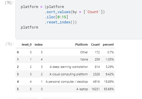
kaggle in East-Asia(data둘러보기)

Kaggle in East Asia


0. introduction

1. World Vs East Asia

  1. Kgg 응답자 수
  2. Kgg 응답자 중 직업
    1.

2. East Asia

3. interestings

  • Tenure: 17y 경력? Q6(20y) Q8(18y) Q15(19y) Q6(20, 21y)
  • FormalEducation: 17y 학력, Q4 in 18y, 19y, 20y
  • 전공 Q5 in18y
  • compensation for year: Q10 in 18y,19y, Q24 in 20,
1
2
3
4
5
6
7
8
9
10
11
12
13
14
15
16
17
18
19
20
21
22
23
24
25
26
27
28
29
# 연도별 나이 
df21Age_Ea = df21_Ea.loc[:,['Q3','Q1']].reset_index().rename(columns={'Q3':'East_Asia', 'Q1':'2021'}).fillna('etc')
df20Age_Ea = df20_Ea.loc[:,['Q3','Q1']].reset_index().rename(columns={'Q3':'East_Asia', 'Q1':'2020'}).fillna('etc')
df19Age_Ea = df19_Ea.loc[:,['Q3','Q1']].reset_index().rename(columns={'Q3':'East_Asia', 'Q1':'2019'}).fillna('etc')
df18Age_Ea = df18_Ea.loc[:,['Q3','Q2']].reset_index().rename(columns={'Q3':'East_Asia', 'Q2':'2018'}).fillna('etc')
df17Age_Ea = df17_Ea.loc[:,['Country','Age']].reset_index().rename(columns={'Country':'East_Asia', 'Age':'2017'}).fillna('etc')


#data frame 정리

dfAge21_percent =df21Age_Ea.groupby(['East_Asia','2021']).size().reset_index().rename(columns = {0:"Count"})
dfAge21_percent['percent'] =((dfAge21_percent['Count'] / len(df21Age_Ea))*100).round(2)
dfAge21_percent['percent_str'] =((dfAge21_percent['Count'] / len(df21Age_Ea))*100).round(2).astype(str) + '%'
# dfAge21['percent'] = ((media['Count'] / len(df))*100).round(2).astype(str) + '%'
# dfAge_percent21=dfAge21.value_counts('East_Asia',normalize=True).mul(100).round(1).astype(str)
dfAge21_percent


# 나라별 연령대 비율 in East Asia
fig = go.Figure()
for country, group in dfAge21_percent.groupby('East_Asia'):
fig.add_trace(go.Bar(
x = group['2021'], y = group['percent'], name = country, text=group['percent_str']
))
fig.update_layout(barmode="stack",
plot_bgcolor = "white",
title='2021_ 연령별 나라 비율 in East Asia')
fig.show()

Q1_EastAsia

1
2
3
4
5
6
7
8
9
10
11
12

# 연령별 나라 비율 in East Asia // 여기 name 어떻게 넣는거야 !!!!
fig = go.Figure()

for country, group in dfAge21_percent.groupby('2021'):
fig.add_trace(go.Bar(
x = group['East_Asia'], y =group['percent'], text=dfAge21_percent['percent_str']
))
fig.update_layout(barmode="stack",
plot_bgcolor = "white",
title='2021_ 나라별 연령 비율 in East Asia')
fig.show()

img_1.Q1_EastAsia

  • 못해먹겠다.

Metaplotly

kaggle in Korea(data둘러보기)

#How popular is kaggle in South Korea?


data 정제하기

1
2
3
4
5
6
7
8
9
10
11
12
13
14
15
16
17
18
19
20
21
22
23
24
df21_Ko = df21[df21['Q3'] == 'South Korea']
df21_Wo = df21[~(df21['Q3'] == 'South Korea')]
df21['region']=["Korea" if x == 'South Korea' else "World" for x in df21['Q3']]
df21['region'].value_counts()

df20_Ko = df20[df20['Q3'] == 'South Korea']
df20_Wo = df20[~(df20['Q3'] == 'South Korea')]
df20['region']=["Korea" if x == 'South Korea' else "World" for x in df20['Q3']]
df20['region'].value_counts()

df19_Ko = df19[df19['Q3'] == 'South Korea']
df19_Wo = df19[~(df19['Q3'] == 'South Korea')]
df19['region']=["Korea" if x == 'South Korea' else "World" for x in df19['Q3']]
df19['region'].value_counts()

df18_Ko = df18[df18['Q3'] == 'South Korea']
df18_Wo = df18[~(df18['Q3'] == 'South Korea')]
df18['region']=["Korea" if x == 'South Korea' else "World" for x in df18['Q3']]
df18['region'].value_counts()

df17_Ko = df17[df17['Country'] == 'South Korea']
df17_Wo = df17[~(df17['Country'] == 'South Korea')]
df17['region']=["Korea" if x == 'South Korea' else "World" for x in df17['Country']]
df17['region'].value_counts()

<<<<<<< HEAD

World 25615
Korea 359
Name: region, dtype: int64

World 19847
Korea 190
Name: region, dtype: int64

World 19536
Korea 182
Name: region, dtype: int64

World 23672
Korea 188
Name: region, dtype: int64

World 16522
Korea 194
Name: region, dtype: int64
=======


2021

  • World 25615
  • Korea 359
  • Name: region, dtype: int64

2020

  • World 19847
  • Korea 190
  • Name: region, dtype: int64

2019

  • World 19536
  • Korea 182
  • Name: region, dtype: int64

2018

  • World 23672
  • Korea 188
  • Name: region, dtype: int64

2017

  • World 16522
  • Korea 194
  • Name: region, dtype: int64

trouble shooting

data 정제를 하다 보니 전체 data에서 korea가 1% 밖에 되지 않아 data set을 더 추가 하기로 했다.

##동아시아
East Asia

Ref. East Asia

동아시아

  • East Asia에는 대한민국, 일본, 중국, 타이완, 몽골, 북조선 총 6개의 국가가 속해 있다.
  • 알 수 없지만, 18년도엔 타이완이 없다.
1
2
3
4
5
6
7
8
9
10
11
12
13
14
15
16
17
18
19
20
21
22
23
24
25
26
27
28
29
30
31
32
33
34
## East Asia에는 대한민국, 일본, 중국, 타이완, 몽골, 북조선 총 6개의 국가가 속해 있다. 
## 알 수 없지만, 18년도엔 타이완이 없다.

EastAsia17 = ['China',"People 's Republic of China", 'Taiwan', 'South Korea', 'Japan']
EastAsia18= ['China', 'South Korea', 'Japan', 'Republic of Korea']
EastAsia19 = ['China','Taiwan', 'South Korea', 'Japan', 'Republic of Korea']
EastAsia20 = ['China','Taiwan', 'South Korea','Republic of Korea', 'Japan']
EastAsia21 = ['China','Taiwan', 'South Korea', 'Japan']


EastAsia = ['Republic of Korea','China','Taiwan', 'South Korea', 'Japan', "People 's Republic of China" ]

df21_Ea = df21[df21['Q3'].isin(EastAsia)]
df21_Wo = df21[~df21['Q3'].isin(EastAsia )]
df21['region']=["EastAsia" if x in EastAsia else "World" for x in df21['Q3']]

df20_Ea = df20[df20['Q3'].isin(EastAsia)]
df20_Wo = df20[~df20['Q3'].isin(EastAsia )]
df20['region']=["EastAsia" if x in EastAsia else "World" for x in df20['Q3']]

df19_Ea = df19[df19['Q3'].isin(EastAsia)]
df19_Wo = df19[~df19['Q3'].isin(EastAsia )]
df19['region']=["EastAsia" if x in EastAsia else "World" for x in df19['Q3']]

df18_Ea = df18[df18['Q3'].isin(EastAsia)]
df18_Wo = df18[~df18['Q3'].isin(EastAsia )]
df18['region']=["EastAsia" if x in EastAsia else "World" for x in df18['Q3']]

df17_Ea = df17[df17['Country'].isin(EastAsia)]
df17_Wo = df17[~df17['Country'].isin(EastAsia )]
df17['region']=["EastAsia" if x in EastAsia else "World" for x in df17['Country']]


#df21['region'].to_frame().value_counts().to_frame().rename(columns={'region': '21y', '' : 'count'})

21년도 를 .value_counts()로 뽑아 냈다.

region_df21

1%대는 아니지만, 이제 10%대 data를 뽑아 냈다.

이것이 어떤 의미가 있을지 모르겠지만, 일단 주말동안 이 data로 궁금한 것을 Graph로 만들어 보자.

1
2
3
4
5
6
7
8
9
10
11
12
13
14
15
16
17
18
19
20
21
22
23
24
25
26
27
28
29
30
31
32
33
34
35
36
37
38
39
40
# % 계산을 위해 len() 을 통해 data 생성.

Ea21 = len(df21_Ea)
Wo21 = len(df21) - len(df21_Ea)

Ea20 = len(df20_Ea)
Wo20 = len(df20) - len(df20_Ea)

Ea19 = len(df19_Ea)
Wo19 = len(df19) - len(df19_Ea)

Ea18 = len(df18_Ea)
Wo18 = len(df18) - len(df18_Ea)

Ea17 = len(df17_Ea)
Wo17 = len(df17) - len(df17_Ea)


def percent (a, b):
result =a/(a+b)*100
return result

def percentR (b, a):
result =a/(a+b)*100
return result

country = ['East Asia', 'Rest of the World']

years = ['2017', '2018', '2019', '2020', '2021']

fig = go.Figure(data=[
go.Bar(name='Rest of the World', x=years, y=[percentR(Ea17, Wo17), percentR(Ea18, Wo18), percentR(Ea19, Wo19),
percentR(Ea20, Wo20), percentR(Ea21, Wo21)]),
go.Bar(name='East Asia', x=years, y=[percent(Ea17, Wo17), percent(Ea18, Wo18), percent(Ea19, Wo19),
percent(Ea20, Wo20), percent(Ea21, Wo21)])
])

fig.update_layout(barmode='stack')
fig.show()

일단, plot은 뽑아 보았는데 이래도 되나 싶다 ^^ 하하

노동력을 더해서 대륙 별로 뽑던지 해야겠다 ㅂㄷㅂㄷ

SrackFig1

072bc76c34c0f369e5fe7e814291408da6a83ffc

kaggle in Africa_barH(1-1)

1. Figure


Helper functions

Kgg_Africa 에서는 python 문법 중에서 함수를 만드는 def 을 이용하여 plot들을 정의 해 놓았다.

def 함수명(매개변수):
  <수행할 문장1>
  <수행할 문장2>
  ...

ref. python_Function/Ko.

1.1 horizontal bar graphs

다음 results plot 을 뜯어보며 bar-H를 해석 해 보자.

  1. How does Africa compares with rest of the world?
    1. (Region(Q3)) 응답자 수(Africa/전체, 2021): bar-H

먼저, hBar는 다음과 같이 정의 되었다.

그동암 bar-H에대한 많은 부분을 공부 했으므로 간단히 함수를 중심으로 뜯어 보자.

plotly.express.histogram

1
2
3
4
5
6
7
8
9
10
11
12
13
14
15
16
17
18
19
20
21
22
23
24
25
26
27
28
29
30
31
32
33
34
35
36
37
38
39
40
41
42
43
44
def plotly_hBar(df, q, title, height=400,l=250,r=50,b=50,t=100,):   
fig = px.histogram(df.iloc[1:],
y=q,
orientation='h',
width=700,
height=height,
histnorm='percent',
color='region',
color_discrete_map={
"Africa": "gold", "World": "salmon"
},
opacity=0.6
)

fig.update_layout(title=title,
font_family="San Serif",
bargap=0.2,
barmode='group',
titlefont={'size': 28},
paper_bgcolor='#F5F5F5',
plot_bgcolor='#F5F5F5',
legend=dict(
orientation="v",
y=1,
yanchor="top",
x=1.250,
xanchor="right",)
).update_yaxes(categoryorder='total ascending')

fig.update_traces(marker_line_color='black',
marker_line_width=1.5)
fig.update_layout(yaxis_title=None,yaxis_linewidth=2.5,
autosize=False,
margin=dict(
l=l,
r=r,
b=b,
t=t,
),
)
fig.update_xaxes(showgrid=False)
fig.update_yaxes(showgrid=False)
fig.show()

  1. def plotly_hBar(df, q, title, height=400,l=250,r=50,b=50,t=100,)
    • 함수 plotly_hBar의 정의
    • df, q, title등의 변수를 선언하고 값을 정해줌.
  2. fig 정의
    1
    2
    3
    4
    5
    6
    7
    8
    9
    10
    11
    12
    fig = px.histogram(df.iloc[1:], 
    y=q,
    orientation='h',
    width=700,
    height=height,
    histnorm='percent',
    color='region',
    color_discrete_map={
    "Africa": "gold", "World": "salmon"
    },
    opacity=0.6
    )
  • plotly.express.histogram()
    • plotly의 express Library를 이용하여 histogram을 그려본다.
      • df.iloc[1:]
        • dataframe으로 iloc을 이용하여 컬럼을 가져옴 1행에서부터 끝까지
      • y= q,
        • 나중에 q변수만 정해서 넣어주면 G가 그려진다.
      • orientation= ‘h’,
        • orientation이 h일땐, x
        • orientation이 v일땐, y
        • 를 하라고 공식문서에 써있는데 왜 얘는 이랬는지 알 수 없음 + Histogram plot ???.
      • height = ‘height’,
        • plot의 높이 지정 height=400이라고 함수 정의때 이미 지정 됨.
      • color = ‘region’,
        • 색은 region이라는 변수가 어떤것이냐에 따라 달라짐
      • color_discrete_map={“Africa”: “gold”, “World”: “salmon”},
        • dictionary처럼 Indexing 해 줌.
      • opacity = 0.6
        • 불 투명함의 정도 (0~1, flot)

color_discrete_map
color_discrete_sequence 의 차이
dict with str keys and str values (default {}) ,
(list of str)

plotly.express

  1. fig.update_layout()
    1
    2
    3
    4
    5
    6
    7
    8
    9
    10
    11
    12
    13
    14
    fig.update_layout(title=title, 
    font_family="San Serif",
    bargap=0.2,
    barmode='group',
    titlefont={'size': 28},
    paper_bgcolor='#F5F5F5',
    plot_bgcolor='#F5F5F5',
    legend=dict(
    orientation="v",
    y=1,
    yanchor="top",
    x=1.250,
    xanchor="right",)
    ).update_yaxes(categoryorder='total ascending')

fig.update_layout() :

kaggle in Africa_Fig

1. Introduction

Helper functions


1.1 horizontal bar graphs

Graph의 code 의 경우 해당 data와 연동해서 한꺼번에 보기로 한다.

< plot의 종류 >

  1. plotly_hBar (df, q, title, height=400,l=250,r=50,b=50,t=100,)
  2. plotly_vBar(df, q, title, l=50,r=50,b=50,t=100)
  3. head_count(df, question_num, parts):
    1. head_count function copied from
  4. df_with_percentages(df, q, n, region)
  5. plot_barH_percent(df1, df2, title, l=150, r=50, b=50, t=100)
  6. annotated_heatmap(df_w, df_a, title, width=850)
  7. categorical_scatter(df1, df2, title, l=150, r=50, b=50, t=100)
  8. annotated_heatmap_Trans(df_w, df_a, title, width=850, height=750, l=150)
  9. head_count_suf(df, question_num, part, n)
  10. df_with_percentages_suf(df, q, part, n, region)


위의 코드의 경우 쓰여지지 않은 코드도 있는 것 같지만, 일단 List UP 해 놓음.


1.2 grouping african countries

1.2.1 연도 별 Africa 국가 이름 df

1
2
3
4
5
6
africa17 = ['Nigeria','Kenya', 'South Africa', 'Egypt']
africa18 = ['Nigeria','Kenya', 'South Africa', 'Egypt', 'Tunisia', 'Morocco']
africa19 = ['Nigeria','Kenya', 'South Africa', 'Egypt', 'Tunisia', 'Morocco', 'Algeria']
africa20 = ['Nigeria','Kenya', 'South Africa', 'Egypt', 'Tunisia', 'Morocco', 'Ghana']
africa21 = ['Nigeria','Kenya', 'South Africa', 'Egypt', 'Tunisia', 'Morocco', 'Algeria', 'Ghana', 'Uganda', 'Ethiopia']

  • 아마도 직접 수기로 찾은 것 같다.

1.2.2 국가 이름 확인

  • pd.isin(): List에 존재하는 요소가 대상 dataFrame, series에 존재 여부를 Boolean type으로 반환.
1
2
3
4
5
6
7
8
9
10
11
12
13
14
15
16
17
18
19
20
21
africa = ['Nigeria', 'Egypt', 'South Africa', 'Algeria', 'Tunisia', 'Morocco', 'Kenya', 'Uganda', 'Ghana', 'Ethiopia']

df21_africa = df21[df21['Q3'].isin(africa)]
df21_world = df21[~df21['Q3'].isin(africa )]
df21['region']=["Africa" if x in africa else "World" for x in df21['Q3']]

df20_africa = df20[df20['Q3'].isin(africa)]
df20_world = df20[~df20['Q3'].isin(africa )]
df20['region']=["Africa" if x in africa else "World" for x in df20['Q3']]

df19_africa = df19[df19['Q3'].isin(africa)]
df19_world = df19[~df19['Q3'].isin(africa)]
df19['region']=["Africa" if x in africa else "World" for x in df19['Q3']]

df18_africa = df18[df18['Q3'].isin(africa)]
df18_world = df18[~df18['Q3'].isin(africa)]
df18['region']=["Africa" if x in africa else "World" for x in df18['Q3']]

df17_africa = df17[df17['Country'].isin(africa)]
df17_world = df17[~df17['Country'].isin(africa )]
df17['region']=["Africa" if x in africa else "World" for x in df17['Country']]

‘africa’라는 배열을 만들어 df를 새로 정의

  • 17’~21’까지 같은 내용이므로 21’의 내용만으로 정리

0> df21 data 확인

df21

1> df21[‘Q3’]의 내용은 당신의 나라는 어디 입니까?

df21_Q3

2> 따라서 “ df21[‘Q3’].isin(africa) “ 코드의 의미는 Q3의 대답이 africa 이면 True 반환.

3> 결론적으로 Q3의 대답이 Africa[]인 모든 대답을 추출 하게 된다.

4> 반대로 dfworld의 경우 ~ ( not )을 사용하여 Q3이 false인 data frame을 추출 할 수 있는것.

1.2.3 region column을 추가

1
df21['region']=["Africa" if x in africa else "World" for x in df21['Q3']]

df21 dataframe에 Region이라는 column 을 추가해 보자.

region 컬럼에 들어갈 값은

  1. List의 끝까지 반복하되, 만약 df21[‘Q3’]의 값이 africa에 해당하면 “Africa”, 그 밖의 경우는 world를 입력해라.

df21_Q3

Africa_Region

data science를 잘 하려면, python 문법도 잘 알아야 할 듯.

kaggle :ScatterLine (Q42)

kaggle dictation (08)


plotly.graph_objects as go_ Scatter + line plot

산점도

  • bivariate”이변수” 값을 시각화 하는 기본적인 그래프.
    • correlation: Positive, Negative, non
  • 두 개의 변수 각각의 분포과 변수간의 관계를 확인 할 수 있다.

ref.


0. data set

https://www.kaggle.com/miguelfzzz/the-typical-kaggle-data-scientist-in-2021


Subject : 가장 많이 이용하는 Media source

1. data 읽어오기

Q42로 시작하는 col을 읽어오기.
python의 for문을 이용.

1
media_cols = [col for col in df if col.startswith('Q42')]

media_cols


2. data Frame 만들어 주기

1
2
3
4
5
6
media = df[media_cols]

media.columns = ['Twitter', 'Email newsletters',
'Reddit', 'Kaggle', 'Course Forums',
'YouTube', 'Podcasts', 'Blogs',
'Journal Publications', 'Slack Communities', 'None', 'Other']

df_media_cols


3.표 설정.

1
2
3
4
5
6
7
8
9
10
media = (
media
.count()
.to_frame()
.reset_index()
.rename(columns={'index':'Medias', 0:'Count'})
.sort_values(by=['Count'], ascending=False)
)

media

media


4. 색 지정

1
2
3
4
5
6
7
8
9
10

colors = ['#033351',] * 12
colors[11] = '#5abbf9'
colors[10] = '#5abbf9'
colors[9] = '#5abbf9'
colors[8] = '#0779c3'
colors[7] = '#0779c3'
colors[6] = '#0779c3'
colors[5] = '#0779c3'
colors[4] = '#0779c3'


5. percent로 계산한 column 추가

i. add percent column

1
2
3
media['percent'] = ((media['Count'] / len(df))*100).round(2).astype(str) + '%'

media

Q42_percent


ii. Count값 (column값으로 ) 정렬

1
2
3
4
5
6
media = (media
.sort_values(by = ['Count'])
.iloc[0:15]
.reset_index())

media

Q42_percent_sort


1. Default는 내림차순
2. iloc으로 0번부터 15까지 List로 긁어오기
3. reset index()


6.plotly.graph_objects.Scatter()

Scatter G 그리기

i. 산점도 점 찍기
1
2
3
4
5
6
7
8

fig = go.Figure(go.Scatter(x = media['Count'],
y = media["Medias"],
text = media['percent'],
mode = 'markers',
marker_color =colors,
marker_size = 12))
fig

Q42_graph


ii. 산점도에 for문을 이용하여 line 연결하기

1
2
3
4
5
6
7
for i in range(0, len(media)):
fig.add_shape(type='line',
x0 = 0, y0 = i,
x1 = media["Count"][i],
y1 = i,
line=dict(color=colors[i], width = 4))
fig

Q42_Scatter+line


  • for i in range(0~platform의 길이만큼)
  • fig. add_shape()
    • type = ‘line’
      • line모양의 grape shape add
    • x0 = 0, y0 = i,
      • 초기값 (0, i)에서 시작
      • (0, 0) = other Line Start
    • x1 = platform[“Count”][i],
      • x축 Index : count의 값만큼 x축방향으로 Line이 그어진다.
    • y1 = i,
      • y축 Index, 마지막 값
    • line=dict(color=colors[i], width = 4)
      • line의 세부 설정, 색과 두께


7. update_traces(hovertemplate)

1
2
3
fig.update_traces(hovertemplate='<b>Media Source</b>: %{y}<br><extra></extra>'+
'<b>Count</b>: %{x}<br>'+
'<b>Proportion</b>: %{text}')


8. Design

i. 축 grid

1
2
fig.update_xaxes(showgrid=True, gridwidth=1, gridcolor='#9f9f9f', ticklabelmode='period')
fig.update_yaxes(showgrid=False)

x 축의 grid만 보여줌. tick labe lmode : period

Q42_grid


plotly의 axes/En


ii. update_layout()
1
2
3
4
5
6
7
8
9
10
11
12

fig.update_layout(showlegend=False,
plot_bgcolor='#F7F7F7',
margin=dict(pad=20),
paper_bgcolor='#F7F7F7',
yaxis_title=None,
xaxis_title=None,
title_text="Most Commonly Used <b>Media Sources</b>",
title_x=0.5,
height=700,
font=dict(family="Hiragino Kaku Gothic Pro, sans-serif", size=17, color='#000000'),
title_font_size=35)

Q42_layout


9. Annotation

1
2
3
4
5
6
7
8
9
10
11
12
13
14
15
16
17
18
19
fig.add_annotation(dict(font=dict(size=14),
x=0.98,
y=-0.22,
showarrow=False,
text="@miguelfzzz",
xanchor='left',
xref="paper",
yref="paper"))

fig.add_annotation(dict(font=dict(size=12),
x=0.04,
y=-0.22,
showarrow=False,
text="Source: 2021 Kaggle Machine Learning & Data Science Survey",
xanchor='left',
xref="paper",
yref="paper"))

fig.show()

Q42_final


kaggle :Donut Chart Graph (Q2)

kaggle dictation (07)


plotly.graph_objects as go: 를 이용한 Donut Chart(pie graph)

###pie plot / 파이차트, 도넛차트

파이차트는 원그래프를 일컫는 말

전체에 대한 각 부분의 비율을 백분율로 나타내어 전체적인 비율을 쉽게 파악 할 수있다.

fig = go.Figure(data=[go.Pie(labels=labels, values=values, hole=.3)])

원그래프에 ‘hole’을 추가하여 생성 할 수 있다.

그 hole 안에 domain(make_subplots())을 추가하여 차트 제목을 추가 할 수도 있다.

같은 원리로

fig = go.Figure(data=[go.Pie(labels=labels, values=values, pull=[0, 0, 0.2, 0])])

조각이 떼어진 pie chart 를 생성 할 수 있다.

pieChart/En : pie chart

Sunburst Chart/En : 다중 pie 차트


plotly.graph_objects as go: 를 이용한 Donut_Chart

Donut_Chart /도넛 차트 (pie chart의 일종)

0. data set

https://www.kaggle.com/miguelfzzz/the-typical-kaggle-data-scientist-in-2021


Subject : 성별의 분포_

1. data 읽어오기 , data Frame 생성

1
2
3
4
5
6
7
8
9
10
11
12
13
gender = (
df['Q2']
.value_counts()
.to_frame()
.reset_index()
.rename(columns={'index':'Gender', 'Q2':'Count'})
.replace(['Prefer not to say','Nonbinary','Prefer to self-describe'], 'Other')
.replace(['Man','Woman'], ['Male', 'Female'])
.groupby('Gender')
.sum()
.reset_index()
)
gender

Q2_gender


2. 색 지정
1
colors = ['#5abbf9','#033351', 'b9e2fc']


3. Figure 그리기

1
2
3
fig = go.Figure(data=[go.Pie(labels=gender['Gender'], 
values=gender['Count'],
hole=.4)])

  • labels=gender[‘Gender’]
    • 컬럼 이름
  • values=gender[‘Count’]
    • 컬럼값
  • hole=.4
    • 도넛형태로 만들어 주기 위한 hole

Q2_dounuts


default 값으로 legend 가 들어 있는 것을 볼 수 있다.


4. update_traces()

1
2
3
4
5
6
fig.update_traces(hoverinfo='percent', 
textinfo='label',
textfont_size=20,
marker=dict(colors=colors,
line=dict(color='#000000', width=1)))
fig

Q2_update_traces


5. update_layout()

표의 layout 바꾸기

1
2
3
4
5
6
7
8
fig.update_layout(showlegend=False, 
plot_bgcolor='#F7F7F7',
paper_bgcolor='#F7F7F7',
title_text="<b>Gender</b> Distribution",
title_x=0.5,
font=dict(family="Hiragino Kaku Gothic Pro, sans-serif", size=25, color='#000000'))

fig


  1. showlegend=False,
    • Legend 없앰
  2. plot_bgcolor=’#F7F7F7’,
    • BG 회색, 하지만 바꿔도 안보임
  3. paper_bgcolor=’#F7F7F7’,
    • plot이 놓여있는 paper bg
  4. title_text=”Gender Distribution”,
    • 제목 설정
  5. title_x=0.5,
    • 제목의 위치
  6. font=dict(family=”Hiragino Kaku Gothic Pro, sans-serif”, size=25, color=’#000000’)
    • font 종류, 제목의 size, 색

Q2Gender_dn


6. Annotation

1
2
3
4
5
6
7
8
9
10
11
12
13
14
15
16
17
18
fig.add_annotation(dict(font=dict(size=14),
x=1.1,
y=-0.16,
showarrow=False,
text="@miguelfzzz",
xanchor='left',
xref="paper",
yref="paper"))

fig.add_annotation(dict(font=dict(size=12),
x=-0.28,
y=-0.16,
showarrow=False,
text="Source: 2021 Kaggle Machine Learning & Data Science Survey",
xanchor='left',
xref="paper",
yref="paper"))
fig.show()

Gender_Final_dn


kaggle :HorizontalBar (Q7)

kaggle dictation (06)


plotly.graph_objects as go: 를 이용한 bar graph

HorizontalBar plot /가로 막대 차트

0. data set

https://www.kaggle.com/miguelfzzz/the-typical-kaggle-data-scientist-in-2021


Subject : 가장 많이쓰는 programming 언어_Horizontal bar

1. data 읽어오기


Q7에는 sub가 많기 때문에 python 구문을 이용하여
‘Q7’ 이 붙어있는 컬럼 불러오기.


languages_cols = [col for col in df if col.startswith(‘Q7’)]

col 1부터 df 끝까지

Q7로 시작하는지 확인하여 true 일 때만 데이터 가져오기

1
languages_cols = [col for col in df if col.startswith('Q7')]


2. data Frame 만들어 주기

algorithms 에 data frame을 씌워서 표를 만들고, 이름을 다음과같이 바꿔줌.

1
2
3
4
5
languages = df[languages_cols]

languages.columns = ['Python', 'R', 'SQL', 'C', 'C++', 'Java',
'Javascript', 'Julia', 'Swift', 'Bash',
'MATLAB', 'None', 'Other']

languages.columns


3.표 설정.
1
2
3
4
5
6
7
8
languages = (
languages
.count()
.to_frame()
.reset_index()
.rename(columns={'index':'Languages', 0:'Count'})
.sort_values(by=['Count'], ascending=False)
)

languages


  1. .count() :coulumn 수 세기
  2. .to_frame() : frame 생성
  3. .reset_index() : 원본과 상관없는 Index 생성
  4. .rename()
    1. columns의 이름을 지정 : ‘index’:’Languages’, 0:’Count’
  5. .sort_values()
    1. by=[‘Count’], ascending=False
    2. Count 기준으로 내림차순으로 정렬


3. percent 추가

1
languages['percent'] = ((languages['Count'] / len(df))*100).round(2).astype(str) + '%'


표에 ‘percent’를 추가
algorithms의 count에 df의 length로 나누고 *100을 하는 전형적인 % 나타내기

값자체에 %를 입력하여 나중에 %를 추가 입력하지 않아도 됨

소숫점 자리 2까지 반영(반올림).
type 자체를 String으로 하여 추가 계산은 불가능.


4. 색 지정

1
2
3
4
5
6
7
8
9
10
11
colors = ['#033351',] * 13
colors[0] = '#5abbf9'
colors[1] = '#5abbf9'
colors[2] = '#0779c3'
colors[3] = '#0779c3'
colors[4] = '#0779c3'
colors[5] = '#0779c3'
colors[6] = '#0779c3'
colors[7] = '#05568a'
colors[8] = '#05568a'
colors[9] = '#05568a'


5. bar Graph 만들기

1
2
3
4
5
6
7
fig = go.Figure(go.Bar(
x=algorithms['Count'],
y=algorithms['Algorithms'],
text=algorithms['percent'],
orientation='h',
marker_color=colors
))

horizontal과 vertical Graph의 차이는 x, y axis를 바꾸어 주는 것과

orientation=’h’ 을 넣어 주는 것의 차이.

Leng_go.Bar


6. update_traces()

traces() 수정 : Trace에 대한 설정

1
2
3
4
5
6
fig.update_traces(texttemplate='%{text}', 
textposition='outside',
cliponaxis = False,
hovertemplate='<b>Lenguage</b>: %{y}<br><extra></extra>'+
'<b>Count</b>: %{x}',
textfont_size=12)
  1. texttemplate : text type
  2. textposition : ‘outside’ _ 설정 해 주지 않은 경우 칸에 따라 적당히 들어감.
  3. cliponaxis = False : text가 칸이 작아서 짤리는 경우를 막아주는 기능 (off)
  4. hovertemplate :
    1. 마우스 On하면 (커서를 위에 대면) 나오는 Hovert에대한 설정.
  5. textfont_size : 폰트 size


7. Design

1
2
3
4
5
6
7
8
9
10
11
12
13
14
15
16
17

fig.update_xaxes(showgrid=False)
fig.update_yaxes(showgrid=False)

fig.update_layout(showlegend=False,
plot_bgcolor='#F7F7F7',
margin=dict(pad=20),
paper_bgcolor='#F7F7F7',
height=700,
xaxis={'showticklabels': False},
yaxis_title=None,
xaxis_title=None,
yaxis={'categoryorder':'total ascending'},
title_text="Most Commonly Used <b>Programming Languages</b>",
title_x=0.5,
font=dict(family="Hiragino Kaku Gothic Pro, sans-serif", size=17, color='#000000'),
title_font_size=35)
  1. Grid Delete

  1. update_layout
    1. showlegend=False,
    2. plot_bgcolor=’#F7F7F7’
    3. margin=dict(pad=20),
      1. padding20
    4. paper_bgcolor=’#F7F7F7’,
    5. xaxis={‘showticklabels’: False},
      1. x 축 labels을 삭제.
    6. yaxis_title=None,
    7. xaxis_title=None, yaxis={‘categoryorder’:’total ascending’},
      1. y 축 title을 categoryorder : 정렬
    8. title_text=”Most Commonly Used Algorithms“,
    9. title_x=0.5,
    10. font=dict(family=”Hiragino Kaku Gothic Pro, sans-serif”, size=15, color=’#000000’),
             title_font_size=35)


8. Annotation

1
2
3
4
5
6
7
8
9
10
11
12
13
14
15
16
17
18
19
fig.add_annotation(dict(font=dict(size=14),
x=0.98,
y=-0.13,
showarrow=False,
text="@miguelfzzz",
xanchor='left',
xref="paper",
yref="paper"))

fig.add_annotation(dict(font=dict(size=12),
x=0,
y=-0.13,
showarrow=False,
text="Source: 2021 Kaggle Machine Learning & Data Science Survey",
xanchor='left',
xref="paper",
yref="paper"))

fig.show()

Leng_Final_HB

kaggle :ScatterLine (Q11)

kaggle dictation (05)


plotly.graph_objects as go: 를 이용한 Scatter + line G

산점도

  • bivariate”이변수” 값을 시각화 하는 기본적인 그래프.
    • correlation: Positive, Negative, non
  • 두 개의 변수 각각의 분포과 변수간의 관계를 확인 할 수 있다.

ref.

0. data set

https://www.kaggle.com/miguelfzzz/the-typical-kaggle-data-scientist-in-2021


Subject : 가장 많이 이용하는 computer platform(hardware)

1. data 읽어오기 + data Frame 만들어 주기

1
2
3
4
5
6
7
8
9
10
11
platform = (
df['Q11']
.value_counts()
.to_frame()
.reset_index()
.rename(columns={'index':'Platform', 'Q11':'Count'})
.sort_values(by=['Count'], ascending=False)
.replace(['A deep learning workstation (NVIDIA GTX, LambdaLabs, etc)',
'A cloud computing platform (AWS, Azure, GCP, hosted notebooks, etc)'],
['A deep learning workstation', 'A cloud computing platform'])
)

ide를 dataframe화 완료.

Q11의 column이름 까지 재설정 완료.

Q11


2.표 설정.
1
2
3
4
5
6
7
8
9
10
11
ide = (
ide
.count()
.to_frame()
.reset_index()
.rename(columns={'index':'IDE', 0:'Count'})
.sort_values(by=['Count'], ascending=False)
)


ide['percent'] = ((ide['Count'] / len(df))*100).round(2).astype(str) + '%'


3. percent 추가

1
platform['percent'] = ((platform['Count'] / platform['Count'].sum())*100).round(2).astype(str) + '%'

Q11_percent


3. 색 지정

1
2
3
4
colors = ['#033351',] * 6
colors[5] = '#5abbf9'
colors[4] = '#0779c3'
colors[3] = '#0779c3'


4. 표 재 설정

1
2
3
4
5
platform = (platform
.sort_values(by = ['Count'])
.iloc[0:15]
.reset_index())
platform

platformRe

  1. .sort_values(by = [‘Count’]) : [Count]로 정렬,
  2. .iloc[0:15] platform의 column 선택: 0~15까지 data 가져오기
  3. .reset_index() : data와 상관 없는 새 index 가져오기


5.plotly.graph_objects.Scatter()

본격적으로 Scatter G 만들기.

## 산점도 점 찍기
1
2
3
4
5
6
7
8

fig = go.Figure(go.Scatter(x = platform['Count'],
y = platform["Platform"],
text = platform['percent'],
mode = 'markers',
marker_color =colors,
marker_size = 12))
fig

Q11_graph


  1. x = platform[‘Count’], y = platform[“Platform”],
    1. x축, y축 설정
  2. text = platform[‘percent’],
    1. text를 넣는다고 하는데 안보이네
  3. mode = ‘markers’,
    1. Text, lines+markers, makers, line 이 가능 한거 같다.
    2. Scatter.mod
  4. marker_color =colors, marker_size = 12)
    1. 산점도 안에 있는 점의 색과 크기


## 산점도에 for문을 이용하여 line 연결하기 
1
2
3
4
5
6
for i in range(0, len(platform)):
fig.add_shape(type='line',
x0 = 0, y0 = i,
x1 = platform["Count"][i],
y1 = i,
line=dict(color=colors[i], width = 4))

Q11_Scatter+line

for i in range(0~platform의 길이만큼)

fig. add_shape()

type = ‘line’
- line모양의 grape shape add

x0 = 0, y0 = i,
- 초기값

x1 = platform[“Count”][i],
x축 Index
y1 = i,
y축 Index, 마지막 값

line=dict(color=colors[i], width = 4)

line의 세부 설정, 색과 두께


  • flatform은 .iloc[0:15] 로 뽑아진 list 형식
    따라서 platform[“Count”][i]값을 뽑아 낼 수 있다.


6. update_traces()

1
2
3
fig.update_traces(hovertemplate='<b>Platform</b>: %{y}<br><extra></extra>'+
'<b>Count</b>: %{x}<br>'+
'<b>Proportion</b>: %{text}')


7. Design

1
2
3
4
5
6
7
8
9
10
11
12
13
fig.update_xaxes(showgrid=True, gridwidth=1, gridcolor='#9f9f9f', ticklabelmode='period')
fig.update_yaxes(showgrid=False)

fig.update_layout(showlegend=False,
plot_bgcolor='#F7F7F7',
margin=dict(pad=20),
paper_bgcolor='#F7F7F7',
yaxis_title=None,
xaxis_title=None,
title_text="Most Commonly Used <b>Computing Platforms</b>",
title_x=0.5,
font=dict(family="Hiragino Kaku Gothic Pro, sans-serif", size=17, color='#000000'),
title_font_size=35)

Q11_layout


8. Annotation

1
2
3
4
5
6
7
8
9
10
11
12
13
14
15
16
17
18
19
fig.add_annotation(dict(font=dict(size=14),
x=0.98,
y=-0.22,
showarrow=False,
text="@miguelfzzz",
xanchor='left',
xref="paper",
yref="paper"))

fig.add_annotation(dict(font=dict(size=12),
x=0.04,
y=-0.22,
showarrow=False,
text="Source: 2021 Kaggle Machine Learning & Data Science Survey",
xanchor='left',
xref="paper",
yref="paper"))

fig.show()

Q11_final


kaggle :HorizontalBar (Q9)

kaggle dictation (04)


plotly.graph_objects as go: 를 이용한 bar graph

HorizontalBar plot /가로 막대 차트

0. data set

https://www.kaggle.com/miguelfzzz/the-typical-kaggle-data-scientist-in-2021


Subject : 어떤알고리즘을 선호 하는 지 알아보는 Horizontal bar

1. data 읽어오기

1
2
3
4
5
6
# Features that start with Q7
ide_cols = [col for col in df if col.startswith('Q9')]

ide = df[ide_cols]

print(ide)

print(ide)

list comprehension
for문으로 돌린 data값을 전부 col로 받아와서
그 값을 또 ide_cols에 싣는 한줄로 이루어진 코드.

2. data Frame 만들어 주기

ide를 dataframe화 완료.

1
2
3
ide.columns = ['JupyterLab', 'RStudio', 'Visual Studio', 'VSCode', 
'PyCharm', 'Spyder', 'Notepad++', 'Sublime Text', 'Vim, Emacs, or similar',
'MATLAB', 'Jupyter Notebook', 'None', 'Other']

Q9의 column이름 재 설정.


3.표 설정.
1
2
3
4
5
6
7
8
ide = (
ide
.count()
.to_frame()
.reset_index()
.rename(columns={'index':'IDE', 0:'Count'})
.sort_values(by=['Count'], ascending=False)
)


3. percent 추가

1
ide['percent'] = ((ide['Count'] / len(df))*100).round(2).astype(str) + '%'


4. 색 지정

1
2
3
4
5
6
7
8
9
colors = ['#033351',] * 13
colors[0] = '#5abbf9'
colors[1] = '#5abbf9'
colors[2] = '#0779c3'
colors[3] = '#0779c3'
colors[4] = '#0779c3'
colors[5] = '#0779c3'
colors[6] = '#0779c3'
colors[7] = '#0779c3'


5. bar Graph 만들기

1
2
3
4
5
6
7
fig = go.Figure(go.Bar(
x=ide['Count'],
y=ide['IDE'],
text=ide['percent'],
orientation='h',
marker_color=colors
))


6. update_traces()

1
2
3
4
5
6
fig.update_traces(texttemplate='%{text}', 
textposition='outside',
cliponaxis = False,
hovertemplate='<b>IDE</b>: %{y}<br><extra></extra>'+
'<b>Count</b>: %{x}',
textfont_size=12)


7. Design

1
2
3
4
5
6
7
8
9
10
11
12
13
14
15
16
fig.update_xaxes(showgrid=False)
fig.update_yaxes(showgrid=False)

fig.update_layout(showlegend=False,
plot_bgcolor='#F7F7F7',
margin=dict(pad=20),
paper_bgcolor='#F7F7F7',
xaxis={'showticklabels': False},
yaxis_title=None,
height = 600,
xaxis_title=None,
yaxis={'categoryorder':'total ascending'},
title_text="Most Commonly Used <b>IDE's</b>",
title_x=0.5,
font=dict(family="Hiragino Kaku Gothic Pro, sans-serif", size=15, color='#000000'),
title_font_size=35)


8. Annotation

1
2
3
4
5
6
7
8
9
10
11
12
13
14
15
16
17
18
19
20
fig.add_annotation(dict(font=dict(size=14),
x=0.98,
y=-0.17,
showarrow=False,
text="@miguelfzzz",
xanchor='left',
xref="paper",
yref="paper"))

fig.add_annotation(dict(font=dict(size=12),
x=0,
y=-0.17,
showarrow=False,
text="Source: 2021 Kaggle Machine Learning & Data Science Survey",
xanchor='left',
xref="paper",
yref="paper"))


fig.show()


kaggle :HorizontalBar (Q17)

kaggle dictation (03)


plotly.graph_objects as go: 를 이용한 bar graph

HorizontalBar plot /가로 막대 차트

0. data set

https://www.kaggle.com/miguelfzzz/the-typical-kaggle-data-scientist-in-2021


Subject : 어떤알고리즘을 선호 하는 지 알아보는 Horizontal bar

1. data 읽어오기

algorithms_cols에 data frame을 먼저 만들고 시작.
잘 모르겠지만 아마도 Q17이 붙은 data를 선택 하기 위한 code

algorithms_cols = [col for col in df if col.startswith(‘Q17’)]

col 1부터 df 끝까지

Q17로 시작하는지 확인하여 true일때만 데이터 가져오기

ref.

How to select dataframe columns that start with *** using pandas in python ?

1
2
algorithms_cols = [col for col in df if col.startswith('Q17')]


2. data Frame 만들어 주기

algorithms 에 data frame을 씌워서 표를 만들고, 이름을 다음과같이 바꿔줌.

1
2
3
4
5
6
7
8

algorithms = df[algorithms_cols]

algorithms.columns = ['Linear or Logistic Regression', 'Decision Trees or Random Forests',
'Gradient Boosting Machines', 'Bayesian Approaches', 'Evolutionary Approaches',
'Dense Neural Networks', 'Convolutional Neural Networks', 'Generative Adversarial Networks',
'Recurrent Neural Networks', 'Transformer Networks', 'None', 'Other']


algorithms


3.표 설정.
1
2
3
4
5
6
7
8
algorithms = (
algorithms
.count()
.to_frame()
.reset_index()
.rename(columns={'index':'Algorithms', 0:'Count'})
.sort_values(by=['Count'], ascending=False)
)


  1. .count() :coulumn 수 세기
  2. .to_frame() : frame 생성
  3. .reset_index() : 원본과 상관없는 Index 생성
  4. .rename()
    1. columns의 이름을 지정 : ‘index’:’Algorithms’, 0:’Count’
  5. .sort_values()
    1. by=[‘Count’], ascending=False
    2. Count 기준으로 내림차순으로 정렬


3. percent 추가

1
2
algorithms['percent'] = ((algorithms['Count'] / len(df))*100).round(2).astype(str) + '%'


표에 ‘percent’를 추가
algorithms의 count에 df의 length로 나누고 *100을 하는 전형적인 % 나타내기

값자체에 %를 입력하여 나중에 %를 추가 입력하지 않아도 됨

소숫점 자리 2까지 반영(반올림).
type 자체를 String으로 하여 추가 계산은 불가능.


4. 색 지정

1
2
3
4
5
6
7
8
colors = ['#033351',] * 12
colors[0] = '#5abbf9'
colors[1] = '#5abbf9'
colors[2] = '#066eb0'
colors[3] = '#066eb0'
colors[4] = '#044a77'
colors[5] = '#044a77'
colors[6] = '#044a77'

colors


색 깊이는 12단계, 0~6까지는 정해주고 나머지 5개는 #033351을 default로 한 것을 알 수 있다.


5. bar Graph 만들기

1
2
3
4
5
6
7
fig = go.Figure(go.Bar(
x=algorithms['Count'],
y=algorithms['Algorithms'],
text=algorithms['percent'],
orientation='h',
marker_color=colors
))

horizontal과 vertical Graph의 차이는 x, y axis를 바꾸어 주는 것과

orientation=’h’ 을 넣어 주는 것의 차이.


<orientation 없음>

orientationH


<orientation H 있음>

orientationH_


6. update_traces()

traces() 수정 : Trace에 대한 설정

1
2
3
4
5
6
fig.update_traces(texttemplate='%{text}', 
textposition='outside',
cliponaxis = False,
hovertemplate='<b>Algorithm</b>: %{y}<br><extra></extra>'+
'<b>Count</b>: %{x}',
textfont_size=12)
  1. texttemplate : text type
  2. textposition : ‘outside’ _ 설정 해 주지 않은 경우 칸에 따라 적당히 들어감.
  3. cliponaxis = False : text가 칸이 작아서 짤리는 경우를 막아주는 기능 (off)
  4. hovertemplate :
    1. 마우스 On하면 (커서를 위에 대면) 나오는 Hovert에대한 설정.
  5. textfont_size : 폰트 size


7. Design

1
2
3
4
5
6
7
8
9
10
11
12
13
14
15
16
17

fig.update_xaxes(showgrid=False)
fig.update_yaxes(showgrid=False)

fig.update_layout(showlegend=False,
plot_bgcolor='#F7F7F7',
margin=dict(pad=20),
paper_bgcolor='#F7F7F7',
xaxis={'showticklabels': False},
yaxis_title=None,
height = 600,
xaxis_title=None,
yaxis={'categoryorder':'total ascending'},
title_text="Most Commonly Used <b>Algorithms</b>",
title_x=0.5,
font=dict(family="Hiragino Kaku Gothic Pro, sans-serif", size=15, color='#000000'),
title_font_size=35)
  1. Grid Delete

grid delete


  1. update_layout
    1. showlegend=False,
    2. plot_bgcolor=’#F7F7F7’
    3. margin=dict(pad=20),
    4. paper_bgcolor=’#F7F7F7’,
    5. xaxis={‘showticklabels’: False},
      1. x 축 labels을 삭제.
    6. yaxis_title=None,
    7. xaxis_title=None, yaxis={‘categoryorder’:’total ascending’},
      1. y 축 title을 categoryorder
      2. img.png
      3. Automatically Sorting Categories by Name or Total Value
      4. layout-xaxis-categoryorder
    8. title_text=”Most Commonly Used Algorithms“,
    9. title_x=0.5,
    10. font=dict(family=”Hiragino Kaku Gothic Pro, sans-serif”, size=15, color=’#000000’),
             title_font_size=35)
      

이미 앞서서 충분히 설명 했기 때문에 본 posting에서 설명되지 않은 부분은

basic bar Graph 에서 확인

8. Annotation

1
2
3
4
5
6
7
8
9
10
11
12
13
14
15
16
17
18
19
20
fig.add_annotation(dict(font=dict(size=14),
x=0.98,
y=-0.17,
showarrow=False,
text="@miguelfzzz",
xanchor='left',
xref="paper",
yref="paper"))

fig.add_annotation(dict(font=dict(size=12),
x=0,
y=-0.17,
showarrow=False,
text="Source: 2021 Kaggle Machine Learning & Data Science Survey",
xanchor='left',
xref="paper",
yref="paper"))


fig.show()