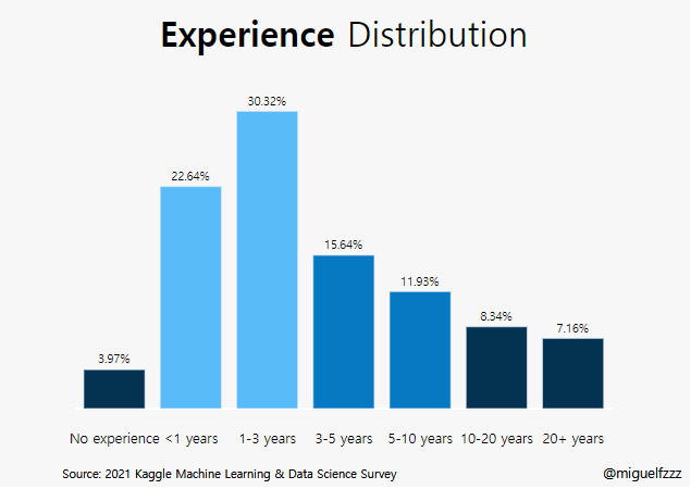
kaggle :Bar Graph (Q6)
kaggle dictation (02)
plotly.graph_objects as go: 를 이용한 bar graph
###bar plot /막대 차트
막대그래프는 가장 많이 쓰이는 플롯들중 하나로 숫자 변수와 범주 형 변수 간의 관계를 보여 줍니다.
막대 차트는 종종 히스토그램과 혼동 되기도 하는데(숫자의 분포를 보여줌) 이는 통계학의 부분
그룹당 여러 값이 있는 경우에는 박스플롯이나 바이올린 플롯을 추천
최소한 그룹당 관측치 수와 각 그룹의 신뢰구간은 표시되야함.
사용한 Library
1 | import pandas as pd |
사실 이 부분에서 seaborn을 사용 했는지 잘 모르겠음.
github에서 plotly가 동적 Livrary라 자꾸 오류가남.
data import
data 원문
data import 방법
data: Kaggle의 the-typical-kaggle-data-scientist-in-2021
이 부분은 data import 방법 을 참고 하거나
kaggle dictation (01) 을 참조하세요.
data encoding (Feature Engineering)
사실 이 부분이 feature Engineering에 해당하는 부분인지 잘 모르겠다.
이 부분은 data를 computer로 자동화하여 계산, 동적 그래프를 만들기 위한 부분.
###Feature Engineering
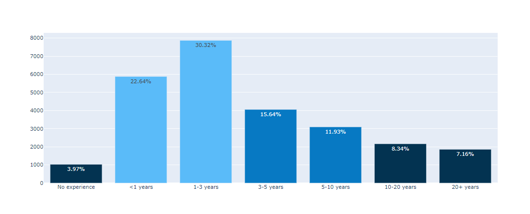
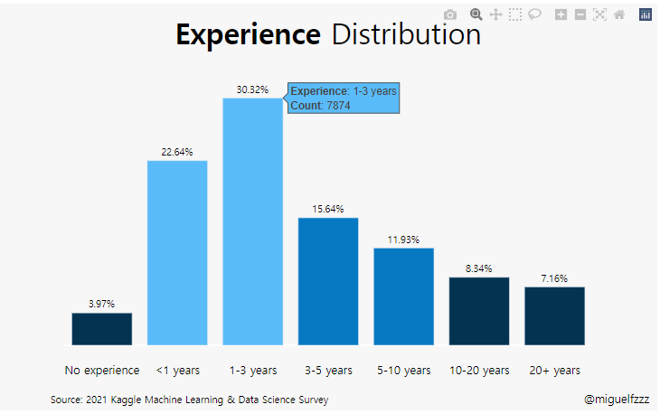
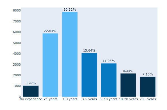
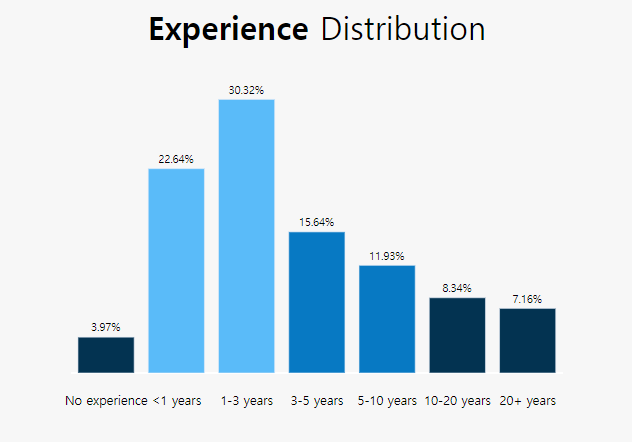
Experience라는 Question 6에 해당하는 값을 전처리 해 준다.
1 | experience = ( |
- .value_counts() : 데이터의 분포를 확인하는데 매우 유용한 함수
- column 값의 개수를 확인 하는것. 중복되는 값을 묶어줌.
- .to_frame() : frame을 설정 (표 생성)
- reset_index()
- 원본 data를 회손하지 않고 Index를 새로 만듦
- .rename(columns={‘index’:’Experience’, ‘Q6’:’Count’})
- column에 새로운 이름을 붙여줌 index는 Experience로 Q6은 count로 지정
- replace()
- [왼쪽]에 있는 값대신 [오른쪽]에 있는 값을 넣으려고 함.
- 이 경우 ‘I have never written code’를 ‘No experience’로 바꾸려고 한듯.
Ref. 판다스 함수
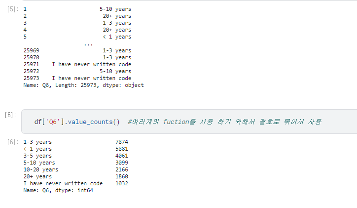
df.value_counts() 함수만 사용하면 아래와 같이 나온다.
1
df['Q6'].value_counts()
1-3 years 7874
< 1 years 5881
3-5 years 4061
5-10 years 3099
10-20 years 2166
20+ years 1860
I have never written code 1032
Name: Q6, dtype: int64
- 이는 문자형 data를 분석하여 display하기 위한 방법
data categoircal로 List로 만들고, 함수정의, 정렬
(#1) : Pandas lib의 categories function
문자열 객체의 배열을 series로 변환하여 범주형으로 변환
1 | #1 |
(#2) : experience[‘percent’]
Experience에 하나의 tap을 추가 해준다.
SQL 의 insert 에 percent tep을 만들어 줄 때 column에대해 계산하여 값을 보여주는 것과 같은 느낌.
value에 들어갈 수식 지정_ Experience의 percent 계산
1 |
|
(#3) : experience.sort_values()
데이터 정렬하기 : 컬럼의 data를 기준으로 정렬
- short_Index의 경우에는 Index를 기준으로 data를 정렬한다.
- 이 경우에는 (‘Experience’)를 기준으로 default값인 오름차순으로 정렬
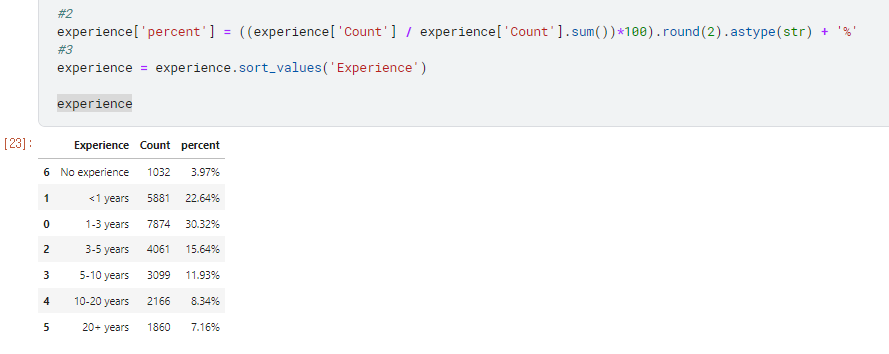
보통 percent나 count를 기준으로 정렬 되는데 이 경우 sort_values(‘Experience’) 를 하였기때문에
기준인 Experience를 기준으로 오름차순으로 정렬 되었다.
1 |
|
(#4) : colors
바chart의 color을 설정
- *7 은 7개의 수준이 있다는 것.
- colors[N] = 뭘까
1 |
|
(#5) : fig = go.Figure(go.Bar())
import plotly.graph_objects as go 이기
때문에 fig는 plotly library 함수 사용
1 | #5 |
x축, y축 정해주기
y=experience[‘Count’],
x=experience[‘Experience’],
cliponaxis
cliponaxis = False,
cliponaxis – Text node를 아래 축에 고정 할지 아닐지 결정
text node를 축 라인과 체크라벨 위에 보여주기위해서는 x축Layer와 y축 layer 설정을 해 주어야 한다.
text=experience[‘percent’]
marker_color=colors
- 지정 해 준 colors를 사용.
- 지정 해 준 colors를 사용.
(#6) : fig.update_traces()
그래프 위에 캡션 다는 기능
지정된 선택 기준을 충족하는 모든 추적에 대해 속성 업데이트 작업 수행 (?? 전혀 모르겠군 !)
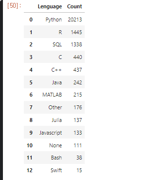
아래 본문과는 상관없는 data를 좀 보세요.
1 | df1 = df['Q1'].value_counts() |
오늘은 못보고 나중에 다시 보자 !
1 |
|
- texttemplate=’%{text}’, : text type
- textposition=’outside’, : inside하면 그래프 안쪽, ouside 하면 그래프 위쪽에 생성
- hovertemplate= 커서를 가까이 대면 나오는 창 x값과, y 값이 어떤 상태인지 알려 준다.
Returns the Figure object that the method was called on
메서드가 호출된 그림객체를 반환.
plotly.graph_objects.Figure.update_traces 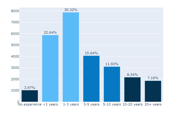
1 | #7 |
(#7) : fig.update_?axes()
만들어진 fig를 수정.
SQL의 update와 비슷한 기능인듯.
fig.update_xaxes(showgrid=False) : x축의 grid 수정
fig.update_yaxes(showgrid=False) : y축의 grid 수정
축을 보이지 않는 형태로 바꾸어 예쁘게 보이게 해줌.
(#8) : update_layout()
1 |
|
default로 되어있는 그래프의 Layout을 수정.
showlegend = False
- 래전드를 보여줄지 : 안보여줌
plot_bgcolor=’#F7F7F7’
margin=dict(pad=20)
-dic에는 여러가지가 올 수 있는데 여기서는 dict(pad)를 사용- padding을 설정, 축과 그래프 사이의 패딩을 px 단위로 설정
- Sets the amount of padding (in px) between the plotting area and the axis lines
- layout-margin
paper_bgcolor=’#F7F7F7’
- 배경색 설정
-
height=500
- plot size 설정
yaxis={‘showticklabels’: False}
- y축의 showticklabels 설정 : 안함
yaxis_title=None, xaxis_title=None
- y축 제목, x축 제목 설정 : 없음
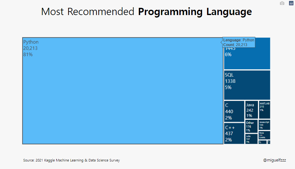
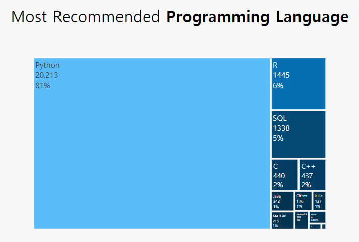
title_text=”Most Recommended Programming Language“
- 제목 달기 <b> code는 bolde tag인듯.
title_x=0.5, title_y=0.95,
- 제목의 위치 (상단 고정)
font=dict(family=”Hiragino Kaku Gothic Pro, sans-serif”, size=17, color=’#000000’),
title_font_size=35)- title의 font 설정 (Default: “”Open Sans”, verdana, arial, sans-serif”)
- font 설정
- family, color, size 설정 가능, title_fond도 함께 설정 가능 해 보임.
plotly.graph_objects.Figure.update_layout
(#9) : add_annotation()
annotation의 경우 plot 안에 글을 집어 넣는 것.
설명을 추가 해 준다고 생각하면 쉽다.
어렵지도 않고, 같은 내용이므로 이전 posting을 첨부
1 |
|