[object Object]
#Plotly Tutorial For Kaggle Survey Competitions
진도가 너무 더디게 나가서 Teacher’s code를 조금더 뜯어 본후
python for문이나 if문을 조금 더 잘 쓸 수 있을기를 바란다.
#Plotly Tutorial For Kaggle Survey Competitions
진도가 너무 더디게 나가서 Teacher’s code를 조금더 뜯어 본후
python for문이나 if문을 조금 더 잘 쓸 수 있을기를 바란다.
ref.
https://www.kaggle.com/miguelfzzz/the-typical-kaggle-data-scientist-in-2021
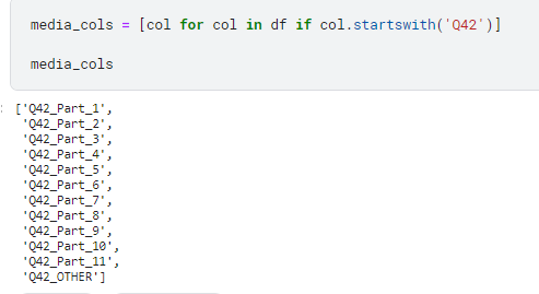
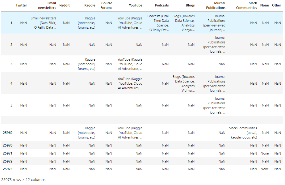
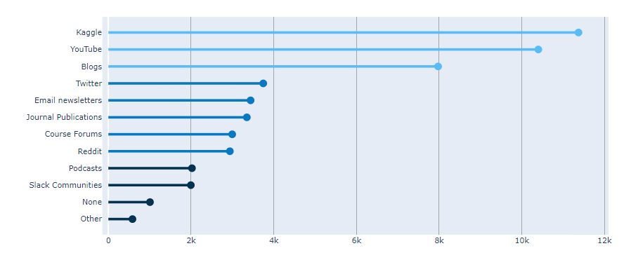
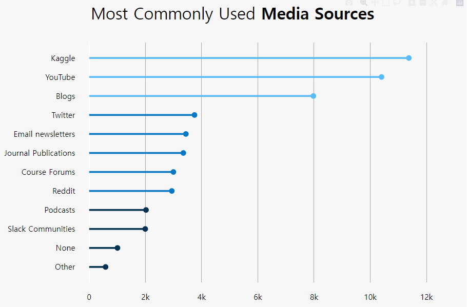
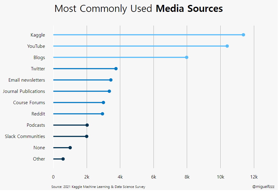
Q42로 시작하는 col을 읽어오기.
python의 for문을 이용.
1 | media_cols = [col for col in df if col.startswith('Q42')] |
1 | media = df[media_cols] |
1 | media = ( |
1 |
|
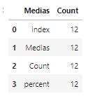
i. add percent column
1 | media['percent'] = ((media['Count'] / len(df))*100).round(2).astype(str) + '%' |
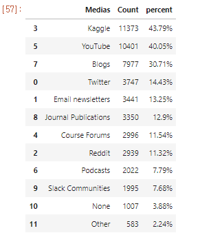
ii. Count값 (column값으로 ) 정렬
1 | media = (media |
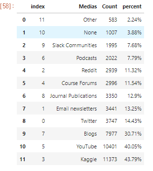
1. Default는 내림차순
2. iloc으로 0번부터 15까지 List로 긁어오기
3. reset index()
1 |
|
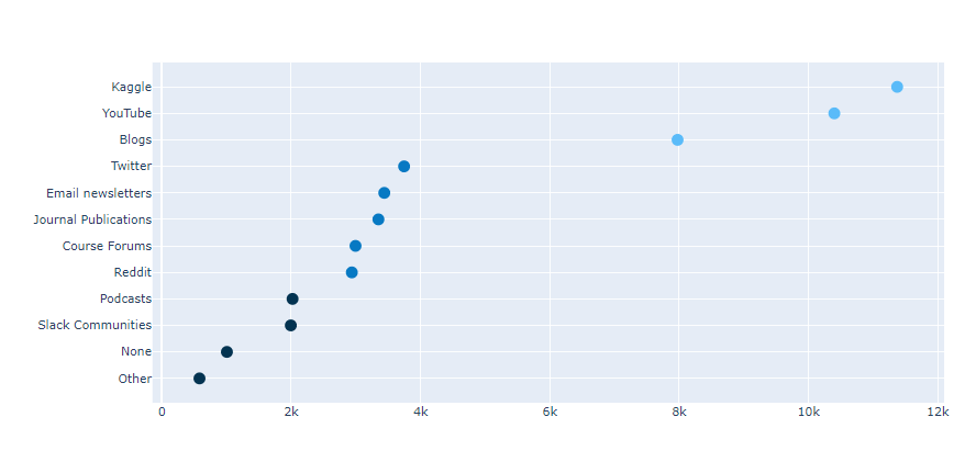
ii. 산점도에 for문을 이용하여 line 연결하기
1 | for i in range(0, len(media)): |
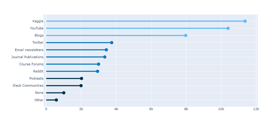
1 | fig.update_traces(hovertemplate='<b>Media Source</b>: %{y}<br><extra></extra>'+ |
i. 축 grid
1 | fig.update_xaxes(showgrid=True, gridwidth=1, gridcolor='#9f9f9f', ticklabelmode='period') |
x 축의 grid만 보여줌. tick labe lmode : period
1 |
|
1 | fig.add_annotation(dict(font=dict(size=14), |
ref.
https://www.kaggle.com/miguelfzzz/the-typical-kaggle-data-scientist-in-2021
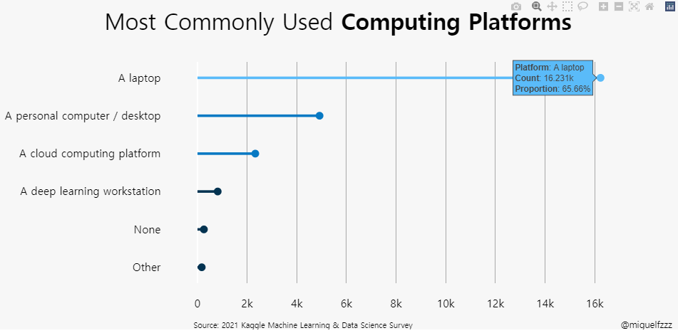
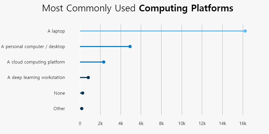
1 | platform = ( |
ide를 dataframe화 완료.
Q11의 column이름 까지 재설정 완료.
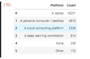
1 | ide = ( |
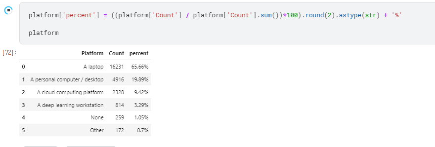
1 | platform['percent'] = ((platform['Count'] / platform['Count'].sum())*100).round(2).astype(str) + '%' |
1 | colors = ['#033351',] * 6 |
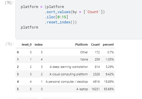
1 | platform = (platform |
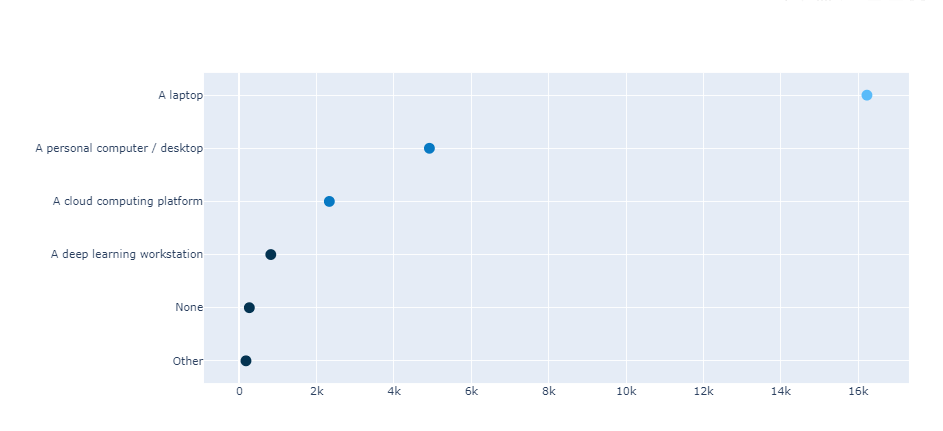
본격적으로 Scatter G 만들기.
## 산점도 점 찍기
1 |
|
## 산점도에 for문을 이용하여 line 연결하기
1 | for i in range(0, len(platform)): |
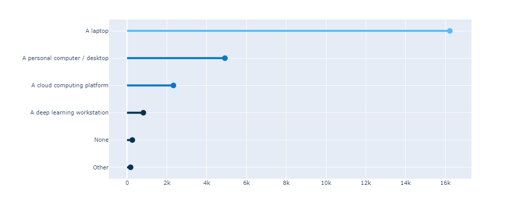
for i in range(0~platform의 길이만큼)
fig. add_shape()
type = ‘line’
- line모양의 grape shape add
x0 = 0, y0 = i,
- 초기값
x1 = platform[“Count”][i],
x축 Index
y1 = i,
y축 Index, 마지막 값
line=dict(color=colors[i], width = 4)
line의 세부 설정, 색과 두께
1 | fig.update_traces(hovertemplate='<b>Platform</b>: %{y}<br><extra></extra>'+ |
1 | fig.update_xaxes(showgrid=True, gridwidth=1, gridcolor='#9f9f9f', ticklabelmode='period') |
1 | fig.add_annotation(dict(font=dict(size=14), |