R for DS_03 ggplot2
Welcome
- 저작권 : “R for DataScience by Hadley Wickham and Garrett Grolemund(O’Reilly). Copyright 2017 Garrett Grolemund, Hadley Wickham, 978-1-491-91039-9
Introduction
- how to visualise your data using ggplot2. R
- ggplot2는 그래프를 그려주는 프로그램
ggplot2 이론배경
3.1.1 Prerequisites
1 | install.packages("tidyverse") |
3.2 First steps
3.2.1 The mpg data frame
- US Environmental Protection Agency on 38 models of car
- A data frame is a rectangular
1 | mpg |
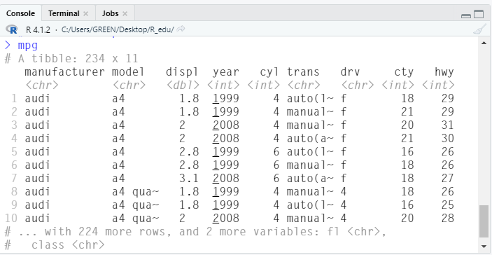
- displ = car’s engine size, in litres
- hwy = fuel efficiency in miles per gallon (mpg)
3.2.2 Creating a ggplot
1 | ggplot(data = mpg) + |
- ggplot(data = mpg) : 비어있는 Graph를 만들어 준다.
- geom_point() : Layers 추가
- scatterplot
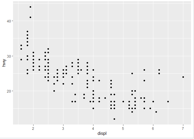
- mapping = aes(x= displ, y = hwy) : x와 y를 mapping 해 준다.
3.2.3 A graphing template
ggplot(data = <DATA>) +
  <GEOM_FUNCTION>(mapping = aes(<MAPPINGS>))
이런 식으로 쓰면 된다고 함. (모형)
3.3 Aesthetic mappings
aesthetic : 래전드 모양, 색 크기
- value : data
- level : aesthetic properties
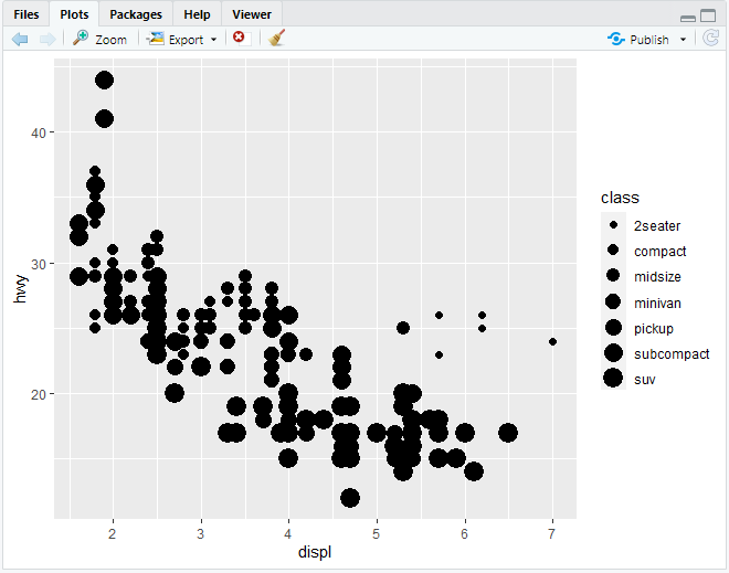
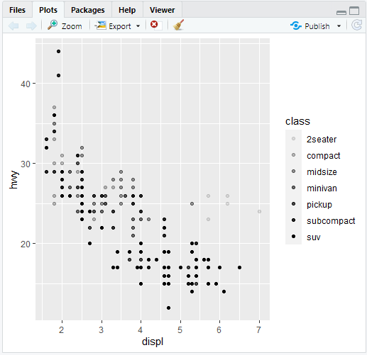
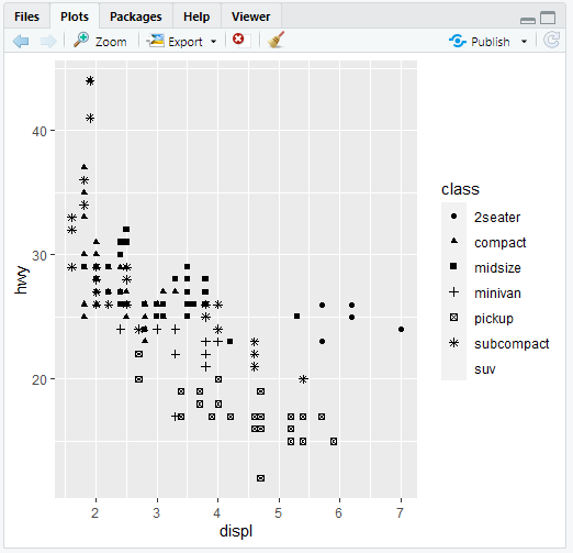
- size : 크기
- color = colour, aesthetic의 색
- alpha = shape , aesthetic의 모양
1 | ggplot(data = mpg) + |
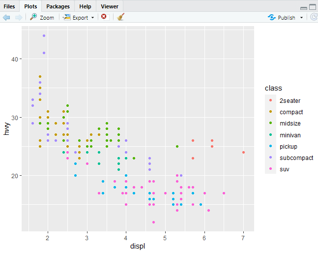
1 | ggplot(data = mpg) + |
colour , color : 모두 써도 됨.
1 | ggplot(data = mpg) + |
1 | ggplot(data = mpg) + |
(수동으로 색 설정)
래전드를 생성 하지 않으면서 color만 바꿀 수 있다.
1 | ggplot(data = mpg) + |
1 | ggplot(data = mpg) + |
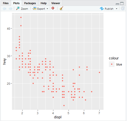
mpg 내의 data가 color이라는 column이 있다.
그 data가 “blue”인 data들의 displ과 hwy의 Graph