[Kgg]Tabular Playground Series (Dec. 2021)

Tabular_Playground_Series_Dec(2021)


origin of dictation


이어지는 포스팅 :
Kgg_TPS 02

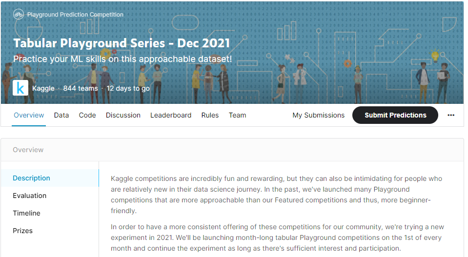
Description of competition

data overview

TPS12_overView

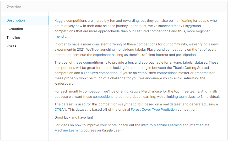
Kaggle에서 매달 1일에 data scientists의 Featured competitions을 위해 beginner- friendly로 제공하는 대회


The study area includes four wilderness areas located in
the Roosevelt National Forest of northern Colorado.
Each observation is a 30m x 30m patch.
You are asked to predict an integer classification for the forest cover type(FCT).


The seven types are:

1 - Spruce/Fir
2 - Lodgepole Pine
3 - Ponderosa Pine
4 - Cottonwood/Willow
5 - Aspen
6 - Douglas-fir
7 - Krummholz

The training set (15120 observations) contains both features and the Cover_Type.
The test set contains only the features.
You must predict the Cover_Type for every row in the test set (565892 observations).


Data Fields


Elevation - 미터 단위 고도
Aspect - 방위각의 종횡비 (위치)
Slope - 경사 기울기
Horizontal_Distance_To_Hydrology - 해수면까지의 수평거리
Vertical_Distance_To_Hydrology - 해수면까지의 수직거리
Horizontal_Distance_To_Roadways - 도로와의 수평 거리
Hillshade_9am (0 to 255 index) - 여름, 오전 9시 Hillshade
Hillshade_Noon (0 to 255 index) - 여름, 정오 Hillshade
Hillshade_3pm (0 to 255 index) - 여름, 오후 3시 Hillshade
Horizontal_Distance_To_Fire_Points - 산불 발화점까지 수평거리

Wilderness_Area

: 야생지역
- 4 개의 columns (토양 유형 지정)
+ 0 = 없음
+ 1 = 있음

Soil_Type

: 토양 유형 지정
- 40 개의 columns
+ 0 = 없음
+ 1 = 있음


Cover_Type

FCT 지정
br> - 7 개 columns

+ 0 = 없음

+ 1 = 있음


The wilderness areas are:


1 - Rawah Wilderness Area
2 - Neota Wilderness Area
3 - Comanche Peak Wilderness Area
4 - Cache la Poudre Wilderness Area


The soil types are:


1 Cathedral family - Rock outcrop complex, extremely stony.

2 Vanet - Ratake families complex, very stony.

3 Haploborolis - Rock outcrop complex, rubbly.

4 Ratake family - Rock outcrop complex, rubbly.

5 Vanet family - Rock outcrop complex complex, rubbly.

6 Vanet - Wetmore families - Rock outcrop complex, stony.

7 Gothic family. Na

8 Supervisor - Limber families complex.

9 Troutville family, very stony.

10 Bullwark - Catamount families - Rock outcrop complex, rubbly.

11 Bullwark - Catamount families - Rock land complex, rubbly.

12 Legault family - Rock land complex, stony.

13 Catamount family - Rock land - Bullwark family complex, rubbly.

14 Pachic Argiborolis - Aquolis complex.

15 unspecified in the USFS Soil and ELU Survey. (Na)

16 Cryaquolis - Cryoborolis complex.

17 Gateview family - Cryaquolis complex.

18 Rogert family, very stony.

19 Typic Cryaquolis - Borohemists complex.

20 Typic Cryaquepts - Typic Cryaquolls complex.

21 Typic Cryaquolls - Leighcan family, till substratum complex.

22 Leighcan family, till substratum, extremely bouldery.

23 Leighcan family, till substratum - Typic Cryaquolls complex.

24 Leighcan family, extremely stony.

25 Leighcan family, warm, extremely stony.

26 Granile - Catamount families complex, very stony.

27 Leighcan family, warm - Rock outcrop complex, extremely stony.

28 Leighcan family - Rock outcrop complex, extremely stony.

29 Como - Legault families complex, extremely stony.

30 Como family - Rock land - Legault family complex, extremely stony.

31 Leighcan - Catamount families complex, extremely stony.

32 Catamount family - Rock outcrop - Leighcan family complex, extremely stony.

33 Leighcan - Catamount families - Rock outcrop complex, extremely stony.

34 Cryorthents - Rock land complex, extremely stony.

35 Cryumbrepts - Rock outcrop - Cryaquepts complex.

36 Bross family - Rock land - Cryumbrepts complex, extremely stony.

37 Rock outcrop - Cryumbrepts - Cryorthents complex, extremely stony.

38 Leighcan - Moran families - Cryaquolls complex, extremely stony.

39 Moran family - Cryorthents - Leighcan family complex, extremely stony.

40 Moran family - Cryorthents - Rock land complex, extremely stony.

  • 경사(Slope) : 어떤 지점의 지반이 수평을 기준으로 몇도 기울어져 있는가
    • θ(theta) 로 표현
    • 각이 클 수록 지반의 경사가 급하고 각이 0이면 평편한 지반
  • 향(Aspect): 지반의 경사면이 어디를 향하는가
    • 북: 0도, 동: 90도, 남: 180도, 서: 270도.
    • 완전히 평편할 경우 GIS 시스템마다 다른 값, Null 가능, (-1과 같은 값이 적당)

Ref.


Evaluation

TPS12_Evaluation

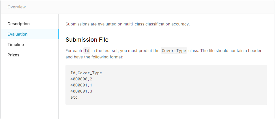
각각의 ID 를 cover type 과 Matching하여 file format 형태를 만들어 제출 하면 됩니다.

python_basic_Exeption

python

Exception

1
2
3
4
5
6
7
8
9
10
11
12
13
14
15
16
17
18
19
20
21
22
23
24
25
26
27
28
29
30
# /c/Users/brill/Desktop/PyThon_Function/venv/Scripts/python
# -*- coding : UTF-8

def error01():
a=10
a/0
#ZeroDivisionError: division by zero

def error02():
a= [1, 2, 3, 4, 5]
a[10]
#IndexError: list index out of range

def error03():
a = 1000
a + "Hello"
#TypeError: unsupported operand type(s) for +: 'int' and 'str'

def error04():
a=10
a+b
#NameError: name 'b' is not defined

if __name__ == "__main__":
error01()
error02()
error03()
error04()
print("program is done")

Exeption의 종류

java 의 try catch 구문과 같음

1
2
3
4
5
6
7
8
9
10
11
12
13
14
15
16
17
18
19
20
21
22
23
24
25
26
27
28
29
30
31
32
33
34
35
# /c/Users/brill/Desktop/PyThon_Function/venv/Scripts/python
# -*- coding : UTF-8

def try_func(x, idx):
try:
return 100/x[idx]
except ZeroDivisionError:
print("did't divide zero")
except IndexError:
print("not in range of Index")
except TypeError:
print("there is type Error")
except NameError:
print("it is not definated parameter")
finally:
print("무조건 실행됨")


def main():
a = [50, 60, 0, 70]
print(try_func(a,1))

# Zero Division Error
print(try_func(a,0))

# Index Error
print(try_func(a,5))

# type Error
print(try_func(a, "hi"))


if __name__ == "__main__":
main()

어떻게던 프로그램이 돌아 갈 수 있도록
만들어 주는 것이 중요하다.


  • class 정리
  1. __init__ : set_name, set_id 해 주지 않고, 통합시켜주는 역할
  2. __eq__, __ne__ : 부등호 연산자
  3. 상속, 다형성(서로다른 클래스에서 공통으로 쓰는 함수)
  4. Exception
  5. class attribute / instance attribute / instance method 차이
  6. 추상 class (안배웠음)
  7. data incapsulation


1
2
3
4
5
6
7
8
9
10
11
12
13
14
15
16
17
18
19
20
21
22
23
24
25
26
27
28
29
30
31
32
33
34
35
36
37
# /c/Users/brill/Desktop/PyThon_Function/venv/Scripts/python
# -*- coding : UTF-8

class SalaryExcept(ValueError): pass # 상속
class TipExept(SalaryExcept): pass # 상속

class Employee:

MIN_SALARY = 30000
MAX_Bonus = 20000

def __init__(self, name, salary = 30000):
self.name = name
if salary< Employee.MIN_SALARY:
raise SalaryExcept("급여가 너무 낮아요!")
self.salary = salary

def give_bonus(self, amount):
if amount > Employee.MAX_Bonus:
print("보너스가 너무 많아 ")
elif self.salary + amount < Employee.MIN_SALARY :
print("보너스 지급 후의 급여도 매우 낮다. ")
else:
self.salary += amount

if __name__ == "__main__":
emp = Employee("YH", salary= 10000)

try:
emp.give_bonus(70000)
except SalaryExcept:
print("Error Salary")

try:
emp.give_bonus(-10000)
except tipExcept:
print("Error Tip")

여전히 Error가 나는 코드
나는 Exception 안됨

python_basic_Bank

python

Bank _ 계좌 만들기

1
2
3
4
5
6
7
8
9
10
11
12
13
14
15
16
# /c/Users/brill/Desktop/PyThon_Function/venv/Scripts/python
# -*- coding : UTF-8

class Human:

def __init__(self, name):
self.name = name


if __name__ == "__main__":
human01 = Human(name="A")
human02 = Human(name="A")

print(human01 == human02)
print("human 01 : ", human01)
print("human 02 : ", human02)

False
human 01 : <__main__.Human object at 0x000001686E41CC10>
human 02 : <__main__.Human object at 0x000001686E41CE50>

저장되는 장소가 다르기 때문에 다르다.

Bank _ customer ID 확인하기

1
2
3
4
5
6
7
8
9
10
11
12
13
14
15
16
17
18
19
20
21
22
23
24
25
26
# /c/Users/brill/Desktop/PyThon_Function/venv/Scripts/python
# -*- coding : UTF-8

class Bank:

#instance attribute
def __init__(self, cust_id, balance=0):
self.balance = balance
self.cust_id = cust_id

#instance methode
def withdraw(self, amount):
self.balance -= amount

def __eq__(self, other):
print("__eq()__ is called")
return self.cust_id == other.cust_id

if __name__ == "__main__":
account01 = Bank(123, 1000)
account02 = Bank(123, 1000)
account03 = Bank(456, 1000)
print(account01 == account02)
print(account02 == account03)
print(account01 == account03)

eq() is called
True
eq() is called
False
eq() is called
False


  • 부등호 연산자
    • != : ne()
    • >= : ge()
    • <= : le()
    • > : gt()
    • < : lt()

eq() 함수 사용하기

1
2
3
4
5
6
7
8
9
10
11
12
13
14
15
16
17
18
19
20
21
22
23
24
25
26
27
28
29
30
31
32
33
# /c/Users/brill/Desktop/PyThon_Function/venv/Scripts/python
# -*- coding : UTF-8

class Bank:

#instance attribute
def __init__(self, cust_id, balance=0):
self.balance, self.cust_id = balance, cust_id


#instance methode
def withdraw(self, amount):
self.balance -= amount

def __eq__(self, other):
print("__eq()__ is called")
return (self.cust_id == other.cust_id) and (type(self) == type(other))

class Phone:

def __init__(self, cust_id):
self.cust_id = cust_id

def __eq__(self, other):
return self.cust_id == other.cust_id


if __name__ == "__main__":
account01 = Bank(1234)
phone01 = Phone(1234)

print(account01 == phone01)

eq() is called
False

eq를 불러와서 같은지 확인 할 수 있다.

접근기록, log 기록 확인하기

1
2
3
4
5
6
7
8
9
10
11
12
13
14
15
16
17
18
19
20
21
22
# /c/Users/brill/Desktop/PyThon_Function/venv/Scripts/python
# -*- coding : UTF-8


class Bank:
def __init__(self, cust_id, name, balance = 0):
self.cust_id, self.name, self.balance = cust_id, name, balance

def __str__(self):
cust_str = """
customer:
cust_id : {cust_id}
name : {name}
balance : {balance}
""".format(cust_id = self.cust_id, name = self.name, balance= self.balance)

return cust_str

if __name__ == "__main__":
bank_cust = Bank(123, "YH")
print(bank_cust)

  • DB에 저장 되지 않지만, 로그 기록을 확인 할 수 있다.

str() and repr() 비교

1
2
3
4
5
6
7
8
9
10
11
12
13
14
15
16
17
18
19
20
21
22
23
24
25
26
# /c/Users/brill/Desktop/PyThon_Function/venv/Scripts/python
# -*- coding : UTF-8


class Bank:
def __init__(self, cust_id, name, balance = 0):
self.cust_id, self.name, self.balance = cust_id, name, balance

def __str__(self):
cust_str = """
customer:
cust_id : {cust_id}
name : {name}
balance : {balance}
""".format(cust_id = self.cust_id, name = self.name, balance= self.balance)

return cust_str

def __repr__(self):
cust_str = "Bank({cust_id}, '{name}', {balance})".format(cust_id = self.cust_id, name = self.name, balance= self.balance)
return cust_str

if __name__ == "__main__":
bank_cust = Bank(123, "YH")
print(str(bank_cust))
print(repr(bank_cust))

difference of str() and repr()

House_price prediction Practice 01

Kaggle 주택가격 예측

Kaggle house oruces advabced regression


1
2
3
4
5
6
7
8
9
10
11
12
13
14
15
16
17
# This Python 3 environment comes with many helpful analytics libraries installed
# It is defined by the kaggle/python Docker image: https://github.com/kaggle/docker-python
# For example, here's several helpful packages to load

import numpy as np # linear algebra
import pandas as pd # data processing, CSV file I/O (e.g. pd.read_csv)

# Input data files are available in the read-only "../input/" directory
# For example, running this (by clicking run or pressing Shift+Enter) will list all files under the input directory

import os
for dirname, _, filenames in os.walk('/kaggle/input'):
for filename in filenames:
print(os.path.join(dirname, filename))

# You can write up to 20GB to the current directory (/kaggle/working/) that gets preserved as output when you create a version using "Save & Run All"
# You can also write temporary files to /kaggle/temp/, but they won't be saved outside of the current session

데이터 다운로드 및 불러오기

1
2
3
4
5
6
7
import pandas as pd

train = pd.read_csv("/kaggle/input/house-prices-advanced-regression-techniques/train.csv")
test = pd.read_csv("/kaggle/input/house-prices-advanced-regression-techniques/test.csv")

train.shape, test.shape
#변수를 줄여야 겠다. 어떤 변수를 줄여야 할까 ?

EDA

  • 이상치과 중복값 제거
  • overallQual (주택의 상태를 1~10등급으로 책정)
  • 평점 1 : 판매가가 높음 = 이상치라고 판단 할 수 있따. : 이걸 제거 해 줘야 함.
1
2
train.info()
#80개 컬럼, SalePrice(독립변수)를 제거 하고는 나머지가 종속변수 = 너무 많다 !!
1
2
3
train.drop(train[(train['OverallQual'] < 5) & (train['SalePrice']> 200000)].index, inplace = True)
train.reset_index(drop = True, inplace = True)
train.shape

종속변수 시각화

1
2
3
4
5
6
7
8
9
10
11
12
13
14
15
16
17
18
import seaborn as sns
import matplotlib.pyplot as plt
from scipy.stats import norm

(mu, sigma) = norm.fit(train['SalePrice'])
print("The value of mu before log transformation is:", mu)
print("The value of sigma before log transformation is:", sigma)

fig, ax = plt.subplots(figsize=(10, 6))
sns.histplot(train['SalePrice'], color="b", stat="probability")
ax.xaxis.grid(False)
ax.set(ylabel="Frequency")
ax.set(xlabel="SalePrice")
ax.set(title="SalePrice distribution")

plt.axvline(mu, color='r', linestyle='--')
plt.text(mu + 10000, 0.11, 'Mean of SalePrice', rotation=0, color='r')
fig.show()
1
2
3
4
5
6
7
8
9
10
11
12
13
14
15
16
17
18
19
import numpy as np 

train["SalePrice"] = np.log1p(train["SalePrice"]) # 로그 변환 후 종속 변수 시각화

(mu, sigma) = norm.fit(train['SalePrice'])
print("The value of mu before log transformation is:", mu)
print("The value of sigma before log transformation is:", sigma)

fig, ax = plt.subplots(figsize=(10, 6))
sns.histplot(train['SalePrice'], color="b", stat="probability")
ax.xaxis.grid(False)
ax.set(ylabel="Frequency")
ax.set(xlabel="SalePrice")
ax.set(title="SalePrice distribution")

plt.axvline(mu, color='r', linestyle='--')
plt.text(mu + 0.05, 0.111, 'Mean of SalePrice', rotation=0, color='r')
plt.ylim(0, 0.12)
fig.show()

data feature 제거

  1. 모형 학습 시간 감소
  2. 연산 시 noise 감소

그래서 : train ID 를 빼주기로함

1
2
3
4
5
train_ID = train['Id']
test_ID = test['Id']
train.drop(['Id'], axis=1, inplace=True)
test.drop(['Id'], axis=1, inplace=True)
train.shape, test.shape
1
2
3
4
5
6
7
8
# y 값 추출, dataset 분리할때 사용
y = train['SalePrice'].reset_index(drop=True)

# 뽑고 나면 원래 df에서 제거
train = train.drop('SalePrice', axis = 1)
train.shape, test.shape, y.shape


1
2
3
4
5
# data 합치기 
# - train data 와 Test를 같이 전처리 하기 위해

all_df = pd.concat([train, test]).reset_index(drop=True)
all_df.shape

결측치 확인

  • 결측치 처리
    1. 제거하기 : column 제거, 특정 행만 제거하기
    2. 채우기 : 1) numeric(수치형) : 평균 또는 중간값으로 채우기
          2) String(문자형) : 최빈값으로 채우기 
      
    3. 통계 기법이용, 채우기 (data 보간)
      • 실무에서는 (KNNImput)등, 시계열 자료 or 산업군에 따라 다르므로 가서 배워라.
1
2
3
4
5
6
7
8
9
10
#결측치 확인 

def check_na(data, head_num = 6):
isnull_na = (data.isnull().sum() / len(data)) * 100
data_na = isnull_na.drop(isnull_na[isnull_na == 0].index).sort_values(ascending=False)
missing_data = pd.DataFrame({'Missing Ratio' :data_na,
'Data Type': data.dtypes[data_na.index]})
print("결측치 데이터 컬럼과 건수:\n", missing_data.head(head_num))

check_na(all_df, 20)
1
2
3
4
all_df.drop(['PoolQC', 'MiscFeature', 'Alley', 'Fence', 'FireplaceQu', 'LotFrontage'], axis=1, inplace=True)
check_na(all_df)

#아직도 결측치가 많이 있다.

채우기

1. 문자열 채우기 
2. 
  1. object column 추출
1
2
3
4
5
6
7
8
9
10
11
12
13
14
15
16
17
18
19
20
21
22
23
24
25
26
#a = all_df['BsmtCond'].value_counts().mode() #mode() : 최빈값 가장 빈도수가 높은 값 찾기
#a

print(all_df['BsmtCond'].value_counts())
print()
print(all_df['BsmtCond'].mode()[0])

#object column, 갯수 확인
import numpy as np
cat_all_vars = train.select_dtypes(exclude=[np.number]) #숫자인 것을 제외한 type column 이름 추출
print("The whole number of all_vars(문자형data)", len(list(cat_all_vars)))

#column 이름 뽑아내기
final_cat_vars = []
for v in cat_all_vars:
if v not in ['PoolQC', 'MiscFeature', 'Alley', 'Fence', 'FireplaceQu', 'LotFrontage']:
final_cat_vars.append(v)

print("The whole number of final_cat_vars", len(final_cat_vars))

#최빈값을 찾아 넣어주기
for i in final_cat_vars:
all_df[i] = all_df[i].fillna(all_df[i].mode()[0])

check_na(all_df, 20)
print("숫자형 data set의 결측치만 남은 것을 알 수 있다. ")
1
2
3
4
5
6
7
8
9
10
11
12
import numpy as np
num_all_vars = list(train.select_dtypes(include=[np.number]))
print("The whole number of all_vars", len(num_all_vars))

num_all_vars.remove('LotFrontage')

print("The whole number of final_cat_vars", len(num_all_vars))
for i in num_all_vars:
all_df[i].fillna(value=all_df[i].median(), inplace=True)

print("결측치가 존재 하지 않은 것을 알 수 있다. ")
check_na(all_df, 20)
1
all_df.info()

왜도(Skewnewss) 처리하기 : 정규 분포를 이룰 수 있게 (설문조사 논문 통계의 경우 -1< 외도 <1)

  • boxcose를 사용 할 예정

  • 왜도가 양수일때, 음수일때 (좌, 우로 치우친 정도)

  • 첨도가 양수일때, 음수일때 (뽀족한 정도)

  • RMSE를 최적(낮게)으로 만들기 위해 조정.

1
2
3
4
5
6
7
8
9
10
11
12
13
14
15
16
17
from scipy.stats import skew

#외도 판정을 받을 만한 data set을 확인
def find_skew(x):
return skew(x)
#앞에서 뽑은 numeric columns : num_all_vars
#사용자 정의함수를 쓰기 위해 apply(find_skew)를 사용, 오름차순정렬

skewness_features = all_df[num_all_vars].apply(find_skew).sort_values(ascending=False)
skewness_features

#high_skew = skew_valrs[slew_var > 1]

#0~1사이에 있는 것이 기준. 기준 밖으로 나간 경우 조정이 필요(정규분포를 만들어 주기 위해)
# 1. 박스코스 변환 : ML -> RMSE (2.5)
# 2. 로그변환 : ML -> RMSE (2.1)
# => RMSE는 적은 것이 좋기 때문에, 로그 변환으로 사용 하는 것이 좋다.
1
2
3
4
5
6
7
8
9
10
11
12
13
14
skewnewss_index = list(skewness_features.index)
skewnewss_index.remove('LotArea')
#외도 정도가 너무 높은 LotArea를 날려주는 것.
all_numeric_df = all_df.loc[:, skewnewss_index]


fig, ax = plt.subplots(figsize=(10, 6))
ax.set_xlim(0, all_numeric_df.max().sort_values(ascending=False)[0])
ax = sns.boxplot(data=all_numeric_df[skewnewss_index] , orient="h", palette="Set1")
ax.xaxis.grid(False)
ax.set(ylabel="Feature names")
ax.set(xlabel="Numeric values")
ax.set(title="Numeric Distribution of Features Before Box-Cox Transformation")
sns.despine(trim=True, left=True)
1
2
3
4
5
6
7
8
9
10
11
12
from scipy.special import boxcox1p
from scipy.stats import boxcox_normmax

high_skew = skewness_features[skewness_features > 1]
high_skew_index = high_skew.index

print("The data before Box-Cox Transformation: \n", all_df[high_skew_index].head())

for num_var in high_skew_index:
all_df[num_var] = boxcox1p(all_df[num_var], boxcox_normmax(all_df[num_var] + 1))

print("The data after Box-Cox Transformation: \n", all_df[high_skew_index].head())
1
2
3
4
5
6
7
8
fig, ax = plt.subplots(figsize=(10, 6))
ax.set_xscale('log')
ax = sns.boxplot(data=all_df[high_skew_index] , orient="h", palette="Set1")
ax.xaxis.grid(False)
ax.set(ylabel="Feature names")
ax.set(xlabel="Numeric values")
ax.set(title="Numeric Distribution of Features Before Box-Cox Transformation")
sns.despine(trim=True, left=True)

도출 변수

Feature Engineering 의 Key step

  • 판매량, 단가, 매출액 X
  • 판매량 X 단가 = 매출액(New Value) : 도출 변수
    • ML은 수식이기 때문에 도출변수가 생성 되는것은 연산의 증가로 이어진다.
    • 시간이 오래 걸린다.
    • 결론 : 변수를 줄이는 것이 좋다.
1
2
3
4
#집의 층수 를 더해서 전체면적이라는 변수를 도출 
all_df['TotalSF'] = all_df['TotalBsmtSF'] + all_df['1stFlrSF'] + all_df['2ndFlrSF']
all_df = all_df.drop(['TotalBsmtSF', '1stFlrSF', '2ndFlrSF'], axis=1)
print(all_df.shape)
1
2
3
4
all_df['Total_Bathrooms'] = (all_df['FullBath'] + (0.5 * all_df['HalfBath']) + all_df['BsmtFullBath'] + (0.5 * all_df['BsmtHalfBath']))
all_df['Total_porch_sf'] = (all_df['OpenPorchSF'] + all_df['3SsnPorch'] + all_df['EnclosedPorch'] + all_df['ScreenPorch'])
all_df = all_df.drop(['FullBath', 'HalfBath', 'BsmtFullBath', 'BsmtHalfBath', 'OpenPorchSF', '3SsnPorch', 'EnclosedPorch', 'ScreenPorch'], axis=1)
print(all_df.shape)
  • 따라서 data 정의서 먼저 봐야 한다. : data description.txt를 먼저 봐야 한다. !!! (실무에서는 없는 경우가 많다.)
  • 시각화 : 각각의 data 무한작업, 도메인 공부
1
2
3
4
5
6
7
8
9
10
11
# 연도와 관련된.
num_all_vars = list(train.select_dtypes(include=[np.number]))
year_feature = []
for var in num_all_vars:
if 'Yr' in var:
year_feature.append(var)
elif 'Year' in var:
year_feature.append(var)
else:
print(var, "is not related with Year")
print(year_feature)
1
2
3
4
5
6
7
8
fig, ax = plt.subplots(3, 1, figsize=(10, 6), sharex=True, sharey=True)
for i, var in enumerate(year_feature):
if var != 'YrSold':
ax[i].scatter(train[var], y, alpha=0.3)
ax[i].set_title('{}'.format(var), size=15)
ax[i].set_ylabel('SalePrice', size=15, labelpad=12.5)
plt.tight_layout()
plt.show()

Kgg_House_years


1
2
all_df = all_df.drop(['YearBuilt', 'GarageYrBlt'], axis=1)
print(all_df.shape)
1
2
3
4
5
6
# 리모델링 시점으로 부터 얼마나 되었나 + 팔리는거
YearsSinceRemodel = train['YrSold'].astype(int) - train['YearRemodAdd'].astype(int)

fig, ax = plt.subplots(figsize=(10, 6))
ax.scatter(YearsSinceRemodel, y, alpha=0.3)
fig.show()

Kgg_House_YearsSinceRemodel


1
2
3
all_df['YearsSinceRemodel'] = all_df['YrSold'].astype(int) - all_df['YearRemodAdd'].astype(int)
all_df = all_df.drop(['YrSold', 'YearRemodAdd'], axis=1)
print(all_df.shape)

더미변수

String data (non-Numeric)

  • 명목형 : 남학생, 여학생…
  • 서열형(순서) : 1등급, 2등급, 3등급 (가중치, 등급숫자 등으로 바꿀 수 있다. )

Kgg_House_StringF


  • 세부적으로 customize 하는 것이 낫다.
  • 명목형 series에 따라 17개의 model을 개별적으로 만들되, 하나의 모델처럼 보이게 시각화 대시보드로 만들어 줘야 합니다.
1
2
all_df['PoolArea'].value_counts()
#0과 다른값들.. 으로 되어있어서
1
2
3
4
5
6
# 0과 1로 나누어 적용
def count_dummy(x):
if x > 0:
return 1
else:
return 0
1
2
3
4
all_df['PoolArea'] = all_df['PoolArea'].apply(count_dummy)
all_df['PoolArea'].value_counts()

# 전체 경향 등에 거의 영향을 주지 않음
1
2
all_df['GarageArea'] = all_df['GarageArea'].apply(count_dummy)
all_df['GarageArea'].value_counts()
1
2
all_df['Fireplaces'] = all_df['Fireplaces'].apply(count_dummy)
all_df['Fireplaces'].value_counts()


Label Encoding, Ordinal Encoding, One-Hot Encoding


  • Label Encoding : 종속변수에만
  • Ordinal Encoding : 독립변수에만
  • 써야 하지만, 개념은 같다.
  • One-Hot Encoding :
1
2
3
4
5
6
7
8
9
10
from sklearn.preprocessing import LabelEncoder
import pandas as pd

temp = pd.DataFrame({'Food_Name': ['Apple', 'Chicken', 'Broccoli'],
'Calories': [95, 231, 50]})

encoder = LabelEncoder()
encoder.fit(temp['Food_Name'])
labels = encoder.transform(temp['Food_Name'])
print(list(temp['Food_Name']), "==>", labels)
1
2
3
4
5
6
7
8
9
10
11
from sklearn.preprocessing import OrdinalEncoder
import pandas as pd

temp = pd.DataFrame({'Food_Name': ['Apple', 'Chicken', 'Broccoli'],
'Calories': [95, 231, 50]})

encoder = OrdinalEncoder()
labels = encoder.fit_transform(temp[['Food_Name']])
print(list(temp['Food_Name']), "==>", labels.tolist())


1
2
3
4
5
6
7
8
9
10
# import pandas as pd
# temp = pd.DataFrame({'Food_Name': ['Apple', 'Chicken', 'Broccoli'],
# 'Calories': [95, 231, 50]})

# temp[['Food_No']] = temp.Food_Name.replace(['Chicken', 'Broccoli', 'Apple'],[1, 2, 3])

# print(temp[['Food_Name', 'Food_No']])

#ValueError: Columns must be same length as key

1
2
3
4
5
6
7
8
import pandas as pd

temp = pd.DataFrame({'Food_Name': ['Apple', 'Chicken', 'Broccoli'],
'Calories': [95, 231, 50]})

temp = pd.get_dummies(temp)
print(temp)
print(temp.shape)
1
2
all_df = pd.get_dummies(all_df).reset_index(drop=True)
all_df.shape

머신러닝 모형 학습 및 평가

데이터셋 분리 및 교차 검증


1
2
3
X = all_df.iloc[:len(y), :]
X_test = all_df.iloc[len(y):, :]
X.shape, y.shape, X_test.shape
1
2
3
from sklearn.model_selection import train_test_split
X_train, X_test, y_train, y_test = train_test_split(X, y, test_size = 0.25, random_state = 0)
X_train.shape, X_test.shape, y_train.shape, y_test.shape


평가지표

MAE


1
2
3
4
5
6
7
8
9
10
import numpy as np

def mean_absolute_error(y_true, y_pred):

error = 0
for yt, yp in zip(y_true, y_pred):
error = error + np.abs(yt-yp)

mae = error / len(y_true)
return mae
1
2
3
4
5
6
7
8
9
10
import numpy as np

def mean_squared_error(y_true, y_pred):

error = 0
for yt, yp in zip(y_true, y_pred):
error = error + (yt - yp) ** 2

mse = error / len(y_true)
return mse


RMSE


1
2
3
4
5
6
7
8
9
10
11
import numpy as np

def root_rmse_squared_error(y_true, ypred):
error = 0

for yt, yp in zip(y_true, y_pred):
error = error + (yt - yp) ** 2

mse = error / len(y_true)
rmse = np.round(np.sqrt(mse), 3)
return rmse

Test1

1
2
3
4
5
6
y_true = [400, 300, 800]
y_pred = [380, 320, 777]

print("MAE:", mean_absolute_error(y_true, y_pred))
print("MSE:", mean_squared_error(y_true, y_pred))
print("RMSE:", root_rmse_squared_error(y_true, y_pred))

Test2

1
2
3
4
5
6
y_true = [400, 300, 800, 900]
y_pred = [380, 320, 777, 600]

print("MAE:", mean_absolute_error(y_true, y_pred))
print("MSE:", mean_squared_error(y_true, y_pred))
print("RMSE:", root_rmse_squared_error(y_true, y_pred))


RMSE with Sklean


1
2
3
4
from sklearn.metrics import mean_squared_error

def rmsle(y_true, y_pred):
return np.sqrt(mean_squared_error(y_true, y_pred))


모형 정의 및 검증 평가


1
2
3
4
5
6
7
8
9
10
11
12
13
14
from sklearn.metrics import mean_squared_error
from sklearn.model_selection import KFold, cross_val_score
from sklearn.linear_model import LinearRegression

def cv_rmse(model, n_folds=5):
cv = KFold(n_splits=n_folds, random_state=42, shuffle=True)
rmse_list = np.sqrt(-cross_val_score(model, X, y, scoring='neg_mean_squared_error', cv=cv))
print('CV RMSE value list:', np.round(rmse_list, 4))
print('CV RMSE mean value:', np.round(np.mean(rmse_list), 4))
return (rmse_list)

n_folds = 5
rmse_scores = {}
lr_model = LinearRegression()
1
2
3
score = cv_rmse(lr_model, n_folds)
print("linear regression - mean: {:.4f} (std: {:.4f})".format(score.mean(), score.std()))
rmse_scores['linear regression'] = (score.mean(), score.std())

첫번째 최종 예측 값 제출

1
2
3
4
5
6
7
8
9
from sklearn.model_selection import cross_val_predict

X = all_df.iloc[:len(y), :]
X_test = all_df.iloc[len(y):, :]
X.shape, y.shape, X_test.shape

lr_model_fit = lr_model.fit(X, y)
final_preds = np.floor(np.expm1(lr_model_fit.predict(X_test)))
print(final_preds)
1
2
3
4
submission = pd.read_csv("sample_submission.csv")
submission.iloc[:,1] = final_preds
print(submission.head())
submission.to_csv("The_first_regression.csv", index=False)

모형 알고리즘 추가

1
2
3
4
5
6
7
8
9
10
11
12
13
14
15
from sklearn.ensemble import RandomForestRegressor, GradientBoostingRegressor
from sklearn.tree import DecisionTreeRegressor
from sklearn.linear_model import LinearRegression

# LinearRegresison
lr_model = LinearRegression()

# Tree Decision
tree_model = DecisionTreeRegressor()

# Random Forest Regressor
rf_model = RandomForestRegressor()

# Gradient Boosting Regressor
gbr_model = GradientBoostingRegressor()
1
2
3
score = cv_rmse(lr_model, n_folds)
print("linear regression - mean: {:.4f} (std: {:.4f})".format(score.mean(), score.std()))
rmse_scores['linear regression'] = (score.mean(), score.std())
1
2
3
score = cv_rmse(tree_model, n_folds)
print("Decision Tree Regressor - mean: {:.4f} (std: {:.4f})".format(score.mean(), score.std()))
rmse_scores['Decision Tree Regressor'] = (score.mean(), score.std())
1
2
3
score = cv_rmse(rf_model, n_folds)
print("RandomForest Regressor - mean: {:.4f} (std: {:.4f})".format(score.mean(), score.std()))
rmse_scores['RandomForest Regressor'] = (score.mean(), score.std())
1
2
3
score = cv_rmse(gbr_model, n_folds)
print("Gradient Boosting Regressor - mean: {:.4f} (std: {:.4f})".format(score.mean(), score.std()))
rmse_scores['Gradient Boosting Regressor'] = (score.mean(), score.std())
1
2
3
4
5
6
7
8
9
10
11
12
13
14
fig, ax = plt.subplots(figsize=(10, 6))

ax = sns.pointplot(x=list(rmse_scores.keys()), y=[score for score, _ in rmse_scores.values()], markers=['o'], linestyles=['-'], ax=ax)
for i, score in enumerate(rmse_scores.values()):
ax.text(i, score[0] + 0.002, '{:.6f}'.format(score[0]), horizontalalignment='left', size='large', color='black', weight='semibold')

ax.set_ylabel('Score (RMSE)', size=20, labelpad=12.5)
ax.set_xlabel('Model', size=20, labelpad=12.5)
ax.tick_params(axis='x', labelsize=13.5, rotation=10)
ax.tick_params(axis='y', labelsize=12.5)
ax.set_ylim(0, 0.25)
ax.set_title('Rmse Scores of Models without Blended_Predictions', size=20)

fig.show()
  • RMSE 가 적은 것이 좋다. : 예측이 잘 된 Model이라고 할 수 있다.
1
2
3
4
5
6
7
8
9
10
11
lr_model_fit = lr_model.fit(X, y)
tree_model_fit = tree_model.fit(X, y)
rf_model_fit = rf_model.fit(X, y)
gbr_model_fit = gbr_model.fit(X, y)

def blended_learning_predictions(X):
blended_score = (0.3 * lr_model_fit.predict(X)) + \
(0.1 * tree_model_fit.predict(X)) + \
(0.3 * gbr_model_fit.predict(X)) + \
(0.3* rf_model_fit.predict(X))
return blended_score
1
2
3
4
blended_score = rmsle(y, blended_learning_predictions(X))
rmse_scores['blended'] = (blended_score, 0)
print('RMSLE score on train data:')
print(blended_score)
1
2
3
4
5
6
7
8
9
10
11
12
13
14
15
fig, ax = plt.subplots(figsize=(10, 6))

ax = sns.pointplot(x=list(rmse_scores.keys()), y=[score for score, _ in rmse_scores.values()], markers=['o'], linestyles=['-'], ax=ax)
for i, score in enumerate(rmse_scores.values()):
ax.text(i, score[0] + 0.002, '{:.6f}'.format(score[0]), horizontalalignment='left', size='large', color='black', weight='semibold')

ax.set_ylabel('Score (RMSE)', size=20, labelpad=12.5)
ax.set_xlabel('Model', size=20, labelpad=12.5)
ax.tick_params(axis='x', labelsize=13.5, rotation=10)
ax.tick_params(axis='y', labelsize=12.5)
ax.set_ylim(0, 0.25)

ax.set_title('Rmse Scores of Models with Blended_Predictions', size=20)

fig.show()
1
2
submission.iloc[:,1] = np.floor(np.expm1(blended_learning_predictions(X_test)))
submission.to_csv("The_second_regression.csv", index=False)

submission_House

Newbie as a data scientist in East Asia! (kaggle Competition)

Newbie as a data scientist in East Asia!

inotebookIMG
notebook


Hello, Kaggers! Nice to meet you!

We are a team in East Asia that wants to be data scientists

As newbies, we want to know what and/or how Kaggler is!

so, let’s have a time to learn about Kaggle as a senior with us from now.

If you want to support us (or feel qute) , I ask for a comment! (PLZ) ^0^

And !! Since we are not native English speakers, please ask questions if there is a context that you don’t understand because it’s not smooth.

I’ll do my best to answer.

1 Introduction

  1. what is the Kaggle
    a subsidiary of Google LLC, is an online community of data scientists and machine learning practitioners.

If we use kaggle, we can take the following advantages.

1) to find and publish data sets
2) to explore and build models in a web-based data-science environment
3) to work with other data scientists and machine learning engineers
4) to enter competitions to solve data science challenges

so, As data scientist beginners, we try to participate in the Kaggle competition.


  1. 21 Kaggle Machine Learning and Data Science Survey
  • The most comprehensive dataset available for ML and data science status

This is the theme of the competition we will participate in this time.

To become a data scientist, we compared what kind of job Kagglers has, how much experience he has, and how much money he earns by dividing into the world and East Asia.

In addition, there are detailed comparisons in East Asia, and ultimately, we will to find out what data the Kaggle competition data shows.

The 2021 survey, like 2017, 2018, 2019, and 2020, launched an industry-wide survey that comprehensively presents the current status of data science and machine learning.

The survey was conducted from 09/01/2021 to 10/04/2021, and after cleaning the data, Kaggle received 25,973 responses!

This year, Kaggle will award $30,000 in prize money to winner in this competition.

we want to receive $30,000 for winning the competition, but we just hope it will help us become a data scientist because it is difficult for a rookie.

Ref.

[1] Kgg_competitions

[2] Kgg_definition

[3] kaggle-survey-2021

1.2 Contents


Introduction
Contents
Summary
Data Import and Preprocessing
Plots and Description
Kaggle's transformation. (World/East_Asia)
    1 user transformation
    2 Gender transformation
    3 Job transformation
    4 Age  transformation
    5 Degree transformation
    6 Experience transformation
    7 Salary transformation
    8 Language transformation
Position of Data Scientist in East Asia
    1 Salary
    2 Salary-Experience
    3 Degree
    4 Salary-Degree
    5 Language
Discussion
Close

1.3 Summary


used data

We used all the data for five years. (2017~2021)

used Language and Library

  • Numpy
  • Metplotlib
  • seaborn
  • Plotly
    • plotly.express : An interface where you can draw a graph easily and quickly.
    • plotly.graph_objects : You can customize it in the way you want because you can do more detailed work than express.
    • plotly.figure_factory : Used before express existed and remains in the module for compatibility with previous versions
    • plotly.subplots : A module that displays multiple graphs in one figure.
    • plotly.offline : Save locally and create HTML that opens in a web browser and make it standalone

Grouping data sections

  • East Asia and World
    • East Asia : [‘China’,’Taiwan’, ‘South Korea’, ‘Japan’]
    • World : all data
  • Gender
    • [Male, Female, Others]
  • Job
    • Data_Analyst =[‘Data Analyst’,’Data Miner,Information technology’,’Data Miner’,
        'Predictive Modeler','Information technology, networking, or system administration', 
        'A business discipline (accounting, economics, finance, etc.)', 'Business Analyst', Humanities', 'Statistician', 'Mathematics or statistics', 'Medical or life sciences (biology, chemistry, medicine, etc.)', Physics or astronomy',  'Social sciences (anthropology, psychology, sociology, etc.)', 'Environmental science or geology', 'Humanities (history, literature, philosophy, etc.)']
      
    • Data_Scientist =[‘Data Scientist’, ‘Research Scientist’, ‘Researcher’,’Machine Learning Engineer’, ‘Scientist/Researcher’]
    • Developer=[‘Developer Relations/Advocacy’,’Data Engineer’,’Engineer’,’Engineering (non-computer focused)’,
      ‘Programmer’,’Software Engineer’, ‘Computer Scientist’,’Computer science (software engineering, etc.)’, ‘Fine arts or performing arts’,’Product Manager’, ‘Software Developer/Software Engineer’, ‘Product/Project Manager’,’Program/Project Manager’,’DBA/Database Engineer’]
    • Not_Employed =[‘Currently not employed’, ‘Not employed’, ‘Student’]
    • Others = [‘I never declared a major’, ‘Other’]
  • Age
    • [18-21, 20s, 30s, 40s, 50s, 60s<]
  • Degree
    • [‘college’, ‘Bachelor’s degree’,’Master’s degree’, ‘Doctoral degree‘, ‘etc’]
  • Experience
    • [<1, 1-3, 3-5, 5-10, 10+]
  • Salary
    • [<999, 1,000-20,000, 20,000-59,999, 60,000-99,999, 100,000-199,999, 200,000~]

All

East_Asia_Data_Scientist

2. data Import and pre-treatments


1
2
3
4
5
6
7
8
9
10
11
12
13
14
15
16
17
18
19
20
import numpy as np
import pandas as pd
import seaborn as sns
import matplotlib.pylab as plt

import plotly.io as pio
import plotly.express as px
import plotly.graph_objects as go
import plotly.figure_factory as ff
from plotly.subplots import make_subplots
from plotly.offline import init_notebook_mode, iplot
init_notebook_mode(connected=True)
pio.templates.default = "none"

import os
for dirname, _, filenames in os.walk('/kaggle/input'):
for filename in filenames:
print(os.path.join(dirname, filename))
import warnings
warnings.filterwarnings("ignore")
1
2
3
4
5
df17= pd.read_csv("/kaggle/input/kaggle-survey-2017/multipleChoiceResponses.csv", encoding="ISO-8859-1")
df18= pd.read_csv("/kaggle/input/kaggle-survey-2018/multipleChoiceResponses.csv", )
df19= pd.read_csv("/kaggle/input/kaggle-survey-2019/multiple_choice_responses.csv", )
df20= pd.read_csv("/kaggle/input/kaggle-survey-2020/kaggle_survey_2020_responses.csv", )
df21= pd.read_csv("/kaggle/input/kaggle-survey-2021/kaggle_survey_2021_responses.csv", )

3. plots and description


1
2
3
4
5
6
7
8
9
10
11
12
13
14
15
16
17
18
19
20
21
22
23
24
25
26
27
28
29
30
31
32
33
34
35
36
37
38
39
40
41
42
43
44
45
46
47
48
49
50
51
52
53
54
55
56
57
58
59
60
61
62
63
64
65
66
67
68
69
70
71
72
73
74
75
76
77
78
79
80
81
82
83
84
85
86
87
88
89
90
91
92
93
94
95
96
97
98
99
100
101
102
103
104
105
106
107
108
109

#질문 제거하기, replace
df17= df17.iloc[1:, :].replace("People 's Republic of China",'China')
df18= df18.iloc[1:, :].replace('Republic of Korea','South Korea')
df19= df19.iloc[1:, :].replace('Republic of Korea','South Korea')
df20= df20.iloc[1:, :].replace('Republic of Korea','South Korea')
df21= df21.iloc[1:, :]

## East Asia에는 대한민국, 일본, 중국, 타이완, 몽골, 북조선 총 6개의 국가가 속해 있다.
## 이유는 알 수 없지만, 18년도엔 타이완이 없다.
EastAsia17 = ['China',"People 's Republic of China", 'Taiwan', 'South Korea', 'Japan']
EastAsia18= ['China', 'South Korea', 'Japan', 'Republic of Korea']
EastAsia19 = ['China','Taiwan', 'South Korea', 'Japan', 'Republic of Korea']
EastAsia20 = ['China','Taiwan', 'South Korea','Republic of Korea', 'Japan']
EastAsia21 = ['China','Taiwan', 'South Korea', 'Japan']
EastAsia = ['Republic of Korea','China','Taiwan', 'South Korea', 'Japan', "People 's Republic of China" ]

df21_Ea = df21[df21['Q3'].isin(EastAsia)]
df21_Wo = df21[~df21['Q3'].isin(EastAsia)]
df21['region']=["EastAsia" if x in EastAsia else "World" for x in df21['Q3']]

df20_Ea = df20[df20['Q3'].isin(EastAsia)]
df20_Wo = df20[~df20['Q3'].isin(EastAsia)]
df20['region']=["EastAsia" if x in EastAsia else "World" for x in df20['Q3']]

df19_Ea = df19[df19['Q3'].isin(EastAsia)]
df19_Wo = df19[~df19['Q3'].isin(EastAsia)]
df19['region']=["EastAsia" if x in EastAsia else "World" for x in df19['Q3']]

df18_Ea = df18[df18['Q3'].isin(EastAsia)]
df18_Wo = df18[~df18['Q3'].isin(EastAsia)]
df18['region']=["EastAsia" if x in EastAsia else "World" for x in df18['Q3']]

df17_Ea = df17[df17['Country'].isin(EastAsia)]
df17_Wo = df17[~df17['Country'].isin(EastAsia)]
df17['region']=["EastAsia" if x in EastAsia else "World" for x in df17['Country']]

df21['year'] = '2021'
df20['year'] = '2020'
df19['year'] = '2019'
df18['year'] = '2018'
df17['year'] = '2017'

years = ['2017', '2018', '2019', '2020', '2021']

df21_Ea = df21[df21['Q3'].isin(EastAsia21)]
Ea21= (
df21_Ea['Q3'].value_counts().to_frame()
.reset_index().rename(columns={'index':'Country', 'Q3':'21'}))

df20_Ea=df20[df20['Q3'].isin(EastAsia)]
Ea20= (
df20_Ea['Q3'].replace('Republic of Korea','South Korea')
.value_counts().to_frame().reset_index()
.rename(columns={'index':'Country', 'Q3':'20'}))

df19_Ea=df19[df19['Q3'].isin(EastAsia)]
Ea19= (df19_Ea['Q3'].replace('Republic of Korea','South Korea')
.value_counts().to_frame().reset_index()
.rename(columns={'index':'Country', 'Q3':'19'}))

df18_Ea=df18[df18['Q3'].isin(EastAsia)]
Ea18= (df18_Ea['Q3'].replace('Republic of Korea','South Korea')
.value_counts().to_frame().reset_index()
.rename(columns={'index':'Country', 'Q3':'18'}))
Ea18.value_counts()
#df18 열에 taiwan = 0을 추가 해야 합니다.

df17_Ea = df17[df17['Country'].isin(EastAsia)]
Ea17= (df17_Ea['Country'].replace("People 's Republic of China",'China')
.value_counts().to_frame().reset_index()
.rename(columns={'index':'Country', 'Country':'17'}))

#data를 합쳐서 하나의 dataframe으로 만들어 줌.
df5years = pd.merge(Ea17, Ea18, on='Country', how='outer')
df5year =pd.merge(Ea19,Ea20, on='Country', how='outer')
df5year=pd.merge(df5year, Ea21, on='Country', how='outer')

df5years = pd.merge(df5years, df5year, on='Country', how='outer')

Ea21 = len(df21_Ea)
Wo21 = len(df21) - len(df21_Ea)

Ea20 = len(df20_Ea)
Wo20 = len(df20) - len(df20_Ea)

Ea19 = len(df19_Ea)
Wo19 = len(df19) - len(df19_Ea)

Ea18 = len(df18_Ea)
Wo18 = len(df18) - len(df18_Ea)

Ea17 = len(df17_Ea)
Wo17 = len(df17) - len(df17_Ea)

years = ['2017','2018','2019','2020', '2021']

def percent (a, b):
result =a/(a+b)*100
result = np.round(result, 2)
return result

def percentR (b, a):
result =a/(a+b)*100
result = np.round(result, 2)
return result

percent = [percent(Ea17, Wo17), percent(Ea18, Wo18), percent(Ea19, Wo19),
percent(Ea20, Wo20), percent(Ea21, Wo21)]

3.1 Kaggle’s transformation (World/East Asia)


3.1.1 user transformation

Number of respondents

(bar, scatter plot : number of respondents to World and East Asia,
Map plot : number of respondents to East Asia)

World and East Asia: The same trend.

East Asia: 15% of the total continent and 20.3% of the population (16/78.7: Ea/Wo)

2018 Issue: Significant increase in respondents->Hypothesis: Due to the rapid increase in China.

2018 Outliers Considering: 2022 Kaggle survey Respondents: Increased in both World and East Asia

I wish our team the honor of becoming a respondent to the Kaggle survey in 2022….

1
2
3
4
5
6
7
8
9
10
11
12
13
14
15
16
17
18
19
20
21
22
23
24
25
26
27
28
29
30
31
32
33
34
35
36
37
38
39
40
41
42
43
44
45
46
47
48
49
50
51
52
53
54
55
56
57
58
59
60
61
62
63
64
65
66
67
68
69
70
71
72
73
74
75
76
77
78
79
80
fig = go.Figure()
y=[len(df17_Ea),len(df18_Ea), len(df19_Ea),len(df20_Ea),len(df21_Ea)]

fig.add_trace(go.Bar(x=years, y=y,
base=0,
marker_color='#F2D64B',
yaxis = "y1",
name='East Asia',
text= percent,
texttemplate='%{text} %',
textposition='outside',
hovertemplate='<b>KaggleUser</b>: %{x}<br>'+ '<b>Count</b>: %{y}'))

fig.add_trace(go.Scatter(name = "World",
x=years,
y=[len(df17), len(df18), len(df19), len(df20), len(df21)],
marker_color='#979DA6',
mode = 'lines+markers', # please check option here
yaxis = "y2"))

fig.update_traces(hovertemplate='<b>Count</b>: %{y}<br><extra></extra>'+
'<b>Year</b>: %{x}<br>')

fig.update_layout(yaxis = dict(title = "Kaggle User in East Asia",showgrid = False, range=[0, len(df21_Ea)*1.2]),
yaxis2 = dict(title = "Kaggle User in World", overlaying = "y1", side = "right",
showgrid = False,
zeroline = False, range=[0, len(df21)*1.2]))

fig.update_layout(title='<b>Kaggle Users</b>',title_font_size=20,
margin = dict(t=200, l=100, r=50, b=200),
height=700, width=700)

fig.update_layout(legend=dict(
orientation="h",
yanchor="bottom",
y=1.1,
xanchor="right",
x=1))
fig.add_annotation(dict(font=dict(size=14),
x=0.9,
y=-0.25,
showarrow=False,
text="@green_yhjw",
xanchor='left',
xref="paper",
yref="paper"))
fig.show()


def world_map(locations,counts,title):
data = [ dict(
type = 'choropleth',
locations = locations,
z = counts,
colorscale = 'Reds',
locationmode = 'country names',
autocolorscale = False,
reversescale = False,
marker = dict(
line = dict(color = '#F7F7F7', width = 1.5)),
colorbar = dict(autotick = True, legth = 3, len=0.75, title = 'respodents',
max = 1000, min = 0))]
layout = dict(
title=title,
titlefont={'size': 28},
width=700,
height=600,
paper_bgcolor='#FFFFFF',
margin=dict(l=50, r=50, t=100, b=100),
geo = dict(
showframe = True,
showcoastlines = True,
fitbounds="locations"))

fig = dict(data=data, layout=layout)
iplot(fig, validate=False, filename='world-map')

z = df21_Ea['Q3'].value_counts()

world_map(locations=z.index, counts=z.values, title= '<b>EastAsia Countries<b>')

18’ :

User change between United States and India.

China’s markedly increase in 2018

  • There is no Taiwan, but only China has increased. : East Asian political situation Issue can be suspected.
1
2
3
4
5
6
7
8
9
10
11
12
13
14
15
16
17
18
19
20
21
22
23
24
25
26
27
28
29
30
31
32
33
34
35
36
37
38
39
40
41
42
43
44
45
46
47
48
49
50
51
52
53
54
55
56
57
58
59
60
61
62
63
64
65
66
67
68
69
70
71
72
73
74
75
76
77
78
79
80
81
82
83
84
A18 = (
df18['Q3']
.replace({'Republic of Korea':'South Korea',
'I do not wish to disclose my location' : 'Other'})
.value_counts()
.to_frame()
.reset_index()
.rename(columns={'index':'type', 'Q3':'2018'})
.groupby('type')
.sum()
.reset_index()
)

A19 = (
df19['Q3']
.replace('Republic of Korea','South Korea')
.value_counts()
.to_frame()
.reset_index()
.rename(columns={'index':'type', 'Q3':'2019'})
.groupby('type')
.sum()
.reset_index()
)

A17 = (
df17['Country']
.replace({'United States': 'United States of America',
'Hong Kong': 'Hong Kong (S.A.R.)',
'United Kingdom':'United Kingdom of Great Britain and Northern Ireland',
})
.replace("People 's Republic of China",'China')
.value_counts()
.to_frame()
.reset_index()
.rename(columns={'index':'type', 'Country':'2017'})
.groupby('type')
.sum()
.reset_index()
)

A18A19=pd.merge(A18,A19, how='outer',on='type').fillna(0)
A18A17=pd.merge(A18,A17, how='outer',on='type').fillna(0)
A18A19['minus']= A18A19['2018']-A18A19['2019']
A18A17['minus']= A18A17['2018']-A18A17['2017']

A18A17=A18A17.sort_values(by="minus", ascending=False)
A18A19=A18A19.sort_values(by="minus", ascending=False)


fig = go.Figure(data=[
go.Bar(x =A18A19['type'],
y = A18A19['minus'],
marker_color='#979DA6',
name = '2018-2019', base=0),
go.Bar(x =A18A17['type'],
y = A18A17['minus'],
marker_color='#F2D64B',
name = '2018-2017', base=0)
])

fig.update_layout(title='<b> Predicting outliers (2018)</b>',title_font_size=20,
margin = dict(t=200, l=100, r=10, b=200),
height=700, width=700,
xaxis_title=None,
yaxis_title=None)
fig.update_xaxes(showgrid=False)
fig.update_yaxes(showgrid=False)

fig.update_layout(legend=dict(
orientation="h",
yanchor="bottom",
y=1.1,
xanchor="right",
x=1))
fig.add_annotation(dict(font=dict(size=14),
x=0.8,
y=-0.5,
showarrow=False,
text="@green_yhjw",
xanchor='left',
xref="paper",
yref="paper"))
fig.show()

Total population:

1.4 billion (85%) in China, 130 million in Japan, 0.5 billion in Korea, and 0.2 billion in Taiwan.

  • China: The number of respondents is smaller than the population.
  • Japan: Starting in 2019, overtaking China
  • Taiwan : 2018 data 0 =? Diplomatic issues? The growth trend is weak.
  • Korea : Respondents at a similar level to Japan’s population.
  • East Asia: The number of respondents will increase further.
1
2
3
4
5
6
7
8
9
10
11
12
13
14
15
16
17
18
19
20
21
22
23
24
25
26
27
28
29
30
31
32
33
34
35
36
37
38
39
40
41
42
43
44
45
46
47
48
49
50
51
52
53
54
55
56
57
58
59
60
61
62
63
64
65
66
67
68
69
70
71
72
73
74
75
76
77
78
79
80
81
82
83
84
85
#data preprocessing
total17 = (
df17['region']
.value_counts()
.to_frame()
.reset_index()
.rename(columns={'index':'type', 'region':'respodents'})
.groupby('type')
.sum()
.reset_index()
)
total18 = (
df18['region']
.value_counts()
.to_frame()
.reset_index()
.rename(columns={'index':'type', 'region':'respodents'})
.groupby('type')
.sum()
.reset_index()
)
total19 = (
df19['region']
.value_counts()
.to_frame()
.reset_index()
.rename(columns={'index':'type', 'region':'respodents'})
.groupby('type')
.sum()
.reset_index()
)
total20 = (
df20['region']
.value_counts()
.to_frame()
.reset_index()
.rename(columns={'index':'type', 'region':'respodents'})
.groupby('type')
.sum()
.reset_index()
)
total21 = (
df21['region']
.value_counts()
.to_frame()
.reset_index()
.rename(columns={'index':'type', 'region':'respodents'})
.groupby('type')
.sum()
.reset_index()
)

#graph
colors = ['#F2D64B','#979DA6']

fig = make_subplots(rows=1, cols=5, specs=[[{'type':'domain'}, {'type':'domain'}, {'type':'domain'}, {'type':'domain'}, {'type':'domain'}]],
subplot_titles=("2017", "2018", "2019", "2020", "2021"))
fig.add_trace(go.Pie(marker=dict(colors=colors),labels=total21['type'], values=total21['respodents'], name="2021", scalegroup='one'), 1, 5)
fig.add_trace(go.Pie(marker=dict(colors=colors),labels=total20['type'], values=total20['respodents'], name="2020", scalegroup='one'), 1, 4)
fig.add_trace(go.Pie(marker=dict(colors=colors),labels=total19['type'], values=total19['respodents'], name="2019", scalegroup='one'), 1, 3)
fig.add_trace(go.Pie(marker=dict(colors=colors),labels=total18['type'], values=total18['respodents'], name="2018", scalegroup='one'), 1, 2)
fig.add_trace(go.Pie(marker=dict(colors=colors),labels=total17['type'], values=total17['respodents'], name="2017", scalegroup='one'), 1, 1)

fig.update_traces(hole=.0, hoverinfo="label+percent+name", textposition='inside', textinfo='percent+label',
textfont_size=12)

fig.update_layout(title='<b>World vs EastAsia</b>',title_font_size=23,
margin = dict(t=300, l=0, r=0, b=200),
height=700, width=700)

fig.update_layout(legend=dict(
orientation="h",
yanchor="bottom",
y=1.3,
xanchor="right",
x=1))
fig.add_annotation(dict(font=dict(size=14),
x=0.8,
y=-0.25,
showarrow=False,
text="@green_yhjw",
xanchor='left',
xref="paper",
yref="paper"))
fig.show()
1
2
3
4
5
6
7
8
9
10
11
12
13
14
15
16
17
18
19
20
21
22
23
24
25
26
27
28
29
30
fig = go.Figure(data=[
go.Bar(name='2017', x=df5years['Country'], y=df5years['17'], marker_color='#F2798F',text=df5years['17'].tolist(), textposition='outside'),
go.Bar(name='2018', x=df5years['Country'], y=df5years['18'], marker_color='#88BFBA',text=df5years['18'].fillna(0).astype(int).tolist(), textposition='outside',),
go.Bar(name='2019', x=df5years['Country'], y=df5years['19'], marker_color='#CDD9A3',text=df5years['19'].tolist(), textposition='outside'),
go.Bar(name='2020', x=df5years['Country'], y=df5years['20'], marker_color='#F28705',text=df5years['20'].tolist(), textposition='outside',),
go.Bar(name='2021', x=df5years['Country'], y=df5years['21'], marker_color='#D9946C',text=df5years['21'].tolist(), textposition='outside')])

fig.update_layout(barmode='group')

fig.update_layout(title='<b>Kaggle User in East Asia</b>',title_font_size=23,
margin = dict(t=200, l=100, r=10, b=200),
height=600, width=700)
fig.update_xaxes(showgrid=False)
fig.update_yaxes(showgrid=False)
fig.update_traces(hovertemplate='<b>Count</b>: %{y}')
fig.update_layout(legend=dict(
orientation="v",
yanchor="bottom",
y=1.15,
xanchor="right",
x=1))
fig.add_annotation(dict(font=dict(size=14),
x=0.8,
y=-0.5,
showarrow=False,
text="@green_yhjw",
xanchor='left',
xref="paper",
yref="paper"))
fig.show()

3.1.2 Gender transformation


World: The proportion of female respondents increases (still below 20%)

The number of respondents is increasing in all genders.

Our team is also a team with high female members and wants to contribute as a respondent in 2022.

1
2
3
4
5
6
7
8
9
10
11
12
13
14
15
16
17
18
19
20
21
22
23
24
25
26
27
28
29
30
31
32
33
34
35
36
37
38
39
40
41
42
43
44
45
46
47
48
49
50
51
52
53
54
55
56
57
58
59
60
61
62
63
64
65
66
67
68
69
70
71
72
73
74
75
76
77
78
79
80
81
82
83
84
85
86
87
88
89
90
91
92
93
94
95
#data preprocessing
Gender_17 = (
df17['GenderSelect']
.replace(['A different identity', 'Prefer to self-describe', 'Non-binary, genderqueer, or gender non-conforming'], 'Others')
.fillna('Others')
.value_counts()
.to_frame()
.reset_index()
.rename(columns={'index':'type', 'GenderSelect':'Gender'})
.groupby('type')
.sum()
.reset_index())
Gender_18 = (
df18['Q1']
.replace(['Prefer not to say', 'Prefer to self-describe'], 'Others')
.fillna('Others')
.value_counts()
.to_frame()
.reset_index()
.rename(columns={'index':'type', 'Q1':'Gender'})
.groupby('type')
.sum()
.reset_index())
Gender_19 = (
df19['Q2']
.replace(['Prefer not to say','Prefer to self-describe'],'Others')
.fillna('Others')
.value_counts()
.to_frame()
.reset_index()
.rename(columns={'index':'type', 'Q2':'Gender'})
.groupby('type')
.sum()
.reset_index())
Gender_20 = (
df20['Q2']
.replace(['Prefer not to say', 'Prefer to self-describe', 'Nonbinary'], 'Others')
.replace(['Man', 'Woman'], ['Male', 'Female'])
.fillna('Others')
.value_counts()
.to_frame()
.reset_index()
.rename(columns={'index':'type', 'Q2':'Gender'})
.groupby('type')
.sum()
.reset_index())
Gender_21 = (
df21['Q2']
.replace(['Prefer not to say', 'Prefer to self-describe', 'Nonbinary'], 'Others')
.replace(['Man', 'Woman'], ['Male', 'Female'])
.fillna('Others')
.value_counts()
.to_frame()
.reset_index()
.rename(columns={'index':'type', 'Q2':'Gender'})
.groupby('type')
.sum()
.reset_index())

colors = ['#D9946C','#88BFBA', '#CDD9A3']

fig = make_subplots(rows=1, cols=5, specs=[[{'type':'domain'}, {'type':'domain'}, {'type':'domain'}, {'type':'domain'}, {'type':'domain'}]],)
fig.add_trace(go.Pie(marker=dict(colors=colors), labels=Gender_21['type'], values=Gender_21['Gender'], name="2021", scalegroup='one', text=np.array(Gender_21['Gender'].sum()), title="2021", titleposition='bottom center'),
1, 5)
fig.add_trace(go.Pie(marker=dict(colors=colors), labels=Gender_20['type'], values=Gender_20['Gender'], name="2020", scalegroup='one', text=np.array(Gender_20['Gender'].sum()), title="2020", titleposition='bottom center'),
1, 4)
fig.add_trace(go.Pie(marker=dict(colors=colors), labels=Gender_19['type'], values=Gender_19['Gender'], name="2019", scalegroup='one', text=np.array(Gender_19['Gender'].sum()), title="2019", titleposition='bottom center'),
1, 3)
fig.add_trace(go.Pie(marker=dict(colors=colors), labels=Gender_18['type'], values=Gender_18['Gender'], name="2018", scalegroup='one', text=np.array(Gender_18['Gender'].sum()), title="2018", titleposition='bottom center'),
1, 2)
fig.add_trace(go.Pie(marker=dict(colors=colors), labels=Gender_17['type'], values=Gender_17['Gender'], name="2017", scalegroup='one', text=np.array(Gender_17['Gender'].sum()), title="2017", titleposition='bottom center'),
1, 1)

fig.update_traces(hole=.0, hoverinfo="label+percent+name",
textinfo='label+percent+value')

fig.update_layout(title='<b>World Gender</b>',title_font_size=23,
margin = dict(t=300, l=100, r=0, b=200),
height=700, width=1000)

fig.update_layout(legend=dict(
orientation="v",
yanchor="bottom",
y=1.3,
xanchor="right",
x=1))
fig.add_annotation(dict(font=dict(size=14),
x=0.85,
y=-0.5,
showarrow=False,
text="@green_yhjw",
xanchor='left',
xref="paper",
yref="paper"))
fig.show()

- Male (1004->2037 : 2017->2021) double increase

- Female 183->327 : 2017->2021 increased 1.8 times

- Others (8->64 : 2017->2021) 8x increase

[Compare the high and low points]
  • It can be seen that the number of female respondents and the ratio of male respondents hardly change, which is a difference compared to World data.

  • It can be seen that the degree of gender freedom in East Asia has increased relatively.

  • Compared to World data, it can be seen that in 2021 (1.87: 2.6= Wo: Ea), compared to 2017 (1.96: 0.7 = Ea), which was relatively conservative.

1
2
3
4
5
6
7
8
9
10
11
12
13
14
15
16
17
18
19
20
21
22
23
24
25
26
27
28
29
30
31
32
33
34
35
36
37
38
39
40
41
42
43
44
45
46
47
48
49
50
51
52
53
54
55
56
57
58
59
60
61
62
63
64
65
66
#data preprocessing
gender21= df21_Ea.loc[:, ['Q3', 'Q2', 'year']].rename(columns={'Q3':'Country', 'Q2':'Gender'})
gender20= df20_Ea.loc[:, ['Q3', 'Q2', 'year']].rename(columns={'Q3':'Country', 'Q2':'Gender'})
gender19= df19_Ea.loc[:, ['Q3', 'Q2', 'year']].rename(columns={'Q3':'Country', 'Q2':'Gender'})
gender18= df18_Ea.loc[:, ['Q3', 'Q1', 'year']].rename(columns={'Q3':'Country', 'Q1':'Gender'})
gender17= df17_Ea.loc[:, ['Country', 'GenderSelect', 'year']].rename(columns={'index':'type', 'GenderSelect':'Gender'})

Gender5y= pd.concat([gender17, gender18, gender19, gender20, gender21])
Gender5y= (Gender5y.replace(['Prefer not to say', 'Prefer to self-describe', 'Nonbinary', 'A different identity'], 'Others')
.replace(['Man', 'Woman'], ['Male', 'Female'])
.groupby(['year', 'Gender'])
.size()
.reset_index()
.rename(columns = {0:"Count"}))

gen17_5y = Gender5y[Gender5y['year'] == "2017"].reset_index(drop = True)
gen18_5y = Gender5y[Gender5y['year'] == "2018"].reset_index(drop = True)
gen19_5y = Gender5y[Gender5y['year'] == "2019"].reset_index(drop = True)
gen20_5y = Gender5y[Gender5y['year'] == "2020"].reset_index(drop = True)
gen21_5y = Gender5y[Gender5y['year'] == "2021"].reset_index(drop = True)

Gen5y_ = pd.concat([gen17_5y, gen18_5y, gen19_5y, gen20_5y, gen21_5y], ignore_index = True)
Gen5y_= pd.pivot(Gen5y_, index = "year", columns = "Gender", values = "Count").reset_index()
Gen5y_

Gen5y_['year'].unique()

#graph
fig = go.Figure()

fig.add_trace(go.Bar(
x = Gen5y_['year'],
y = Gen5y_['Male'].tolist(),
name = 'Male',
marker_color='#88BFBA', text=Gen5y_['Male'].tolist(), textposition='outside'))

fig.add_trace(go.Bar(
x = Gen5y_['year'],
y = Gen5y_['Female'].tolist(),
name = 'Female',
marker_color='#D9946C', text=Gen5y_['Female'].tolist(), textposition='outside'))

fig.add_trace(go.Bar(
x = Gen5y_['year'],
y = Gen5y_['Others'].tolist(),
name = 'Others',
marker_color='#CDD9A3', text=Gen5y_['Others'].tolist(), textposition='outside'))

fig.update_layout(barmode="group")

fig.update_layout(title='<b>Gender by year</b>',title_font_size=22,
margin = dict(t=200, l=100, r=10, b=200),
height=700, width=700,
xaxis_title=None,
yaxis_title=None)
fig.update_xaxes(showgrid=False)
fig.update_yaxes(showgrid=False)
fig.add_annotation(dict(font=dict(size=14),
x=0.8,
y=-0.5,
showarrow=False,
text="@green_yhjw",
xanchor='left',
xref="paper",
yref="paper"))
fig.show()

3.1.3 Job transformation


21' World Vs East Asia Age Ratio: Bar plot

  • Not Employed : More than 30% in both East Asia and the world, the highest.

    Because “Students” is included.

  • Data Scientist : High percentage in the world and East Asia.

  • Relatively low proportion in East Asia.
    = Absolute lack of numbers

We would like to move forward by selecting a **data scientist** with insufficient numbers in East Asia.

1
2
3
4
5
6
7
8
9
10
11
12
13
14
15
16
17
18
19
20
21
22
23
24
25
26
27
28
29
30
31
32
33
34
35
36
37
38
39
40
41
42
43
44
45
46
47
48
49
50
51
52
53
54
55
56
57
58
59
60
61
62
63
64
65
66
67
68
69
70
71
72
73
74
75
76
77
78
79
80
81
82
83
84
85
86
87
88
89
90
91
92
93
94
95
96
97
98
99
100
101
102
103
104
105
106
107
108
109
110
111
112
113
114
115
116
117
118
119
120
121
122
123
124
125
126
127
128
129
130
131
132
#data preprocessing
Data_Analyst =['Data Analyst','Data Miner,Information technology','Data Miner',
'Predictive Modeler','Information technology, networking, or system administration',
'A business discipline (accounting, economics, finance, etc.)', 'Business Analyst', 'Humanities',
'Statistician', 'Mathematics or statistics', 'Medical or life sciences (biology, chemistry, medicine, etc.)',
'Physics or astronomy', 'Social sciences (anthropology, psychology, sociology, etc.)', 'Environmental science or geology',
'Humanities (history, literature, philosophy, etc.)']
Data_Scientist =['Data Scientist', 'Research Scientist', 'Researcher',
'Machine Learning Engineer', 'Scientist/Researcher']
Developer=['Developer Relations/Advocacy','Data Engineer','Engineer','Engineering (non-computer focused)',
'Programmer','Software Engineer', 'Computer Scientist','Computer science (software engineering, etc.)',
'Fine arts or performing arts','Product Manager', 'Software Developer/Software Engineer',
'Product/Project Manager','Program/Project Manager','DBA/Database Engineer']
Not_Employed =['Currently not employed', 'Not employed', 'Student']
Others = ['I never declared a major', 'Other']


df21job_Ea = df21_Ea.loc[:,['Q3','Q5']].rename(columns={'Q5':'2021'}).fillna('Other')
df20job_Ea = df20_Ea.loc[:,['Q3','Q5']].rename(columns={'Q5':'2020'}).fillna('Other')
df19job_Ea = df19_Ea.loc[:,['Q3','Q5']].rename(columns={'Q5':'2019'}).fillna('Other')
df18job_Ea = df18_Ea.loc[:,['Q3','Q5']].rename(columns={ 'Q5':'2018'}).fillna('Other')
df17job_Ea = df17_Ea.loc[:,['Country','CurrentJobTitleSelect']].rename(columns={'CurrentJobTitleSelect':'2017'}).fillna('Other')

df21job_Ea.value_counts('2021')
df21job_Ea['JOB']=["Data Analyst" if x in Data_Analyst
else "Data Scientist" if x in Data_Scientist # Data Scientist
else "Developer" if x in Developer
else "NotEmployed" if x in Not_Employed
else "Others"
for x in df21job_Ea['2021']]
df21job_Ea.value_counts('JOB')

df20job_Ea.value_counts('2020')
df20job_Ea['JOB']=["Data Analyst" if x in Data_Analyst
else "Data Scientist" if x in Data_Scientist
else "Developer" if x in Developer
else "NotEmployed" if x in Not_Employed
else "Other"
for x in df20job_Ea['2020']]
df20job_Ea[['2020','JOB']]

df19job_Ea.value_counts('2019')
df19job_Ea['JOB']=["Data Analyst" if x in Data_Analyst
else "Data Scientist" if x in Data_Scientist
else "Developer" if x in Developer
else "NotEmployed" if x in Not_Employed
else "Other"
for x in df19job_Ea['2019']]

df19jobTest = df19job_Ea.loc[df19job_Ea.JOB == 'Other']
df19jobTest['2019'].value_counts()


df18job_Ea.value_counts('2018')
df18job_Ea['JOB']=["Data Analyst" if x in Data_Analyst
else "Data Scientist" if x in Data_Scientist
else "Developer" if x in Developer
else "NotEmployed" if x in Not_Employed
else "Other"
for x in df18job_Ea['2018']]

df18jobTest = df18job_Ea.loc[df18job_Ea.JOB == 'Other']
df18jobTest['2018'].value_counts()


df17job_Ea.value_counts('2017')
df17job_Ea['JOB']=["Data Analyst" if x in Data_Analyst
else "Data Scientist" if x in Data_Scientist
else "Developer" if x in Developer
else "NotEmployed" if x in Not_Employed
else "Other"
for x in df17job_Ea['2017']]

df17jobTest = df17job_Ea.loc[df17job_Ea.JOB == 'Other']
df17jobTest['2017'].value_counts()


df21jobTest = df21job_Ea.loc[df21job_Ea.JOB == 'Other']
df21jobTest['2021'].head()
df21job_Ea.value_counts('JOB')

dfjob21 =df21job_Ea.groupby(['Q3','JOB']).size().reset_index().rename(columns = {0:"Count"}).rename(columns={'Q3':'country'})
dfjob20 =df20job_Ea.groupby(['Q3','JOB']).size().reset_index().rename(columns = {0:"Count"}).rename(columns={'Q3':'country'})
dfjob19 =df19job_Ea.groupby(['Q3','JOB']).size().reset_index().rename(columns = {0:"Count"}).rename(columns={'Q3':'country'})
dfjob18 =df18job_Ea.groupby(['Q3','JOB']).size().reset_index().rename(columns = {0:"Count"}).rename(columns={'Q3':'country'})
dfjob17 =df17job_Ea.groupby(['Country','JOB']).size().reset_index().rename(columns = {0:"Count"}).rename(columns={'Country':'country'})

df21_Ea_job =df21job_Ea.groupby(['JOB']).size().reset_index().rename(columns = {0:"Count"})
df20_Ea_job =df20job_Ea.groupby(['JOB']).size().reset_index().rename(columns = {0:"Count"})
df19_Ea_job =df19job_Ea.groupby(['JOB']).size().reset_index().rename(columns = {0:"Count"})
df18_Ea_job =df18job_Ea.groupby(['JOB']).size().reset_index().rename(columns = {0:"Count"})
df17_Ea_job =df17job_Ea.groupby(['JOB']).size().reset_index().rename(columns = {0:"Count"})

df21_DA=df21[df21['Q5'].isin(Data_Analyst)]
df21_DS=df21[df21['Q5'].isin(Data_Scientist)]
df21_D=df21[df21['Q5'].isin(Developer)]
df21_N=df21[df21['Q5'].isin(Not_Employed)]
df21_O=df21[df21['Q5'].isin(Others)]

World_ = np.array([df21_DA['Q5'].count(), df21_DS['Q5'].count(), df21_D['Q5'].count(), df21_N['Q5'].count(), df21_O['Q5'].count()])
East_Asia_ = df21_Ea_job['Count'].to_numpy()
World =((World_/World_.sum())*100).round(1)
East_Asia =((East_Asia_/East_Asia_.sum())*100).round(1)
y = df21_Ea_job.JOB.to_numpy()

fig = go.Figure(data=[
go.Bar(y=y, x=World, orientation='h', name="World", base=0, hovertemplate='<b>World</b>: %{x}%<br>', marker_color='#979DA6', text=World, textposition='outside'),
go.Bar(y=y, x=-East_Asia, orientation='h', name="East Asia", base=0, hovertemplate='<b>East Asia</b>: %{x}%<br>', marker_color='#F2D64B', text=East_Asia, textposition='outside')])

fig.update_layout(barmode='stack')
fig.update_layout(title='<b>World vs EastAsia</b>',title_font_size=22,
margin = dict(t=200, l=100, r=50, b=200),
height=700, width=750,
xaxis_title=None,
yaxis_title=None)
fig.update_xaxes(showgrid=False)
fig.update_yaxes(showgrid=False)
fig.update_layout(legend=dict(
orientation="h",
yanchor="bottom",
y=1.1,
xanchor="right",
x=1))
fig.add_annotation(dict(font=dict(size=14),
x=0.8,
y=-0.5,
showarrow=False,
text="@green_yhjw",
xanchor='left',
xref="paper",
yref="paper"))
fig.show()

World Job Ratio: Heat Map

The trend of increasing each job except Others.

Data Scientist has a high proportion, and the trend is to increase further in 2022.

East Asia Job Ratio: Heat Map

East Asia : Increasing the ratio of data scientist.
1
2
3
4
5
6
7
8
9
10
11
12
13
14
15
16
17
18
19
20
21
22
23
24
25
26
27
28
29
30
31
32
33
34
35
36
37
38
39
40
41
42
43
44
45
46
47
48
49
50
51
52
53
54
55
56
57
58
59
60
61
62
63
64
65
66
67
68
69
70
71
72
73
74
75
76
77
78
79
80
81
82
83
84
85
86
87
88
89
90
91
92
93
94
95
96
97
98
99
100
101
102
103
104
105
106
107
108
109
110
111
112
113
#data preprocessing
df21job= df21.loc[:,['region','Q5']].rename(columns={'Q5':'2021'}).fillna('Others')
df20job= df20.loc[:,['region','Q5']].rename(columns={'Q5':'2020'}).fillna('Others')
df19job= df19.loc[:,['region','Q5']].rename(columns={'Q5':'2019'}).fillna('Others')
df18job= df18.loc[:,['region','Q6']].rename(columns={ 'Q6':'2018'}).fillna('Others')
df17job= df17.loc[:,['region','CurrentJobTitleSelect']].rename(columns={'CurrentJobTitleSelect':'2017'}).fillna('Others')

df21job['JOB']=["Data Analyst" if x in Data_Analyst
else "Data Scientist" if x in Data_Scientist # Data Scientist
else "Developer" if x in Developer
else "NotEmployed" if x in Not_Employed
else "Others"
for x in df21job['2021']]


df20job['JOB']=["Data Analyst" if x in Data_Analyst
else "Data Scientist" if x in Data_Scientist
else "Developer" if x in Developer
else "NotEmployed" if x in Not_Employed
else "Others"
for x in df20job['2020']]


df19job['JOB']=["Data Analyst" if x in Data_Analyst
else "Data Scientist" if x in Data_Scientist
else "Developer" if x in Developer
else "NotEmployed" if x in Not_Employed
else "Others"
for x in df19job['2019']]


df18job['JOB']=["Data Analyst" if x in Data_Analyst
else "Data Scientist" if x in Data_Scientist
else "Developer" if x in Developer
else "NotEmployed" if x in Not_Employed
else "Others"
for x in df18job['2018']]


df17job['JOB']=["Data Analyst" if x in Data_Analyst
else "Data Scientist" if x in Data_Scientist
else "Developer" if x in Developer
else "NotEmployed" if x in Not_Employed
else "Others"
for x in df17job['2017']]

df21_job =df21job.groupby(['JOB']).size().reset_index().rename(columns = {0:"Count"})
df20_job =df20job.groupby(['JOB']).size().reset_index().rename(columns = {0:"Count"})
df19_job =df19job.groupby(['JOB']).size().reset_index().rename(columns = {0:"Count"})
df18_job =df18job.groupby(['JOB']).size().reset_index().rename(columns = {0:"Count"})
df17_job =df17job.groupby(['JOB']).size().reset_index().rename(columns = {0:"Count"})

merge11=pd.merge(df21_job,df20_job, how='outer',on='JOB')
merge21=pd.merge(df19_job,df18_job, how='outer',on='JOB')
merge31=pd.merge(merge11,merge21, how='outer',on='JOB')
merge_Wo=(pd.merge(merge31,df17_job, how='outer',on='JOB')
.rename(columns = {'Count_x_x':'2021','Count_y_x':'2020','Count_x_y':'2019','Count_y_y':'2018','Count':'2017'}).fillna(0)
.reindex(columns = ['JOB','2017','2018','2019','2020','2021' ]))

df21job_Ea = df21job[df21job['region'] == 'EastAsia'].loc[:,['region','JOB']].rename(columns={'region':'EastAsia'})
df20job_Ea = df20job[df20job['region'] == 'EastAsia'].loc[:,['region','JOB']].rename(columns={'region':'EastAsia'})
df19job_Ea = df19job[df19job['region'] == 'EastAsia'].loc[:,['region','JOB']].rename(columns={'region':'EastAsia'})
df18job_Ea = df18job[df18job['region'] == 'EastAsia'].loc[:,['region','JOB']].rename(columns={'region':'EastAsia'})
df17job_Ea = df17job[df17job['region'] == 'EastAsia'].loc[:,['region','JOB']].rename(columns={'region':'EastAsia'})

df21job_Ea =df21job_Ea.groupby(['JOB']).size().reset_index().rename(columns = {0:"Count"})
df20job_Ea =df20job_Ea.groupby(['JOB']).size().reset_index().rename(columns = {0:"Count"})
df19job_Ea =df19job_Ea.groupby(['JOB']).size().reset_index().rename(columns = {0:"Count"})
df18job_Ea =df18job_Ea.groupby(['JOB']).size().reset_index().rename(columns = {0:"Count"})
df17job_Ea =df17job_Ea.groupby(['JOB']).size().reset_index().rename(columns = {0:"Count"})

merge1=pd.merge(df21job_Ea,df20job_Ea, how='outer',on='JOB')
merge2=pd.merge(df19job_Ea,df18job_Ea, how='outer',on='JOB')
merge3=pd.merge(merge1,merge2, how='outer',on='JOB')
merge=(pd.merge(merge3,df17job_Ea, how='outer',on='JOB')
.rename(columns = {'Count_x_x':'2021','Count_y_x':'2020','Count_x_y':'2019','Count_y_y':'2018','Count':'2017'}).fillna(0)
.reindex(columns = ['JOB','2017','2018','2019','2020','2021' ]))

#graph
z1=((merge_Wo.iloc[:,[1,2,3,4,5]].to_numpy()/merge_Wo.iloc[:,[1,2,3,4,5]].to_numpy().sum())*100).round(1)
z2=((merge.iloc[:,[1,2,3,4,5]].to_numpy()/merge.iloc[:,[1,2,3,4,5]].to_numpy().sum())*100).round(1)

x=['2017-year','2018-year','2019-year','2020-year','2021-year']
y1=merge_Wo['JOB'].tolist()
y2=merge['JOB'].tolist()


fig1 = ff.create_annotated_heatmap(z1, x = x, y = y1, colorscale='sunset')
fig2 = ff.create_annotated_heatmap(z2, x = x, y = y2, colorscale='sunset')

for annot in fig2['layout']['annotations']:
annot['xref'] = 'x2'

fig = make_subplots(rows=1, cols=2)
fig.add_trace(fig1.data[0], row=1, col=1)
fig.add_trace(fig2.data[0], row=1, col=2)
fig.update_layout(fig1.layout, title='<b> World vs EastAsia</b>',title_font_size=22,
margin = dict(t=200, l=100, r=10, b=200),
height=700, width=1150, coloraxis=dict(showscale=True, colorscale='sunset'))
fig.update_traces(hovertemplate='<b>Job</b>: %{y}<br>'+
'<b>Year</b>: %{x}<br>'+
'<b>Percent</b>: %{z}%')
fig.layout.annotations += fig2.layout.annotations
fig.add_annotation(dict(font=dict(size=14),
x=0.9,
y=-0.25,
showarrow=False,
text="@green_yhjw",
xanchor='left',
xref="paper",
yref="paper"))

fig.show()

3.1.4 Age transformation


> Age change in World and East Asia by year: Stacked scatter plot

  1. In the case of Age data, there is no 2017 data.
  2. 70% of the World respondents said 20s to 30s.
  3. 70% of East Asia respondents said 20s to 30s.
  4. The number of respondents increases, but the ratio seems to have stabilized.
1
2
3
4
5
6
7
8
9
10
11
12
13
14
15
16
17
18
19
20
21
22
23
24
25
26
27
28
29
30
31
32
33
34
35
36
37
38
39
40
41
42
43
44
45
46
47
48
49
50
51
52
53
54
55
56
57
58
59
60
61
62
63
64
65
66
67
68
69
70
71
72
73
74
75
76
77
78
79
80
81
82
83
84
85
86
87
88
89
90
91
92
93
94
95
96
97
98
99
100
101
102
103
104
105
106
107
108
109
110
111
112
113
114
115
116
117
118
119
120
121
122
123
124
125
126
127
128
129
130
131
132
133
134
135
136
137
138
139
140
141
142
143
144
145
146
147
148
149
150
151
152
153
154
155
156
157
158
159
160
161
162
163
164
165
166
167
168
169
170
171
172
173
174
175
176
177
178
179
180
181
182
183
184
185
186
187
188
189
190
191
192
193
194
195
196
197
198
199
200
201
202
203
204
205
206
207
208
209
210
211
212
213
214
215
216
217
218
219
220
221
222
223
224
#data preprocessing
#World
Age21_W = df21.loc[:,['Q3','Q1', 'year']].reset_index().rename(columns={'Q3':'East_Asia', 'Q1':'age'}).fillna('etc')
Age20_W = df20.loc[:,['Q3','Q1','year']].reset_index().rename(columns={'Q3':'East_Asia', 'Q1':'age'}).fillna('etc')
Age19_W = df19.loc[:,['Q3','Q1','year']].reset_index().rename(columns={'Q3':'East_Asia', 'Q1':'age'}).fillna('etc')
Age18_W = df18.loc[:,['Q3','Q2','year']].reset_index().rename(columns={'Q3':'East_Asia', 'Q2':'age'}).fillna('etc')

Age5y_W= pd.concat([Age21_W, Age20_W, Age19_W, Age18_W])
Age5y_W= (Age5y_W.replace(['60-69', '70+', '70-79', '80+'], '60+')
.replace(['22-24', '25-29'], '22-29')
.replace(['30-34', '35-39'], '30-39')
.replace(['40-44', '45-49'], '40-49')
.replace(['50-54', '55-59'], '50-59')
.groupby(['year', 'age'])
.size()
.reset_index()
.rename(columns = {0:"Count"}))

Age21_percent_W = Age5y_W[Age5y_W['year'] == "2021"].reset_index(drop = True)
Age21_percent_W['percentage'] = Age21_percent_W["Count"] / Age21_percent_W["Count"].sum()
Age21_percent_W['%'] = np.round(Age21_percent_W['percentage'] * 100, 1)

Age20_percent_W = Age5y_W[Age5y_W['year'] == "2020"].reset_index(drop = True)
Age20_percent_W['percentage'] = Age20_percent_W["Count"] / Age20_percent_W["Count"].sum()
Age20_percent_W['%'] = np.round(Age20_percent_W['percentage'] * 100, 1)

Age19_percent_W = Age5y_W[Age5y_W['year'] == "2019"].reset_index(drop = True)
Age19_percent_W['percentage'] = Age19_percent_W["Count"] / Age19_percent_W["Count"].sum()
Age19_percent_W['%'] = np.round(Age19_percent_W['percentage'] * 100, 1)

Age18_percent_W = Age5y_W[Age5y_W['year'] == "2018"].reset_index(drop = True)
Age18_percent_W['percentage'] = Age18_percent_W["Count"] / Age18_percent_W["Count"].sum()
Age18_percent_W['%'] = np.round(Age18_percent_W['percentage'] * 100, 1)

Age5y_percent_W = pd.concat([Age18_percent_W, Age19_percent_W, Age20_percent_W, Age21_percent_W], ignore_index = True)
Age5y_percent_W= pd.pivot(Age5y_percent_W, index = "year", columns = 'age', values = "%").reset_index()
Age5y_percent_W

Age21 = df21_Ea.loc[:,['Q3','Q1', 'year']].reset_index().rename(columns={'Q3':'East_Asia', 'Q1':'age'}).fillna('etc')
Age20 = df20_Ea.loc[:,['Q3','Q1','year']].reset_index().rename(columns={'Q3':'East_Asia', 'Q1':'age'}).fillna('etc')
Age19 = df19_Ea.loc[:,['Q3','Q1','year']].reset_index().rename(columns={'Q3':'East_Asia', 'Q1':'age'}).fillna('etc')
Age18 = df18_Ea.loc[:,['Q3','Q2','year']].reset_index().rename(columns={'Q3':'East_Asia', 'Q2':'age'}).fillna('etc')

Age5y= pd.concat([Age21, Age20, Age19, Age18])
Age5y= (Age5y.replace(['60-69', '70+', '70-79', '80+'], '60+')
.replace(['22-24', '25-29'], '22-29')
.replace(['30-34', '35-39'], '30-39')
.replace(['40-44', '45-49'], '40-49')
.replace(['50-54', '55-59'], '50-59')
.groupby(['year', 'age'])
.size()
.reset_index()
.rename(columns = {0:"Count"}))

#EastAsia
Age21_percent = Age5y[Age5y['year'] == "2021"].reset_index(drop = True)
Age21_percent['percentage'] = Age21_percent["Count"] / Age21_percent["Count"].sum()
Age21_percent['%'] = np.round(Age21_percent['percentage'] * 100, 1)
Age21_percent

Age20_percent = Age5y[Age5y['year'] == "2020"].reset_index(drop = True)
Age20_percent['percentage'] = Age20_percent["Count"] / Age20_percent["Count"].sum()
Age20_percent['%'] = np.round(Age20_percent['percentage'] * 100, 1)
Age20_percent

Age19_percent = Age5y[Age5y['year'] == "2019"].reset_index(drop = True)
Age19_percent['percentage'] = Age19_percent["Count"] / Age19_percent["Count"].sum()
Age19_percent['%'] = np.round(Age19_percent['percentage'] * 100, 1)
Age19_percent

Age18_percent = Age5y[Age5y['year'] == "2018"].reset_index(drop = True)
Age18_percent['percentage'] = Age18_percent["Count"] / Age18_percent["Count"].sum()
Age18_percent['%'] = np.round(Age18_percent['percentage'] * 100, 1)
Age18_percent

Age5y_percent = pd.concat([Age18_percent, Age19_percent, Age20_percent, Age21_percent], ignore_index = True)
Age5y_percent= pd.pivot(Age5y_percent, index = "year", columns = 'age', values = "%").reset_index()
Age5y_percent

Age5y_percent_order = Age5y_percent_W['year'].tolist()
Age5y_order = Age5y_W['age'].unique().tolist()

#graph1
fig = go.Figure()
fig.add_trace(go.Scatter(
x = Age5y_percent_order,
y = Age5y_percent_W['18-21'].tolist(),
mode = "lines",
name = '18-21',
line = dict(width = 1),
stackgroup = "one",
marker_color='#F2798F'))

fig.add_trace(go.Scatter(
x = Age5y_percent_order,
y = Age5y_percent_W['22-29'].tolist(),
mode = "lines",
name = "20s",
line = dict(width = 1),
stackgroup = "one",
marker_color='#88BFBA'))
fig.add_trace(go.Scatter(
x = Age5y_percent_order,
y = Age5y_percent_W['30-39'].tolist(),
mode = "lines",
name = "30s",
line = dict(width = 1),
stackgroup = "one",
marker_color='#CDD9A3'))

fig.add_trace(go.Scatter(
x = Age5y_percent_order,
y = Age5y_percent_W['40-49'].tolist(),
mode = "lines",
name = "40s",
line = dict(width = 1),
stackgroup = "one",
marker_color='#F28705'))
fig.add_trace(go.Scatter(
x = Age5y_percent_order,
y = Age5y_percent_W['50-59'].tolist(),
mode = "lines",
name = "50s",
line = dict(width = 1),
stackgroup = "one",
marker_color='#D9946C'))
fig.add_trace(go.Scatter(
x = Age5y_percent_order,
y = Age5y_percent_W['60+'].tolist(),
mode = "lines",
name = "60s<",
line = dict(width = 1),
stackgroup = "one",
marker_color='#F2D64B'))

fig.update_traces(hovertemplate='<b>Percent</b>: %{y}%<br>'+
'<b>Year</b>: %{x}<br>')
fig.update_layout(yaxis_range = (0, 100), height=500, width=700,
title_text="<b>World</b>", title_font_size=20,
title_x=0.5)
fig.update_xaxes(showgrid=False)
fig.update_yaxes(showgrid=False)
fig.add_annotation(dict(font=dict(size=14),
x=0.8,
y=-0.2,
showarrow=False,
text="@green_yhjw",
xanchor='left',
xref="paper",
yref="paper"))
fig.show()

#graph2
Age5y_percent_order = Age5y_percent['year'].tolist()
Age5y_order = Age5y['age'].unique().tolist()

fig = go.Figure()

fig.add_trace(go.Scatter(
x = Age5y_percent_order,
y = Age5y_percent['18-21'].tolist(),
mode = "lines",
name = '18-21',
line = dict(width = 1),
stackgroup = "one",
marker_color='#F2798F'))

fig.add_trace(go.Scatter(
x = Age5y_percent_order,
y = Age5y_percent['22-29'].tolist(),
mode = "lines",
name = "20s",
line = dict(width = 1),
stackgroup = "one",
marker_color='#88BFBA'))
fig.add_trace(go.Scatter(
x = Age5y_percent_order,
y = Age5y_percent['30-39'].tolist(),
mode = "lines",
name = "30s",
line = dict(width = 1),
stackgroup = "one",
marker_color='#CDD9A3'))

fig.add_trace(go.Scatter(
x = Age5y_percent_order,
y = Age5y_percent['40-49'].tolist(),
mode = "lines",
name = "40s",
line = dict(width = 1),
stackgroup = "one",
marker_color='#F28705'))
fig.add_trace(go.Scatter(
x = Age5y_percent_order,
y = Age5y_percent['50-59'].tolist(),
mode = "lines",
name = "50s",
line = dict(width = 1),
stackgroup = "one",
marker_color='#D9946C'))
fig.add_trace(go.Scatter(
x = Age5y_percent_order,
y = Age5y_percent['60+'].tolist(),
mode = "lines",
name = "60s<",
line = dict(width = 1),
stackgroup = "one",
marker_color='#F2D64B'))
fig.update_traces(hovertemplate='<b>Percent</b>: %{y}%<br>'+
'<b>Year</b>: %{x}<br>')
fig.update_layout(yaxis_range = (0, 100), height=500, width=700,
title_text="<b>East Asia</b>", title_font_size=20,
title_x=0.5)
fig.update_xaxes(showgrid=False)
fig.update_yaxes(showgrid=False)
fig.add_annotation(dict(font=dict(size=14),
x=0.8,
y=-0.2,
showarrow=False,
text="@green_yhjw",
xanchor='left',
xref="paper",
yref="paper"))
fig.show()

17'East Asia Age Ratio: Heat Map

  • East Asia : 50% or more. Those in their 20s and 30s.
  • Korea: Those in their 20s are the highest.
    The number of respondents in their 50s and older is also large.
  • Taiwan : The number of respondents in their 30s and older is relatively small.
  • China: 70% or more of respondents in their 30s or younger.
    Related to life expectancy?
  • Japan: Like an aging country, all ages are evenly distributed.
    Even if you’re older, there are many respondents to Kaggle.
1
2
3
4
5
6
7
8
9
10
11
12
13
14
15
16
17
18
19
20
21
22
23
24
25
26
27
28
29
30
31
32
33
34
35
36
37
38
39
40
41
42
43
44
45
46
47
48
49
50
51
52
53
54
55
56
57
58
59
60
61
62
#data processing
df21Age_Ea = df21_Ea.loc[:,['Q3','Q1']].reset_index().rename(columns={'Q3':'East_Asia', 'Q1':'2021'}).fillna('etc')

df21Age_Ea=(df21Age_Ea.replace(['60-69', '70+', '70-79', '80+'], '60+')
.replace(['22-24', '25-29'], '22-29')
.replace(['30-34', '35-39'], '30-39')
.replace(['40-44', '45-49'], '40-49')
.replace(['50-54', '55-59'], '50-59'))

# 연령-지역 %
dfKo_Age21= df21Age_Ea[df21Age_Ea['East_Asia']=='South Korea']
dfKo_Age21_per=dfKo_Age21['2021'].value_counts().to_frame().reset_index()
dfKo_Age21_per['South Korea']=((dfKo_Age21_per['2021'] / len(dfKo_Age21))*100).round(2)

dfTw_Age21= df21Age_Ea[df21Age_Ea['East_Asia']=='Taiwan']
dfTw_Age21_per=dfTw_Age21['2021'].value_counts().to_frame().reset_index()
dfTw_Age21_per['Taiwan']=((dfTw_Age21_per['2021'] / len(dfTw_Age21))*100).round(2)
dfTw_Age21_per

dfCh_Age21= df21Age_Ea[df21Age_Ea['East_Asia']=='China']
dfCh_Age21_per=dfCh_Age21['2021'].value_counts().to_frame().reset_index()
dfCh_Age21_per['China']=((dfCh_Age21_per['2021'] / len(dfCh_Age21))*100).round(2)
dfCh_Age21_per

df21Age_Ea.head()
dfJp_Age21= df21Age_Ea[df21Age_Ea['East_Asia']=='Japan']
dfJp_Age21_per=dfJp_Age21['2021'].value_counts().to_frame().reset_index()
dfJp_Age21_per['Japan']=((dfJp_Age21_per['2021'] / len(dfJp_Age21))*100).round(2)
dfJp_Age21_per


merge1= pd.merge(dfKo_Age21_per,dfTw_Age21_per, on='index', how='outer')
merge2= pd.merge(dfCh_Age21_per,dfJp_Age21_per, on='index', how='outer')
merge= pd.merge(merge1,merge2, on='index', how='outer').fillna(0).sort_values(by=['index'],ascending=True)

#graph
x1=['South Korea','Taiwan','China','Japan']
y1=merge.sort_values(by=['index'], ascending=True)['index'].tolist()
z1=merge.iloc[:,[2,4,6,8]].to_numpy()

fig = go.Figure(data=go.Heatmap(
z=z1,
x=x1,
y=y1,
hoverongaps = True,
opacity=1.0, xgap=2.5, ygap=2.5))
fig = ff.create_annotated_heatmap(z1, x = x1, y = y1, colorscale='sunset')
fig.update_layout(height=500, width=600,
title_text="<b>East Asia Age (2021)</b>", title_font_size=20,
title_x=0.5)
fig.update_traces(hovertemplate='<b>Age</b>: %{y}<br>'+
'<b>Country</b>: %{x}<br>'+
'<b>Percent</b>: %{z}%')
fig.add_annotation(dict(font=dict(size=14),
x=0.8,
y=-0.2,
showarrow=False,
text="@green_yhjw",
xanchor='left',
xref="paper",
yref="paper"))
fig.show()

17’East Asia’s age ratio: Box plot

2017: Data is not a section but an individual number.

If you divide the interval, you can add it to the previous graph.

It was data that I could draw a bar plot, so I drew it.

You can see a 100-year-old in China, but they don’t remove missing values on purpose.

1
2
3
4
5
6
7
8
9
10
11
12
13
14
15
16
17
18
19
20
21
22
23
24
25
26
27
28
29
30
31
32
33
34
35
36
37
38
39
40
41
42
43
44
45
46
47
48
49
50
51
52
53
54
55
56
57
58
# 연도별 나이 
df21Age_Ea = df21_Ea.loc[:,['Q3','Q1']].reset_index().rename(columns={'Q3':'East_Asia', 'Q1':'2021'}).fillna('etc')
df20Age_Ea = df20_Ea.loc[:,['Q3','Q1']].reset_index().rename(columns={'Q3':'East_Asia', 'Q1':'2020'}).fillna('etc')
df19Age_Ea = df19_Ea.loc[:,['Q3','Q1']].reset_index().rename(columns={'Q3':'East_Asia', 'Q1':'2019'}).fillna('etc')
df18Age_Ea = df18_Ea.loc[:,['Q3','Q2']].reset_index().rename(columns={'Q3':'East_Asia', 'Q2':'2018'}).fillna('etc')
df17Age_Ea = df17_Ea.loc[:,['Country','Age']].reset_index().rename(columns={'Country':'East_Asia', 'Age':'2017'}).fillna('etc')

#data frame 정리
dfAge21 =df21Age_Ea.groupby(['East_Asia','2021']).size().reset_index().rename(columns = {0:"Count"})
dfAge20 =df20Age_Ea.groupby(['East_Asia','2020']).size().reset_index().rename(columns = {0:"Count"})
dfAge19 =df19Age_Ea.groupby(['East_Asia','2019']).size().reset_index().rename(columns = {0:"Count"})
dfAge18 =df18Age_Ea.groupby(['East_Asia','2018']).size().reset_index().rename(columns = {0:"Count"})
dfAge17 =(df17Age_Ea.groupby(['East_Asia','2017'])
.size().reset_index().rename(columns = {0:"Count"}))
#graph
fig = go.Figure()

x = ['China','Japan','South Korea','Taiwan']

fig.add_trace(go.Box( y=dfAge17['2017'][dfAge17['East_Asia']=="Japan"].to_numpy(),
name='Japan',
marker=dict(color='#CDD9A3')))
fig.add_trace(go.Box(y=dfAge17['2017'][dfAge17['East_Asia']=="China"].to_numpy(),
name='China',
marker=dict(color='#88BFBA')))
fig.add_trace(go.Box(y=dfAge17['2017'][dfAge17['East_Asia']=="South Korea"].to_numpy(),
name='South Korea',
marker=dict(color='#F2798F')))
fig.add_trace(go.Box(y=dfAge17['2017'][dfAge17['East_Asia']=="Taiwan"].to_numpy(),
name='Taiwan',
marker=dict(color='#F28705'
),))

fig.update_layout(yaxis = dict(range=[0, 120]))


fig.update_layout(yaxis_range = (0, 110), height=600, width=700,
title_text="<b>Age in East Asia (2017)</b>", title_font_size=20,
margin = dict(t=100, l=50, r=50, b=100),
title_x=0.5)

fig.update_xaxes(showgrid=False)
fig.update_yaxes(showgrid=False)
fig.update_layout(legend=dict(
orientation="v",
yanchor="bottom",
y=0.8,
xanchor="right",
x=1))
fig.add_annotation(dict(font=dict(size=14),
x=0.8,
y=-0.2,
showarrow=False,
text="@green_yhjw",
xanchor='left',
xref="paper",
yref="paper"))
fig.show()

3.1.5 Degree transformation


World job ratio in each country: pie plot

  • World: 90% or higher Bachelor’s degree
  • East Asia: 85% bachelor’s degree or higher
1
2
3
4
5
6
7
8
9
10
11
12
13
14
15
16
17
18
19
20
21
22
23
24
25
26
27
28
29
30
31
32
33
34
35
36
37
38
39
40
41
42
43
#data preprocessing
degree_wo = (df21['Q4']
.replace(['No formal education past high school',
'Some college/university study without earning a bachelor’s degree'],'~college')
.replace(['Doctoral degree',
'Professional doctorate'],'Doctoral degree~')
.value_counts().to_frame())
degree_ea = (df21_Ea['Q4']
.replace(['No formal education past high school',
'Some college/university study without earning a bachelor’s degree'],'~college')
.replace(['Doctoral degree',
'Professional doctorate'],'Doctoral degree~')
.value_counts().to_frame())

#graph
colors = ['#F2798F','#88BFBA', '#CDD9A3', '#F28705', '#D9946C']
fig = make_subplots(rows=1, cols=2, specs=[[{'type':'pie'}, {'type':'pie'}]], subplot_titles=("World", "East Asia"))
fig.add_trace(go.Pie(marker=dict(colors=colors), labels=degree_wo.index, values=degree_wo['Q4'].to_numpy(), name="World"),
1, 1)
fig.add_trace(go.Pie(marker=dict(colors=colors), labels=degree_ea.index, values=degree_ea['Q4'].to_numpy(), name="East Asia"),
1, 2)

fig.update_traces(hole=.0, hoverinfo="label+percent+name")

fig.update_layout(title='<b>World vs East Asia</b>',title_font_size=22,
margin = dict(t=200, l=30, r=0, b=200),
height=700, width=700)
fig.update_layout(legend=dict(
orientation="h",
yanchor="bottom",
y=1.1,
xanchor="right",
x=1.0))
fig.add_annotation(dict(font=dict(size=14),
x=0.8,
y=-0.5,
showarrow=False,
text="@green_yhjw",
xanchor='left',
xref="paper",
yref="paper"))
fig.show()

Percentage of East Asia degrees by year: sunburst plot

The highest percentage of respondents with master’s degrees per year

1
2
3
4
5
6
7
8
9
10
11
12
13
14
15
16
17
18
19
20
21
22
23
24
25
26
27
28
29
30
31
32
33
34
35
36
37
38
39
40
41
42
43
44
45
46
#data preprocessing
df21_Ea_degree=(df21_Ea['Q4'].replace(['No formal education past high school', 'Some college/university study without earning a bachelor’s degree'],'~college')
.replace(['Doctoral degree','Professional doctorate'],'Doctoral degree~')
.value_counts().to_frame().rename(columns={'Q4':'2021'}))
df20_Ea_degree=(df20_Ea['Q4'].replace(['No formal education past high school', 'Some college/university study without earning a bachelor’s degree'],'~college')
.replace(['Doctoral degree', 'Professional degree'],'Doctoral degree~')
.value_counts().to_frame().rename(columns={'Q4':'2020'}))
df19_Ea_degree=(df19_Ea['Q4'].replace(['No formal education past high school','Some college/university study without earning a bachelor’s degree'],'~college')
.replace(['Doctoral degree', 'Professional degree'],'Doctoral degree~')
.value_counts().to_frame().rename(columns={'Q4':'2019'}))
df18_Ea_degree=(df18_Ea['Q4'].replace(['No formal education past high school', 'Some college/university study without earning a bachelor’s degree'],'~college')
.replace(['Doctoral degree', 'Professional degree'],'Doctoral degree~')
.value_counts().to_frame().rename(columns={'Q4':'2018'}))
df17_Ea_degree=(df17_Ea['FormalEducation']
.replace(['No formal education past high school', 'Some college/university study without earning a bachelor’s degree'],'~college')
.replace(['Doctoral degree', 'Professional degree'],'Doctoral degree~')
.value_counts().to_frame()
.rename(columns={'FormalEducation':'2017'} ,index = {'I did not complete any formal education past high school':'No formal education past high school','Master\'s degree':'Master’s degree','Bachelor\'s degree':'Bachelor’s degree','Some college/university study without earning a bachelor\'s degree':'Some college/university study without earning a bachelor’s degree'}) )

concat1 = pd.concat([df21_Ea_degree,df20_Ea_degree],axis=1, join='outer')
concat2 = pd.concat([df19_Ea_degree,df18_Ea_degree],axis=1, join='outer')
concat3 = pd.concat([concat1,concat2],axis=1, join='outer')
df21_Ea_degree_yearly_=concat3.join(df17_Ea_degree).fillna(0).transpose() #.transpose() 행 열 바꾸기

df21_Ea_degree_yearly=df21_Ea_degree_yearly_.stack().to_frame().reset_index().rename(columns={'level_0':'year','level_1':'degree',0:'value'})
df21_Ea_degree_yearly

#graph
fig = px.sunburst(df21_Ea_degree_yearly, path=['year','degree'], values=df21_Ea_degree_yearly['value'].tolist())
fig.update_layout( margin = dict(t=10, l=10, r=10, b=10),colorway=("#F2798F","#88BFBA","#CDD9A3",'#F28705','#D9946C'))

fig.update_layout(title='<b> Degree</b>',title_font_size=25,
margin = dict(t=100, l=100, r=50, b=100),
height=700, width=700)
fig.update_traces(hovertemplate='<b>Name</b>: %{id}<br>'+
'<b>Count</b>: %{value}<br>'+
'<b>Parent</b>: %{parent}')
fig.add_annotation(dict(font=dict(size=14),
x=0.8,
y=-0.2,
showarrow=False,
text="@green_yhjw",
xanchor='left',
xref="paper",
yref="paper"))
fig.show()

Plus we could see the advantages of Plotly in this graph.

Matplotlib draws a static graph, but Plotly can dynamically click and move, and it supports zooming out, zooming in, and downloading graphs.

Because all of our graphs are made of plotly, the viewer can represent or remove items in the graph if desired.
With a click

East Asia Degree Ratio: Bar plot

40% of master’s degrees or higher, and respondents have a high educational background.

  • China and Japan have similar trends to East Asia and the World.

    The number of people itself is large, so a representative trend seems to appear here.

    However, it is noteworthy that the two countries have the same tendency.
  • Korea: It is the only country among the four countries with a high degree of education below Ph.D., bachelor’s degree, and junior college. Only masters are low.
    (Polarization of education?)

  • Taiwan: 1st place in master’s ratio (55%), 2nd place in Ph.D. or higher (13.8%).
    = The highest level of education.

1
2
3
4
5
6
7
8
9
10
11
12
13
14
15
16
17
18
19
20
21
22
23
24
25
26
27
28
29
30
31
32
33
34
35
36
37
38
39
40
41
42
43
44
45
46
47
48
49
50
51
52
53
54
55
56
57
58
59
60
61
62
63
64
65
66
67
68
69
70
71
72
73
74
75
76
77
78
79
80
81
82
83
84
85
86
87
88
89
90
91
#data preprocessing
df21Edu_Ea = df21_Ea.loc[:,['Q3','Q4']].reset_index().rename(columns={'Q3':'East_Asia', 'Q4':'Dgree'}).fillna('etc')
df21Edu_Ea =(df21Edu_Ea.replace({'I prefer not to answer':'etc'}).replace(['No formal education past high school',
'Some college/university study without earning a bachelor’s degree'],'~college')
.replace(['Doctoral degree',
'Professional doctorate'],'Doctoral degree~'))

df21Edu_Ea= (df21Edu_Ea
.groupby(['East_Asia', 'Dgree'])
.size()
.reset_index()
.rename(columns = {0:"Count"}))

# 연령-지역 %
dfKo_Edu21= df21Edu_Ea[df21Edu_Ea['East_Asia']=='South Korea']
dfKo_Edu21['%']=((dfKo_Edu21['Count'] / dfKo_Edu21['Count'].sum()*100)).round(2)
dfKo_Edu21=dfKo_Edu21.sort_values(by='%', ascending=False)
dfTw_Edu21= df21Edu_Ea[df21Edu_Ea['East_Asia']=='Taiwan']
dfTw_Edu21['%']=((dfTw_Edu21['Count'] / dfTw_Edu21['Count'].sum())*100).round(2)
dfTw_Edu21=dfTw_Edu21.sort_values(by='%', ascending=False)
dfCh_Edu21= df21Edu_Ea[df21Edu_Ea['East_Asia']=='China']
dfCh_Edu21['%']=((dfCh_Edu21['Count'] / dfCh_Edu21['Count'].sum())*100).round(2)
dfCh_Edu21=dfCh_Edu21.sort_values(by='%', ascending=False)
dfJp_Edu21= df21Edu_Ea[df21Edu_Ea['East_Asia']=='Japan']
dfJp_Edu21['%']=((dfJp_Edu21['Count'] / dfJp_Edu21['Count'].sum())*100).round(2)
dfJp_Edu21=dfJp_Edu21.sort_values(by='%', ascending=False)

# #data 완성
# dfEdu_21_per = pd.concat([dfKo_Edu21, dfTw_Edu21, dfCh_Edu21, dfJp_Edu21], ignore_index = True)
# dfEdu_21_per= pd.pivot(dfEdu_21_per, index = "Dgree", columns = 'East_Asia', values = "%").reset_index()
# dfEdu_21_per

#graph
fig = make_subplots(rows = 1, cols = 4,
shared_yaxes=True,
vertical_spacing = 0.05)

fig.add_trace(go.Bar(x = dfCh_Edu21['Dgree'],
y = dfCh_Edu21['%'],
text = dfCh_Edu21['%'].astype(str) + "%",
textposition='outside',
name='China',
marker_color='#88BFBA'),
row = 1, col = 1)

fig.add_trace(go.Bar(x = dfJp_Edu21['Dgree'],
y = dfJp_Edu21['%'],
text = dfJp_Edu21['%'].astype(str) + "%",
textposition='outside',
name='Japan',
marker_color='#CDD9A3'),
row = 1, col = 2)

fig.add_trace(go.Bar(x = dfKo_Edu21['Dgree'],
y = dfKo_Edu21['%'],
text = dfKo_Edu21['%'].astype(str) + "%",
textposition='outside',
name='South Korea',
marker_color='#F28705'),
row = 1, col = 3)

fig.add_trace(go.Bar(x = dfTw_Edu21['Dgree'],
y = dfTw_Edu21['%'],
text = dfTw_Edu21['%'].astype(str) + "%",
textposition='outside',
name='Taiwan',
marker_color='#D9946C'),
row = 1, col = 4)

fig.update_layout(showlegend=True,title='<b>Degree in East Asia</b>',title_font_size=22,
margin = dict(t=200, l=100, r=50, b=200),
height=700, width=700)
fig.update_traces(hovertemplate='<b>Percent</b>: %{y}%<br>'+
'<b>Degree</b>: %{x}<br>')
fig.update_xaxes(showgrid=False)
fig.update_yaxes(showgrid=False)
fig.update_layout(legend=dict(
orientation="h",
yanchor="bottom",
y=1.1,
xanchor="right",
x=1))
fig.add_annotation(dict(font=dict(size=14),
x=0.8,
y=-0.5,
showarrow=False,
text="@green_yhjw",
xanchor='left',
xref="paper",
yref="paper"))
fig.show()

3.1.6 Experience transformation


Trends in World & East Asia Career: Stacked Scatter plot

- < 2 years: 50% of the total.
- 3-5 years: Decrease in the world, maintain East Asia ratio
- 2021 'etc data' disappeared.
1
2
3
4
5
6
7
8
9
10
11
12
13
14
15
16
17
18
19
20
21
22
23
24
25
26
27
28
29
30
31
32
33
34
35
36
37
38
39
40
41
42
43
44
45
46
47
48
49
50
51
52
53
54
55
56
57
58
59
60
61
62
63
64
65
66
67
68
69
70
71
72
73
74
75
76
77
78
79
80
81
82
83
84
85
86
87
88
89
90
91
92
93
94
95
96
97
98
99
100
101
102
103
104
105
106
107
108
109
110
111
112
113
114
115
116
117
118
119
120
#Exp data 전처리
# Exp 뽑아오기
Exp21_Wo = df21.loc[:,['Q3','Q6', 'year']].reset_index().rename(columns={'Q3':'Country', 'Q6':'Exp'}).fillna('etc')
Exp20_Wo = df20.loc[:,['Q3','Q6','year']].reset_index().rename(columns={'Q3':'Country', 'Q6':'Exp'}).fillna('etc')
Exp19_Wo = df19.loc[:,['Q3','Q15','year']].reset_index().rename(columns={'Q3':'Country', 'Q15':'Exp'}).fillna('etc')
Exp18_Wo = df18.loc[:,['Q3','Q8','year']].reset_index().rename(columns={'Q3':'Country', 'Q8':'Exp'}).fillna('etc')
Exp17_Wo = df17.loc[:,['Country','Tenure', 'year']].reset_index().rename(columns={'Country':'Country', 'Tenure':'Exp'}).fillna('etc')

Exp21_Wo= Exp21_Wo.replace({'I have never written code': '< 1 years', '1-3 years': '1-2 years'}).replace(['10-20 years', '20+ years'], '10+ years' )
Exp20_Wo= Exp20_Wo.replace({'I have never written code': '< 1 years'}).replace(['10-20 years', '20+ years'], '10+ years' )
Exp19_Wo= Exp19_Wo.replace({'I have never written code': '< 1 years'}).replace(['10-20 years', '20+ years'], '10+ years' )
Exp18_Wo= (Exp18_Wo.replace({'0-1': '< 1 years', '1-2': '1-2 years', '5-10':'5-10 years'})
.replace(['2-3', '3-4', '4-5'],'3-5 years')
.replace(['10-15', '15-20','20-25', '30 +','25-30'],'10+ years'))
Exp17_Wo=(Exp17_Wo.replace({'More than 10 years':'10+ years', '1 to 2 years':'1-2 years', 'Less than a year':'< 1 years',
'3 to 5 years':'3-5 years', "I don't write code to analyze data":'< 1 years',
'6 to 10 years':'5-10 years'}))

#data 정제(한꺼번에 이름바꾸기)
Exp5y_Wo= pd.concat([Exp17_Wo, Exp18_Wo, Exp19_Wo, Exp20_Wo, Exp21_Wo]).reset_index()
Exp5y_Wo=(Exp5y_Wo.groupby(['year', 'Exp'])
.size()
.reset_index()
.rename(columns = {0:"Count"}))

#percent data 넣기
Exp21_per_W= Exp5y_Wo[Exp5y_Wo['year'] == "2021"].reset_index(drop = True)
Exp21_per_W['percentage'] = Exp21_per_W["Count"] / Exp21_per_W["Count"].sum()
Exp21_per_W['%'] = np.round(Exp21_per_W['percentage'] * 100, 1)

Exp20_per_W = Exp5y_Wo[Exp5y_Wo['year'] == "2020"].reset_index(drop = True)
Exp20_per_W['percentage'] = Exp20_per_W["Count"] / Exp20_per_W["Count"].sum()
Exp20_per_W['%'] = np.round(Exp20_per_W['percentage'] * 100, 1)

Exp19_per_W = Exp5y_Wo[Exp5y_Wo['year'] == "2019"].reset_index(drop = True)
Exp19_per_W['percentage'] = Exp19_per_W["Count"] / Exp19_per_W["Count"].sum()
Exp19_per_W['%'] = np.round(Exp19_per_W['percentage'] * 100, 1)

Exp18_per_W = Exp5y_Wo[Exp5y_Wo['year'] == "2018"].reset_index(drop = True)
Exp18_per_W['percentage'] = Exp18_per_W["Count"] / Exp18_per_W["Count"].sum()
Exp18_per_W['%'] = np.round(Exp18_per_W['percentage'] * 100, 1)

Exp17_per_W = Exp5y_Wo[Exp5y_Wo['year'] == "2017"].reset_index(drop = True)
Exp17_per_W['percentage'] = Exp17_per_W["Count"] / Exp17_per_W["Count"].sum()
Exp17_per_W['%'] = np.round(Exp17_per_W['percentage'] * 100, 1)

#data 완성
Exp5y_per_W = pd.concat([Exp17_per_W, Exp18_per_W, Exp19_per_W, Exp20_per_W, Exp21_per_W], ignore_index = True)
Exp5y_per_W= pd.pivot(Exp5y_per_W, index = "year", columns = 'Exp', values = "%").reset_index()
Exp5y_per_W.fillna('0')
Exp5y_percent_order = Exp5y_per_W['year'].tolist()

fig = go.Figure()
fig.add_trace(go.Scatter(
x = Exp5y_percent_order,
y = Exp5y_per_W['< 1 years'].tolist(),
mode = "lines",
name = '< 1 years',
line = dict(width = 0.5),
stackgroup = "one",
marker_color='#F2798F'))
fig.add_trace(go.Scatter(
x = Exp5y_percent_order,
y = Exp5y_per_W['1-2 years'].tolist(),
mode = "lines",
name = '1-2 years',
line = dict(width = 0.5),
stackgroup = "one",
marker_color='#88BFBA'))
fig.add_trace(go.Scatter(
x = Exp5y_percent_order,
y = Exp5y_per_W['3-5 years'].tolist(),
mode = "lines",
name = '3-5 years',
line = dict(width = 0.5),
stackgroup = "one",
marker_color='#CDD9A3'))
fig.add_trace(go.Scatter(
x = Exp5y_percent_order,
y = Exp5y_per_W['5-10 years'].tolist(),
mode = "lines",
name = '5-10 years',
line = dict(width = 0.5),
stackgroup = "one",
marker_color='#F28705'))
fig.add_trace(go.Scatter(
x = Exp5y_percent_order,
y = Exp5y_per_W['10+ years'].tolist(),
mode = "lines",
name = '10+ years',
line = dict(width = 0.5),
stackgroup = "one",
marker_color='#D9946C'))

fig.add_trace(go.Scatter(
x = Exp5y_percent_order,
y = Exp5y_per_W['etc'].tolist(),
mode = "lines",
name = 'etc',
line = dict(width = 1),
stackgroup = "one",
marker_color='#F2D64B'))

fig.update_traces(hovertemplate='<b>Percent</b>: %{y}%<br>')
fig.update_layout(yaxis_range = (0, 100), title_font_size=20,
title_text="<b>Experience in world</b>",
height=500, width=700,
title_x=0.5)
fig.update_xaxes(showgrid=False)
fig.update_yaxes(showgrid=False)
fig.add_annotation(dict(font=dict(size=14),
x=0.8,
y=-0.2,
showarrow=False,
text="@green_yhjw",
xanchor='left',
xref="paper",
yref="paper"))
fig.show()

1
2
3
4
5
6
7
8
9
10
11
12
13
14
15
16
17
18
19
20
21
22
23
24
25
26
27
28
29
30
31
32
33
34
35
36
37
38
39
40
41
42
43
44
45
46
47
48
49
50
51
52
53
54
55
56
57
58
59
60
61
62
63
64
65
66
67
68
69
70
71
72
73
74
75
76
77
78
79
80
81
82
83
84
85
86
87
88
89
90
91
92
93
94
95
96
97
98
99
100
101
102
103
104
105
106
107
108
109
110
111
112
113
114
115
116
117
118
119
120
121
122
123
124
125
126
127
128
129
130
131
132
133
134
135
#data preprocessing
Exp21 = df21_Ea.loc[:,['Q3','Q6', 'year']].reset_index().rename(columns={'Q3':'East_Asia', 'Q6':'Exp'}).fillna('etc')
Exp20 = df20_Ea.loc[:,['Q3','Q6','year']].reset_index().rename(columns={'Q3':'East_Asia', 'Q6':'Exp'}).fillna('etc')
Exp19 = df19_Ea.loc[:,['Q3','Q15','year']].reset_index().rename(columns={'Q3':'East_Asia', 'Q15':'Exp'}).fillna('etc')
Exp18 = df18_Ea.loc[:,['Q3','Q8','year']].reset_index().rename(columns={'Q3':'East_Asia', 'Q8':'Exp'}).fillna('etc')
Exp17 = df17_Ea.loc[:,['Country','Tenure', 'year']].reset_index().rename(columns={'Country':'East_Asia', 'Tenure':'Exp'}).fillna('etc')

Exp21Uni=['3-5 years', '< 1 years', '1-3 years', '10-20 years',
'I have never written code', '5-10 years', '20+ years']
Exp20Uni= ['3-5 years', '< 1 years', '5-10 years', '1-2 years', 'etc',
'20+ years', '10-20 years', 'I have never written code']
Exp19Uni=['1-2 years', '5-10 years', '< 1 years',
'I have never written code', '3-5 years', '10-20 years',
'20+ years', 'etc']
Exp18Uni=['0-1', '2-3', '1-2', '5-10', '3-4', '10-15', '15-20', '4-5',
'20-25', '30 +', 'etc', '25-30']
Exp17Uni=['More than 10 years', '1 to 2 years', 'etc', 'Less than a year',
'3 to 5 years', "I don't write code to analyze data",
'6 to 10 years']

Exp21= Exp21.replace({'I have never written code': '< 1 years', '1-3 years': '1-2 years'}).replace(['10-20 years', '20+ years'], '10+ years' )
Exp20= Exp20.replace({'I have never written code': '< 1 years'}).replace(['10-20 years', '20+ years'], '10+ years' )
Exp19= Exp19.replace({'I have never written code': '< 1 years'}).replace(['10-20 years', '20+ years'], '10+ years' )
Exp18= (Exp18.replace({'0-1': '< 1 years', '1-2': '1-2 years', '5-10':'5-10 years'})
.replace(['2-3', '3-4', '4-5'],'3-5 years')
.replace(['10-15', '15-20','20-25', '30 +','25-30'],'10+ years'))
Exp17=(Exp17.replace({'More than 10 years':'10+ years', '1 to 2 years':'1-2 years', 'Less than a year':'< 1 years',
'3 to 5 years':'3-5 years', "I don't write code to analyze data":'< 1 years',
'6 to 10 years':'5-10 years'}))

Exp5y= pd.concat([Exp17, Exp18, Exp19, Exp20, Exp21]).reset_index()
Exp5y=(Exp5y.groupby(['year', 'Exp'])
.size()
.reset_index()
.rename(columns = {0:"Count"}))

Exp21_percent = Exp5y[Exp5y['year'] == "2021"].reset_index(drop = True)
Exp21_percent['percentage'] = Exp21_percent["Count"] / Exp21_percent["Count"].sum()
Exp21_percent['%'] = np.round(Exp21_percent['percentage'] * 100, 1)
Exp21_percent

Exp20_percent = Exp5y[Exp5y['year'] == "2020"].reset_index(drop = True)
Exp20_percent['percentage'] = Exp20_percent["Count"] / Exp20_percent["Count"].sum()
Exp20_percent['%'] = np.round(Exp20_percent['percentage'] * 100, 1)
Exp20_percent

Exp19_percent = Exp5y[Exp5y['year'] == "2019"].reset_index(drop = True)
Exp19_percent['percentage'] = Exp19_percent["Count"] / Exp19_percent["Count"].sum()
Exp19_percent['%'] = np.round(Exp19_percent['percentage'] * 100, 1)
Exp19_percent

Exp18_percent = Exp5y[Exp5y['year'] == "2018"].reset_index(drop = True)
Exp18_percent['percentage'] = Exp18_percent["Count"] / Exp18_percent["Count"].sum()
Exp18_percent['%'] = np.round(Exp18_percent['percentage'] * 100, 1)
Exp18_percent

Exp17_percent = Exp5y[Exp5y['year'] == "2017"].reset_index(drop = True)
Exp17_percent['percentage'] = Exp17_percent["Count"] / Exp17_percent["Count"].sum()
Exp17_percent['%'] = np.round(Exp17_percent['percentage'] * 100, 1)
Exp17_percent


#graph
Exp5y_percent = pd.concat([Exp17_percent, Exp18_percent, Exp19_percent, Exp20_percent, Exp21_percent], ignore_index = True)
Exp5y_percent= pd.pivot(Exp5y_percent, index = "year", columns = 'Exp', values = "%").reset_index()
Exp5y_percent.fillna('0')

Exp5y_percent_order = Exp5y_percent['year'].tolist()

fig = go.Figure()

fig.add_trace(go.Scatter(
x = Exp5y_percent_order,
y = Exp5y_percent['< 1 years'].tolist(),
mode = "lines",
name = '< 1 years',
line = dict(width = 0.5),
stackgroup = "one",
marker_color='#F2798F'))
fig.add_trace(go.Scatter(
x = Exp5y_percent_order,
y = Exp5y_percent['1-2 years'].tolist(),
mode = "lines",
name = '1-2 years',
line = dict(width = 0.5),
stackgroup = "one",
marker_color='#88BFBA'))
fig.add_trace(go.Scatter(
x = Exp5y_percent_order,
y = Exp5y_percent['3-5 years'].tolist(),
mode = "lines",
name = '3-5 years',
line = dict(width = 0.5),
stackgroup = "one",
marker_color='#CDD9A3'))
fig.add_trace(go.Scatter(
x = Exp5y_percent_order,
y = Exp5y_percent['5-10 years'].tolist(),
mode = "lines",
name = '5-10 years',
line = dict(width = 0.5),
stackgroup = "one",
marker_color='#F28705'))
fig.add_trace(go.Scatter(
x = Exp5y_percent_order,
y = Exp5y_percent['10+ years'].tolist(),
mode = "lines",
name = '10+ years',
line = dict(width = 0.5),
stackgroup = "one",
marker_color='#D9946C'))
fig.add_trace(go.Scatter(
x = Exp5y_percent_order,
y = Exp5y_percent['etc'].tolist(),
mode = "lines",
name = 'etc',
line = dict(width = 0.5),
stackgroup = "one",
marker_color='#F2D64B'))
fig.update_traces(hovertemplate='<b>Percent</b>: %{y}%<br>')
fig.update_layout(yaxis_range = (0, 100),
title_text="<b>Experience in East Asia</b>",
height=500, width=700, title_font_size=20,
title_x=0.5)
fig.update_xaxes(showgrid=False)
fig.update_yaxes(showgrid=False)
fig.add_annotation(dict(font=dict(size=14),
x=0.8,
y=-0.2,
showarrow=False,
text="@green_yhjw",
xanchor='left',
xref="paper",
yref="paper"))
fig.show()

3.1.7 Salary transformation


World & East Asia Annual salary: Bar-H plot

  • $ 200,000 ~ : World (2.9%) is more than 50% compared to East Asia (1.3%)
  • $ ~250,000 : World (59.2%) is less than East Asia (50.3%)

    = East Asia’s annual salary gap between rich and poor is less.
  • $ 25,000~60,000: The highest section in East Asia at 24%.

    = The annual salary section that we aim for.
1
2
3
4
5
6
7
8
9
10
11
12
13
14
15
16
17
18
19
20
21
22
23
24
25
26
27
28
29
30
31
32
33
34
35
36
37
38
39
40
41
42
43
44
45
46
47
48
49
50
51
52
53
54
55
56
57
58
59
60
61
62
63
64
65
66
67
68
69
70
71
72
73
74
75
76
77
78
79
80
81
82
83
84
85
86
87
88
89
90
91
92
93
94
95
96
97
98
99
100
101
102
103
#data preprocessing
df21_salary_=df21['Q25'].value_counts().to_frame().rename(index={'$0-999':'<999','>$1,000,000':'1,000,000~','$500,000-999,999':'500,000-999,999'}).fillna(0)
df21_Ea_salary_=df21_Ea['Q25'].value_counts().to_frame().rename(index={'$0-999':'<999','>$1,000,000':'1,000,000~','$500,000-999,999':'500,000-999,999'}).fillna(0)

#퍼센트
df21_salary__=(df21_salary_['Q25']/(df21_salary_['Q25'].sum())*100).round(1).to_frame().rename(columns={'Q25':'World'})
df21_Ea_salary__=(df21_Ea_salary_['Q25']/(df21_Ea_salary_['Q25'].sum())*100).round(1).to_frame().rename(columns={'Q25':'EA'})

#그룹화
df21_salary=(df21_salary__.rename(index=
{'1,000-1,999':'1,000-7,499',
'2,000-2,999':'1,000-7,499',
'3,000-3,999':'1,000-7,499',
'4,000-4,999':'1,000-7,499',
'5,000-7,499':'1,000-7,499'})
.rename(index={'7,500-9,999':'7,500-24,999',
'10,000-14,999':'7,500-24,999',
'15,000-19,999':'7,500-24,999',
'20,000-24,999':'7,500-24,999' })
.rename(index={'25,000-29,999':'25,000-59,999',
'30,000-39,999':'25,000-59,999',
'40,000-49,999':'25,000-59,999',
'50,000-59,999':'25,000-59,999'})
.rename(index={'60,000-69,999':'60,000-99,999',
'70,000-79,999':'60,000-99,999',
'80,000-89,999':'60,000-99,999',
'90,000-99,999':'60,000-99,999'})
.rename(index={'100,000-124,999':'100,000-199,999',
'125,000-149,999':'100,000-199,999',
'150,000-199,999':'100,000-199,999'})
.rename(index={'200,000-249,999':'200,000-1,000,000~',
'250,000-299,999':'200,000-1,000,000~',
'300,000-499,999':'200,000-1,000,000~',
'500,000-999,999':'200,000-1,000,000~',
'1,000,000~':'200,000-1,000,000~'})
.reset_index().groupby('index').sum()
.reindex(index = ['<999',
'1,000-7,499',
'7,500-24,999',
'25,000-59,999',
'60,000-99,999',
'100,000-199,999',
'200,000-1,000,000~']))

df21_Ea_salary=(df21_Ea_salary__.rename(index=
{'1,000-1,999':'1,000-7,499',
'2,000-2,999':'1,000-7,499',
'3,000-3,999':'1,000-7,499',
'4,000-4,999':'1,000-7,499',
'5,000-7,499':'1,000-7,499'})
.rename(index={'7,500-9,999':'7,500-24,999',
'10,000-14,999':'7,500-24,999',
'15,000-19,999':'7,500-24,999',
'20,000-24,999':'7,500-24,999'})
.rename(index={'25,000-29,999':'25,000-59,999',
'30,000-39,999':'25,000-59,999',
'40,000-49,999':'25,000-59,999',
'50,000-59,999':'25,000-59,999'})
.rename(index={'60,000-69,999':'60,000-99,999',
'70,000-79,999':'60,000-99,999',
'80,000-89,999':'60,000-99,999',
'90,000-99,999':'60,000-99,999'})
.rename(index={'100,000-124,999':'100,000-199,999',
'125,000-149,999':'100,000-199,999',
'150,000-199,999':'100,000-199,999'})
.rename(index={'200,000-249,999':'200,000-1,000,000~',
'250,000-299,999':'200,000-1,000,000~',
'300,000-499,999 ':'200,000-1,000,000~',
'500,000-999,999':'200,000-1,000,000~',
'1,000,000~':'200,000-1,000,000~'})
.reset_index().groupby('index').sum()
.reindex(index = ['<999',
'1,000-7,499',
'7,500-24,999',
'25,000-59,999',
'60,000-99,999',
'100,000-199,999',
'200,000-1,000,000~']))

#graph
World = df21_salary['World'].values
East_Asia = df21_Ea_salary['EA'].values
y = df21_salary.index

fig = go.Figure(data=[
go.Bar(y=y, x=World, orientation='h', name="World", base=0, hovertemplate='<b>World</b>: %{x}%<br>', marker_color='#979DA6'),
go.Bar(y=y, x=-East_Asia, orientation='h', name="East Asia", base=0, hovertemplate='<b>East Asia</b>: %{x}%<br>', marker_color='#F2D64B')
])

fig.update_layout(barmode='stack')
fig.update_layout(
margin=dict(l=200, r=0, t=200, b=100),
autosize=False,
title_text="<b> Salary in East Asia vs World</b>", height=600, width=700, title_font_size=20, title_x=0.5)
fig.update_xaxes(showgrid=False)
fig.update_yaxes(showgrid=False)
fig.update_layout(legend=dict(
orientation="h",
yanchor="bottom",
y=1.1,
xanchor="right",
x=1))
fig.show()

World experience and annual salary: Heat Map

Relatively **positive correlation.**

  • Even with 5-10 years of experience, more than 45% has an annual salary of less than $20,000

  • With more than 10 years of experience, more than 30% receive an annual salary of $100,000.

1
2
3
4
5
6
7
8
9
10
11
12
13
14
15
16
17
18
19
20
21
22
23
24
25
26
27
28
29
30
31
32
33
34
35
36
37
38
39
40
41
42
43
44
45
46
47
48
49
50
51
52
53
54
55
56
57
58
59
60
61
62
63
64
65
66
67
68
69
70
71
72
73
74
75
76
77
78
79
80
81
82
83
84
85
86
87
88
89
90
#data preprocessing
SalExp21= df21.loc[:, ['region', 'Q25', 'Q6']].rename(columns={'Q6':'Exp', 'Q25':'Salary'})


SalExp21=(SalExp21
.replace(['0-999','$0-999','0'], '< 999')
.replace({'>$1,000,000':'200,000~'})
.replace(['1,000-1,999','2,000-2,999','3,000-3,999',
'4,000-4,999','5,000-7,499','7,500-9,999','10,000-14,999', '15,000-19,999'],'1,000-20,000')
.replace(['20,000-24,999''25,000-29,999','30,000-39,999', '40,000-49,999',
'50,000-59,999'],'20,000-59,999')
.replace(['60,000-69,999', '70,000-79,999', '80,000-89,999',
'90,000-99,999'], '60,000-99,999')
.replace(['100,000-124,999', '300,000-499,999',
'125,000-149,999', '125,000-149,999',
'150,000-199,999'],'100,000-199,999')
.replace(['200,000-249,999', '250,000-299,999',
'1,000,000','$500,000-999,999'], '200,000~')
.replace({'I have never written code': '< 1 years'})
.replace(['10-20 years', '20+ years'], '10+ years' )
)

sal_order=['< 999', '1,000-20,000', '20,000-59,999', '60,000-99,999','100,000-199,999', '200,000~']
Exp21_order=['< 1 years', '1-3 years','3-5 years', '5-10 years', '10+ years' ]


SalExp21_Ea = SalExp21[SalExp21['region'] == "EastAsia"].reset_index(drop = True)
SalExp21_Ea=(SalExp21_Ea.groupby(['Exp', 'Salary'])
.size()
.unstack().fillna(0).astype('int64'))

SalExp21_Wo = SalExp21[SalExp21['region'] == "World"].reset_index(drop = True)
SalExp21_Wo=(SalExp21_Wo.groupby(['Exp', 'Salary'])
.size()
.unstack().fillna(0).astype('int64'))
SalExp21_Wo


#graph
#World
z = SalExp21_Wo
z = z[sal_order]
z = z.reindex(Exp21_order)

z_data = z.apply(lambda x:np.round(x/x.sum()*100, 2), axis = 1).to_numpy() # convert to correlation matrix
x = sal_order
y = Exp21_order

fig = ff.create_annotated_heatmap(z_data, x = x, y = y, colorscale = "sunset")
fig.update_layout( title_text="<b>Experience and salary in World</b>",
height=700, width=700, title_font_size=20,
title_x=0.5,
margin=dict(l=100, r=100, t=200, b=100))

fig.add_annotation(dict(font=dict(size=14),
x=0.85,
y=-0.1,
showarrow=False,
text="@green_yhjw",
xanchor='left',
xref="paper",
yref="paper"))
fig.show()


#East Asia
z = SalExp21_Ea
z = z[sal_order]
z = z.reindex(Exp21_order)
z_data = z.apply(lambda x:np.round(x/x.sum(), 2), axis = 1).to_numpy() # convert to correlation matrix
x = sal_order
y = Exp21_order

fig = ff.create_annotated_heatmap(z_data, x = x, y = y, colorscale = "sunset")
fig.update_layout(title_text="<b>Experience and salary in East Asia</b>",
height=700, width=700, title_font_size=20,
title_x=0.5,
margin=dict(l=100, r=100, t=200, b=100))

fig.add_annotation(dict(font=dict(size=14),
x=0.85,
y=-0.1,
showarrow=False,
text="@green_yhjw",
xanchor='left',
xref="paper",
yref="paper"))
fig.show()

World & East Asia Degree/Annual salary: Heat Map

  • \$ ~20,000 : Regardless of degree, about 40% of the annual salary is $ 20,000 or less.

    Guess it’s the ratio that comes from a student.
  • $ 25,000-100,000 : Earned more than 40% with a bachelor’s degree alone in East Asia

    (World: less than 20%)
  • $ 200,000~ : Even with a doctorate or higher, it is difficult to obtain it from East Asia.
1
2
3
4
5
6
7
8
9
10
11
12
13
14
15
16
17
18
19
20
21
22
23
24
25
26
27
28
29
30
31
32
33
34
35
36
37
38
39
40
41
42
43
44
45
46
47
48
49
50
51
52
53
54
55
56
57
58
59
60
61
62
63
64
65
66
67
68
69
70
71
72
73
74
75
76
77
78
79
80
81
82
83
84
85
86
87
88
89
90
91
92
93
94
95
96
97
98
#data preprocessing
Salary21= df21.loc[:, ['region', 'Q25', 'year']].rename(columns={'Q3':'Country', 'Q25':'Salary'})
salary21_Index=['< 999', '1,000-20,000', '20,000-59,999', '60,000-99,999','100,000-199,999', '200,000~']

Salary21=(Salary21
.replace(['0-999','$0-999','0'], '< 999')
.replace({'>$1,000,000':'200,000~'})
.replace(['1,000-1,999','2,000-2,999','3,000-3,999', '4,000-4,999','5,000-7,499','7,500-9,999','10,000-14,999', '15,000-19,999'],'1,000-20,000')
.replace(['20,000-24,999''25,000-29,999','30,000-39,999', '40,000-49,999', '50,000-59,999'],'20,000-59,999')
.replace(['60,000-69,999', '70,000-79,999', '80,000-89,999','90,000-99,999'], '60,000-99,999')
.replace(['100,000-124,999', '300,000-499,999', '125,000-149,999', '125,000-149,999', '150,000-199,999'],'100,000-199,999')
.replace(['200,000-249,999', '250,000-299,999','1,000,000','$500,000-999,999'], '200,000~')).fillna('0')
sal_order=['< 999', '1,000-20,000', '20,000-59,999', '60,000-99,999','100,000-199,999', '200,000~']

Salary21=(Salary21.groupby(['region', 'Salary'])
.size()
.reset_index()
.rename(columns = {0:"Count"}))

Salary21_Ea = Salary21[Salary21['region'] == "EastAsia"].reset_index(drop = True)
Salary21_Ea['%']=((Salary21_Ea['Count'] / Salary21_Ea['Count'].sum())*100).round(2)
Salary21_Wo = Salary21[Salary21['region'] == "World"].reset_index(drop = True)
Salary21_Wo['%']=((Salary21_Wo['Count'] / Salary21_Wo['Count'].sum())*100).round(2)

Dgr_Sal_21= df21.loc[:, ['region', 'Q25', 'Q4']].rename(columns={'Q4':'Dgree', 'Q25':'Salary'})
Dgr_Sal_21 = (Dgr_Sal_21.replace(['0-999','$0-999','0'], '< 999')
.replace({'>$1,000,000':'200,000~'})
.replace(['1,000-1,999','2,000-2,999','3,000-3,999', '4,000-4,999','5,000-7,499','7,500-9,999','10,000-14,999', '15,000-19,999'],'1,000-20,000')
.replace(['20,000-24,999''25,000-29,999','30,000-39,999', '40,000-49,999', '50,000-59,999'],'20,000-59,999')
.replace(['60,000-69,999', '70,000-79,999', '80,000-89,999', '90,000-99,999'], '60,000-99,999')
.replace(['100,000-124,999', '300,000-499,999', '125,000-149,999', '125,000-149,999','150,000-199,999'],'100,000-199,999')
.replace(['200,000-249,999', '250,000-299,999','1,000,000','$500,000-999,999'], '200,000~')
.replace({'I prefer not to answer':'etc'})
.replace(['No formal education past high school', 'Some college/university study without earning a bachelor’s degree'],'~college')
.replace(['Doctoral degree', 'Professional doctorate'],'Doctoral degree~'))


#EastAsia 뽑기
Dgr_Sal_21_Ea= Dgr_Sal_21[Dgr_Sal_21['region'] == "EastAsia"].reset_index(drop = True)
Dgr_Sal_21_Ea = Dgr_Sal_21_Ea.groupby(['Dgree', 'Salary']).size().unstack().fillna(0).astype('int64')

dgree_order=[ '~college','Bachelor’s degree', 'Master’s degree', 'Doctoral degree~', 'etc']


#graph
#World
z = Dgr_Sal_21.groupby(['Dgree', 'Salary']).size().unstack().fillna(0).astype('int64')
z = z[sal_order]
z = z.reindex(dgree_order)

z_data = z.apply(lambda x:np.round(x/x.sum()*100, 2), axis = 1).to_numpy() # convert to correlation matrix
x = sal_order
y = dgree_order

fig = ff.create_annotated_heatmap(z_data, x = x, y = y, colorscale = "sunset")
fig.update_layout( title_text="<b> Degree-Salary in World</b>",
height=700, width=700, title_font_size=20,
title_x=0.5,
margin=dict(l=150, r=100, t=200, b=50))
fig.update_traces(hovertemplate='<b>Degree</b>: %{y}<br>'+
'<b>Salary</b>: %{x}<br>'+
'<b>Percent</b>: %{z}%')
fig.add_annotation(dict(font=dict(size=14),
x=0.8,
y=-0.1,
showarrow=False,
text="@green_yhjw",
xanchor='left',
xref="paper",
yref="paper"))
fig.show()


#East Asia
z = Dgr_Sal_21_Ea
z = z[sal_order]
z = z.reindex(dgree_order)
z_data = z.apply(lambda x:np.round(x/x.sum()*100, 2), axis = 1).to_numpy() # convert to correlation matrix
x = sal_order
y = dgree_order

fig = ff.create_annotated_heatmap(z_data, x = x, y = y, colorscale = "sunset")
fig.update_layout(title_text="<b> Degree-Salary in East Asia</b>",
height=700, width=700, title_font_size=20,
title_x=0.5,
margin=dict(l=150, r=100, t=200, b=50))
fig.update_traces(hovertemplate='<b>Degree</b>: %{y}<br>'+
'<b>Salary</b>: %{x}<br>'+
'<b>Percent</b>: %{z}%')
fig.add_annotation(dict(font=dict(size=14),
x=0.8,
y=-0.1,
showarrow=False,
text="@green_yhjw",
xanchor='left',
xref="paper",
yref="paper"))
fig.show()

3.1.8 Language transformation


World & East Asia Programming Language: Bar plot

- Python: 80% of the world and 85% of East Asia use it.

We've been working on the project as python, so I hope we can continue to learn python and become experienced Data Scientists!

1
2
3
4
5
6
7
8
9
10
11
12
13
14
15
16
17
18
19
20
21
22
23
24
25
26
27
28
29
30
31
32
33
34
35
36
37
38
39
40
41
42
43
44
45
46
47
48
49
50
51
52
53
54
55
56
57
58
59
60
61
62
63
64
65
66
67
68
69
70
71
72
73
74
75
76
77
78
79
80
81
#data preprocessing
#world
programming_list = ["Python", "R", "SQL", "Java", "C", "Bash", "Javascript", "C++"]
programming_df = pd.Series(programming_list)

df_2019 = df19[df19['Q19'].isin(programming_df)]
df_2020 = df20[df20['Q8'].isin(programming_df)]
df_2021 = df21[df21['Q8'].isin(programming_df)]

df19Lag = df_2019.loc[:, ['region', 'Q5', 'Q19', 'year']]
df19Lag = df19Lag.rename(columns = {'Q19': 'Language'}, inplace = False) # To match with other datasets
df20Lag = df_2020.loc[:, ['region', 'Q5', 'Q8', 'year']].rename(columns = {'Q8': 'Language'}, inplace = False)
df21Lag = df_2021.loc[:, ['region', 'Q5', 'Q8', 'year']].rename(columns = {'Q8': 'Language'}, inplace = False)

df3y_Lag = pd.concat([df19Lag, df20Lag, df21Lag])
df3y_Lag = df3y_Lag.groupby(['year', 'Language']).size().reset_index().rename(columns = {0:"Count"})
df3y_Lag

# 2019
dfLang_19 = df3y_Lag[df3y_Lag['year'] == "2019"].reset_index(drop = True)
dfLang_19['percentage'] = dfLang_19["Count"] / dfLang_19["Count"].sum()
dfLang_19['%'] = np.round(dfLang_19['percentage'] * 100, 1)

# 2020
dfLang_20 = df3y_Lag[df3y_Lag['year'] == "2020"].reset_index(drop = True)
dfLang_20['percentage'] = dfLang_20["Count"] / dfLang_20["Count"].sum()
dfLang_20['%'] = np.round(dfLang_20['percentage'] * 100, 1)

# 2021
dfLang_21 = df3y_Lag[df3y_Lag['year'] == "2021"].reset_index(drop = True)
dfLang_21['percentage'] = dfLang_21["Count"] / dfLang_21["Count"].sum()
dfLang_21['%'] = np.round(dfLang_21['percentage'] * 100, 1)

dfLang_19=dfLang_19.sort_values(by='%', ascending=False)
dfLang_20=dfLang_20.sort_values(by='%', ascending=False)
dfLang_21=dfLang_21.sort_values(by='%', ascending=False)

#graph
fig = go.Figure()

fig.add_trace(go.Bar(x = dfLang_19['Language'],
y = dfLang_19['%'],
name = "2019",
text = dfLang_19['%'].astype(str) + "%",
textposition='auto', marker_color='#CDD9A3'))

fig.add_trace(go.Bar(x = dfLang_20['Language'],
y = dfLang_20['%'],
name = "2020",
text = dfLang_20['%'].astype(str) + "%",
textposition='auto', marker_color='#F28705'))

fig.add_trace(go.Bar(x = dfLang_21['Language'],
y = dfLang_21['%'],
name = "2021",
text = dfLang_21['%'].astype(str) + "%",
textposition='auto', marker_color='#88BFBA'))
fig.update_layout(title='<b>Language in World</b>',title_font_size=20,
margin = dict(t=100, l=100, r=50, b=100),
height=600, width=700,
xaxis_title=None,
yaxis_title=None)
fig.update_traces(hovertemplate='<b>Percent</b>: %{y}%<br>'+
'<b>Language</b>: %{x}<br>')
fig.update_xaxes(showgrid=False)
fig.update_yaxes(showgrid=False)
fig.update_layout(legend=dict(
orientation="v",
yanchor="bottom",
y=0.8,
xanchor="right",
x=1))
fig.add_annotation(dict(font=dict(size=14),
x=0.8,
y=-0.2,
showarrow=False,
text="@green_yhjw",
xanchor='left',
xref="paper",
yref="paper"))
fig.show()
1
2
3
4
5
6
7
8
9
10
11
12
13
14
15
16
17
18
19
20
21
22
23
24
25
26
27
28
29
30
31
32
33
34
35
36
37
38
39
40
41
42
43
44
45
46
47
48
49
50
51
52
53
54
55
56
57
58
59
60
61
62
63
64
65
66
67
68
69
70
71
72
73
74
#data prprocessing
#Ea

df_2019 = df19_Ea[df19_Ea['Q19'].isin(programming_df)]
df_2020 = df20_Ea[df20_Ea['Q8'].isin(programming_df)]
df_2021 = df21_Ea[df21_Ea['Q8'].isin(programming_df)]

df19Lag = df_2019.loc[:, ['region', 'Q5', 'Q19', 'year']]
df19Lag = df19Lag.rename(columns = {'Q19': 'Language'}, inplace = False) # To match with other datasets
df20Lag = df_2020.loc[:, ['region', 'Q5', 'Q8', 'year']].rename(columns = {'Q8': 'Language'}, inplace = False)
df21Lag = df_2021.loc[:, ['region', 'Q5', 'Q8', 'year']].rename(columns = {'Q8': 'Language'}, inplace = False)


df3y_Lag = pd.concat([df19Lag, df20Lag, df21Lag])
df3y_Lag = df3y_Lag.groupby(['year', 'Language']).size().reset_index().rename(columns = {0:"Count"})
df3y_Lag


# 2019
dfLang_19 = df3y_Lag[df3y_Lag['year'] == "2019"].reset_index(drop = True)
dfLang_19['percentage'] = dfLang_19["Count"] / dfLang_19["Count"].sum()
dfLang_19['%'] = np.round(dfLang_19['percentage'] * 100, 1)

# 2020
dfLang_20 = df3y_Lag[df3y_Lag['year'] == "2020"].reset_index(drop = True)
dfLang_20['percentage'] = dfLang_20["Count"] / dfLang_20["Count"].sum()
dfLang_20['%'] = np.round(dfLang_20['percentage'] * 100, 1)

# 2021
dfLang_21 = df3y_Lag[df3y_Lag['year'] == "2021"].reset_index(drop = True)
dfLang_21['percentage'] = dfLang_21["Count"] / dfLang_21["Count"].sum()
dfLang_21['%'] = np.round(dfLang_21['percentage'] * 100, 1)

dfLang_19=dfLang_19.sort_values(by='%', ascending=False)
dfLang_20=dfLang_20.sort_values(by='%', ascending=False)
dfLang_21=dfLang_21.sort_values(by='%', ascending=False)

#graph
fig = go.Figure()

fig.add_trace(go.Bar(x = dfLang_19['Language'],
y = dfLang_19['%'],
name = "2019",
text = dfLang_19['%'].astype(str) + "%",
textposition='auto', marker_color='#CDD9A3'))

fig.add_trace(go.Bar(x = dfLang_20['Language'],
y = dfLang_20['%'],
name = "2020",
text = dfLang_20['%'].astype(str) + "%",
textposition='auto', marker_color='#F28705'))

fig.add_trace(go.Bar(x = dfLang_21['Language'],
y = dfLang_21['%'],
name = "2021",
text = dfLang_21['%'].astype(str) + "%",
textposition='auto', marker_color='#88BFBA'))
fig.update_layout(title='<b>Language in EastAsia</b>',title_font_size=20,
margin = dict(t=100, l=100, r=50, b=100),
height=600, width=700,
xaxis_title=None,
yaxis_title=None)
fig.update_traces(hovertemplate='<b>Percent</b>: %{text}')
fig.update_xaxes(showgrid=False)
fig.update_yaxes(showgrid=False)
fig.add_annotation(dict(font=dict(size=14),
x=0.8,
y=-0.2,
showarrow=False,
text="@green_yhjw",
xanchor='left',
xref="paper",
yref="paper"))
fig.show()

3.2 Position of Data Scientist in East Asia


1
2
3
4
5
6
7
8
9
10
11
12
13
14
15
16
17
18
19
20
21
22
23
24
# data preprocessing
df21_Ea_DS = df21_Ea[df21_Ea['Q5'].isin(Data_Scientist)].fillna(0)

salary_order= ['<999', '1,000-19,999', '20,000-59,999', '60,000-99,999','100,000-199,999', '200,000~']
dgree_order=[ '~college','Bachelor’s degree', 'Master’s degree', 'Doctoral degree~', 'etc']

df21_Ea_DS=(df21_Ea_DS
#salary
.replace({'$0-999':'<999','>$1,000,000':'1,000,000~','$500,000-999,999':'500,000-999,999'})

.replace(['1,000-1,999','2,000-2,999','3,000-3,999', '4,000-4,999','5,000-7,499','7,500-9,999','10,000-14,999', '15,000-19,999'],'1,000-19,999')
.replace(['20,000-24,999','25,000-29,999','30,000-39,999', '40,000-49,999', '50,000-59,999'],'20,000-59,999')
.replace(['60,000-69,999', '70,000-79,999', '80,000-89,999', '90,000-99,999'], '60,000-99,999')
.replace(['100,000-124,999','125,000-149,999','150,000-199,999'],'100,000-199,999')
.replace(['200,000-249,999', '250,000-299,999', '300,000-499,999','500,000-999,999', '1,000,000~'], '200,000~')
#degree
.replace({'I prefer not to answer':'etc'})
.replace(['No formal education past high school','Some college/university study without earning a bachelor’s degree'],'~college')
.replace(['Doctoral degree', 'Professional doctorate'],'Doctoral degree~')
)
sal_order= ['<999', '1,000-19,999', '20,000-59,999', '60,000-99,999','100,000-199,999', '200,000~']
dgree_order=[ '~college','Bachelor’s degree', 'Master’s degree', 'Doctoral degree~', 'etc']


3.2.1 Salary


1
2
3
4
5
6
7
8
9
10
11
12
13
14
15
16
17
18
19
20
21
22
23
24
25
26
27
28
29
30
31
32
33
34
35
36
37
38
39
40
41
42
43
44
45
46
47
48
49
50
51
52
53
54
55
56
57
58
59
60
61
62
df21_Ea_DS_= df21_Ea_DS.loc[:,['Q5','Q25']].reset_index().rename(columns={'Q5':'Data_Scientist', 'Q25':'Salary'}).fillna('etc')
df21_Ea_DS_= (df21_Ea_DS_.groupby(['Data_Scientist', 'Salary']).size()
.reset_index()
.rename(columns = {0:"Count"}))

#Data Scientist
df21_Ea_DS_Ds = df21_Ea_DS_[df21_Ea_DS_['Data_Scientist'] == "Data Scientist"].reset_index(drop = True)
df21_Ea_DS_Ds['%']=((df21_Ea_DS_Ds['Count'] / df21_Ea_DS_Ds['Count'].sum())*100).round(2)

#Machine Learning Engineer
df21_Ea_DS_Mle = df21_Ea_DS_[df21_Ea_DS_['Data_Scientist'] == "Machine Learning Engineer"].reset_index(drop = True)
df21_Ea_DS_Mle['%']=((df21_Ea_DS_Mle['Count'] / df21_Ea_DS_Mle['Count'].sum())*100).round(2)

#Research Scientist
df21_Ea_DS_Rs = df21_Ea_DS_[df21_Ea_DS_['Data_Scientist'] == "Research Scientist"].reset_index(drop = True)
df21_Ea_DS_Rs['%']=((df21_Ea_DS_Rs['Count'] / df21_Ea_DS_Rs['Count'].sum())*100).round(2)
df21_Ea_DS_Rs


df21_Ea_DS_salary = pd.concat([df21_Ea_DS_Ds, df21_Ea_DS_Mle, df21_Ea_DS_Rs], ignore_index = True)
df21_Ea_DS_salary= pd.pivot(df21_Ea_DS_salary, index = "Salary", columns = 'Data_Scientist', values = "%").reset_index().fillna('0')
df21_Ea_DS_salary= df21_Ea_DS_salary.set_index("Salary").reindex(sal_order)

#graph
fig = go.Figure()
fig.add_trace(go.Bar(x = df21_Ea_DS_salary.index,
y = df21_Ea_DS_salary['Data Scientist'],
name = "Data Scientist",
text = df21_Ea_DS_salary['Data Scientist'].astype(str) + "%",
textposition='auto', marker_color='#F2798F'))

fig.add_trace(go.Bar(x = df21_Ea_DS_salary.index,
y = df21_Ea_DS_salary['Machine Learning Engineer'],
name = "Machine Learning Engineer",
text = df21_Ea_DS_salary['Machine Learning Engineer'].astype(str) + "%",
textposition='auto', marker_color='#CDD9A3'))

fig.add_trace(go.Bar(x = df21_Ea_DS_salary.index,
y = df21_Ea_DS_salary['Research Scientist'],
name = "Research Scientist",
text = df21_Ea_DS_salary['Research Scientist'].astype(str) + "%",
textposition='auto', marker_color='#88BFBA'))

fig.update_layout(barmode='stack',
showlegend=True,
height=600, width=700,
title_text="<b>Data Scientist's Salary in East Asia</b>",
title_x=0.5,
title_font_size=20,
margin=dict(l=100, r=100, t=100, b=100))
fig.update_traces(hovertemplate='<b>Percent</b>: %{y}%<br>'+
'<b>Salary</b>: %{x}$<br>')
fig.update_xaxes(showgrid=False)
fig.update_yaxes(showgrid=False)
fig.update_layout(legend=dict(
orientation="v",
yanchor="bottom",
y=0.8,
xanchor="right",
x=1.2))

fig.show()

3.2.2 Salary-Experience


1
2
3
4
5
6
7
8
9
10
11
12
13
14
15
16
17
18
19
20
21
22
23
24
25
df21Ea_DS_ExSal = df21_Ea_DS.loc[:,['Q6','Q25']].reset_index().rename(columns={'Q25':'Salary', 'Q6':'Exp'}).fillna('etc')
df21Ea_DS_ExSal= (df21Ea_DS_ExSal.groupby(['Exp', 'Salary']).size().unstack().fillna(0).astype('int64'))

Exp_order=['< 1 years','1-3 years','3-5 years', '5-10 years', '10-20 years', '20+ years', 'I have never written code']

df21Ea_DS_ExSal

z = df21Ea_DS_ExSal
z = z[sal_order]
z = z.reindex(Exp_order)

z_data = z.apply(lambda x:np.round(x/x.sum()*100, 2), axis = 1).to_numpy() # convert to correlation matrix
x = sal_order
y = Exp_order

fig = ff.create_annotated_heatmap(z_data, x = x, y = y, colorscale = "sunset")
fig.update_layout(title_text="<b> Data Scientist's Experience & Salary </b>",title_font_size=20,
height=700, width=700,
title_x=0.5,
margin=dict(l=100, r=100, t=200, b=100))
fig.update_traces(hovertemplate='<b>Salary</b>: %{y}<br>'+
'<b>Experience</b>: %{x}<br>'+
'<b>Percent</b>: %{z}%')

fig.show()

3.2.3 Degree


1
2
3
4
5
6
7
8
9
10
11
12
13
14
15
16
17
18
19
20
21
22
23
df21_Ea_degree = df21_Ea_DS['Q4'].value_counts().to_frame()
degree = df21_Ea_degree.index
values = df21_Ea_degree['Q4'].tolist()

colors = ['#F2798F','#88BFBA', '#CDD9A3', '#F28705', '#D9946C']
fig = go.Figure(data=[go.Bar(name='Degree', x=degree, y=values ,orientation='v', marker_color=colors, text=values, textposition='outside')])
fig.update_layout(title_text="<b>Data Scientist's Degree (2021)</b>", title_font_size=20,
height=600, width=700,
title_x=0.5,
margin=dict(l=100, r=100, t=200, b=100))
fig.update_traces(hovertemplate='<b>Count</b>: %{y}<br>'+
'<b>Degree</b>: %{x}<br>')
fig.update_xaxes(showgrid=False)
fig.update_yaxes(showgrid=False)
fig.add_annotation(dict(font=dict(size=14),
x=0.8,
y=-0.2,
showarrow=False,
text="@green_yhjw",
xanchor='left',
xref="paper",
yref="paper"))
fig.show()

3.2.4 Salary-Degree


1
2
3
4
5
6
7
8
9
10
11
12
13
14
15
16
17
18
19
20
21
22
23
24
25
26
27
28
29
30
31
32
df21Ea_DS_EduSal= df21_Ea_DS.loc[:, ['Q4', 'Q25']].rename(columns={'Q4':'Edu', 'Q25':'Salary'})
df21Ea_DS_EduSal['Edu'].unique()
Edu_order=['~college', 'Bachelor’s degree','Master’s degree', 'Doctoral degree~', 'etc']

df21Ea_DS_EduSal= (df21Ea_DS_EduSal.groupby(['Edu', 'Salary']).size().unstack().fillna(0).astype('int64'))
df21Ea_DS_EduSal

z = df21Ea_DS_EduSal
z = z[sal_order]
z = z.reindex(Edu_order)

z_data = z.apply(lambda x:np.round(x/x.sum()*100, 2), axis = 1).to_numpy() # convert to correlation matrix
x = sal_order
y = Edu_order

fig = ff.create_annotated_heatmap(z_data, x = x, y = y, colorscale = "sunset")
fig.update_layout(title_text="<b> Data Scientist's Degree & Salary </b>", title_font_size=20,
height=700, width=700,
title_x=0.5,
margin=dict(l=150, r=100, t=200, b=50))
fig.update_traces(hovertemplate='<b>Degree</b>: %{y}<br>'+
'<b>Salary</b>: %{x}<br>'+
'<b>Percent</b>: %{z}%')
fig.add_annotation(dict(font=dict(size=14),
x=0.8,
y=-0.1,
showarrow=False,
text="@green_yhjw",
xanchor='left',
xref="paper",
yref="paper"))
fig.show()

3.2.5 Language


1
2
3
4
5
6
7
8
9
10
11
12
13
14
15
16
17
18
19
20
21
22
23
24
25
26
27
28
29
30
31
32
33
34
35
36
37
38
39
40
41
42
43
44
45
46
47
48
49
50
51
52
53
54
55
56
57
58
59
60
61
62
63
64
65
66
67
68
69
70
71
72
73
74
75
76
77
#data preprocessing
df20_Ea_DS = df20_Ea[df20_Ea['Q5'].isin(Data_Scientist)]
df19_Ea_DS =df19_Ea[df19_Ea['Q5'].isin(Data_Scientist)]
df19Ea_DSLag = df19_Ea_DS.loc[:, [ 'Q5', 'Q19', 'year']]
df19Ea_DSLag = df19Ea_DSLag.rename(columns = {'Q19': 'Language'}, inplace = False) # To match with other datasets
df20Ea_DSLag = df20_Ea_DS.loc[:, [ 'Q5', 'Q8', 'year']].rename(columns = {'Q8': 'Language'}, inplace = False)
df21Ea_DSLag = df21_Ea_DS.loc[:, [ 'Q5', 'Q8', 'year']].rename(columns = {'Q8': 'Language'}, inplace = False)

df3y_Ds_Lag = pd.concat([df19Ea_DSLag, df20Ea_DSLag, df21Ea_DSLag])
df3y_Ds_Lag = df3y_Ds_Lag.groupby(['year', 'Language']).size().reset_index().rename(columns = {0:"Count"})
df3y_Ds_Lag

# 2019
dfLang_Ds_19 = df3y_Ds_Lag[df3y_Ds_Lag['year'] == "2019"].reset_index(drop = True)
dfLang_Ds_19['percentage'] = dfLang_Ds_19["Count"] / dfLang_Ds_19["Count"].sum()
dfLang_Ds_19['%'] = np.round(dfLang_Ds_19['percentage'] * 100, 1)

# 2020
dfLang_Ds_20 = df3y_Ds_Lag[df3y_Ds_Lag['year'] == "2020"].reset_index(drop = True)
dfLang_Ds_20['percentage'] = dfLang_Ds_20["Count"] / dfLang_Ds_20["Count"].sum()
dfLang_Ds_20['%'] = np.round(dfLang_Ds_20['percentage'] * 100, 1)

# 2021
dfLang_Ds_21 = df3y_Ds_Lag[df3y_Ds_Lag['year'] == "2021"].reset_index(drop = True)
dfLang_Ds_21['percentage'] = dfLang_Ds_21["Count"] / dfLang_Ds_21["Count"].sum()
dfLang_Ds_21['%'] = np.round(dfLang_Ds_21['percentage'] * 100, 1)

dfLang_Ds_19=dfLang_Ds_19.sort_values(by='%', ascending=False)
dfLang_Ds_20=dfLang_Ds_20.sort_values(by='%', ascending=False)
dfLang_Ds_21=dfLang_Ds_21.sort_values(by='%', ascending=False)

#graph
fig = go.Figure()

fig.add_trace(go.Bar(x = dfLang_Ds_19['Language'],
y = dfLang_Ds_19['%'],
name = "2019",
text = dfLang_Ds_19['%'].astype(str) + "%",
textposition='auto',
marker_color='#CDD9A3'))

fig.add_trace(go.Bar(x = dfLang_Ds_20['Language'],
y = dfLang_Ds_20['%'],
name = "2020",
text = dfLang_Ds_20['%'].astype(str) + "%",
textposition='auto',
marker_color='#F28705'))

fig.add_trace(go.Bar(x = dfLang_Ds_21['Language'],
y = dfLang_Ds_21['%'],
name = "2021",
text = dfLang_Ds_21['%'].astype(str) + "%",
textposition='auto',
marker_color='#88BFBA'))

fig.update_layout(title='<b> The language used by the data scientist</b>',title_font_size=22,
margin = dict(t=120, l=100, r=10, b=150),
height=600, width=700)
fig.update_traces(hovertemplate='<b>Percent</b>: %{y}%<br>'+
'<b>Language</b>: %{x}<br>')
fig.update_xaxes(showgrid=False)
fig.update_yaxes(showgrid=False)
fig.update_layout(legend=dict(
orientation="h",
yanchor="bottom",
y=0.8,
xanchor="right",
x=1))
fig.add_annotation(dict(font=dict(size=14),
x=0.8,
y=-0.2,
showarrow=False,
text="@green_yhjw",
xanchor='left',
xref="paper",
yref="paper"))
fig.show()
1
2
3
4
5
6
7
8
9
10
11
12
13
14
15
16
17
18
19
20
ds_pc=(df21_Ea_DS.loc[:, ['Q5','Q25','Q6','Q4','Q8']]
.replace({'I have never written code': '< 1 years', '1-3 years': '1-2 years'})
.replace(['10-20 years', '20+ years'], '10+ years' )
.replace([0,'<999'])
)
fig = px.parallel_categories(ds_pc, labels={'Q5':'Job', 'Q25':'Salary', 'Q6':'Experience', 'Q4':'Degree', 'Q8':'Language'})

fig.update_layout(hovermode = 'x')
fig.update_layout(title='<b> Data Scientist</b>',title_font_size=20,
margin = dict(t=120, l=100, r=10, b=150),
height=600, width=700)
fig.add_annotation(dict(font=dict(size=14),
x=0.8,
y=-0.2,
showarrow=False,
text="@green_yhjw",
xanchor='left',
xref="paper",
yref="paper"))
fig.show()

4. Ref.


Ref.

5. close


안녕하세요 한국에 사는 YH입니다.

python을 배운지 한달이 채 안되서 명이 한 팀이 되어 이번 대회에 참가 하게 되었습니다.

많이 부족하지만 여기까지 읽어 주셔서 감사합니다.

아직은 너무너무 부족한 제출물 이지만, 앞으로 열심히 해서 케글 대회에서 1등하는 그 날까지 지켜봐 주세요 ^^!

혹시 코멘트로 다 전하지 못하셨던 말이 있으시다면, 저의 github blog에 방문하여 도움을 주세요!

별거 없지만 놀러오세요 ;-)

Hello, I’m YH and I live in Korea.

Less than a month after learning python, people became a team and participated in this competition.

It’s not enough, but thank you for reading it up to here.

It’s still not enough, but please watch until the day we win first place at the Kaggle competition ^^!


If there’s anything you haven’t said in the comments, please visit my github blog and help me!

It’s nothing special, but come and play. ;-)

East Asia, Data Scientist (kaggle in East-Asia)

Data scientist in East Asia


Data scientist로써 East Asia 에서 살아 남아보자 !

Data Import

East asia data에서 DS(Data scientist)뽑아내기

1
2
3
4
5
6
7
8
9
10
11
12
13
14
15
16
17
18
19
20
21
22
23
24
25
26
27
28
# 21년 EastAsia 의 Data Scientist
# 21년 EastAsia의 Data Scientist는 'Data Scientist', 'Machine Learning Engineer', 'Scientist/Researcher'
# Data_Scientist =['Data Scientist', 'Research Scientist', 'Researcher','Machine Learning Engineer', 'Scientist/Researcher']
df21_Ea_DS = df21_Ea[df21_Ea['Q5'].isin(Data_Scientist)]
#21년 EastAsia의 Data Scientist 설문조사 응답자 리스트

dgree_order=[ '~college','Bachelor’s degree', 'Master’s degree', 'Doctoral degree~', 'etc']
sal_order=['< 999', '1,000-7,499', '7,500-24,999', '25,000-59,999', '60,000-99,999','100,000-199,999', '200,000~']

df21_Ea_DS=(df21_Ea_DS.replace(['0-999','$0-999','0'], '< 999')
.replace({'>$1,000,000':'200,000~'})
.replace(['1,000-1,999','2,000-2,999','3,000-3,999',
'4,000-4,999','5,000-7,499'],'1,000-7,499')
.replace(['7,500-9,999','10,000-14,999', '15,000-19,999',
'20,000-24,999'],'7,500-24,999')
.replace(['25,000-29,999','30,000-39,999', '40,000-49,999',
'50,000-59,999'],'25,000-59,999')
.replace(['60,000-69,999', '70,000-79,999', '80,000-89,999',
'90,000-99,999'], '60,000-99,999')
.replace(['100,000-124,999', '300,000-499,999',
'125,000-149,999', '125,000-149,999',
'150,000-199,999'],'100,000-199,999')
.replace(['200,000-249,999', '250,000-299,999',
'1,000,000','$500,000-999,999'], '200,000~')
.replace({'I prefer not to answer':'etc'}).replace(['No formal education past high school',
'Some college/university study without earning a bachelor’s degree'],'~college')
.replace(['Doctoral degree',
'Professional doctorate'],'Doctoral degree~'))

replace.()

  • replace.()를 data를 뽑아 내면서 사용 하면, 편하다.
  • 다음 project 부터는 그렇게 사용하자!
  • 순차적으로 적용 하더라도 replace.()는 맨 앞에 사용하자.
  • data를 정제할 때 구획을 어디서 나누느냐는 presentation에 중요한 구성 요소이다.(강조할 부분이 바뀐다.)


Ds의 연봉 뽑아내기

1
2
3
4
5
6
7
8
9
10
11
12
13
14
15
16
17
18
19
20
21
22
23
24
25
26
27
df21_Ea_DS_= df21_Ea_DS.loc[:,['Q5','Q25']].reset_index().rename(columns={'Q5':'Data_Scientist', 'Q25':'Salary'}).fillna('etc')
df21_Ea_DS_= (df21_Ea_DS_.groupby(['Data_Scientist', 'Salary']).size()
.reset_index()
.rename(columns = {0:"Count"})
)


#Data Scientist
df21_Ea_DS_Ds = df21_Ea_DS_[df21_Ea_DS_['Data_Scientist'] == "Data Scientist"].reset_index(drop = True)
df21_Ea_DS_Ds['%']=((df21_Ea_DS_Ds['Count'] / df21_Ea_DS_Ds['Count'].sum())*100).round(2)
# Salary21_Ea=Salary21_Ea.sort_values(by='%', ascending=False)

#Machine Learning Engineer
df21_Ea_DS_Mle = df21_Ea_DS_[df21_Ea_DS_['Data_Scientist'] == "Machine Learning Engineer"].reset_index(drop = True)
df21_Ea_DS_Mle['%']=((df21_Ea_DS_Mle['Count'] / df21_Ea_DS_Mle['Count'].sum())*100).round(2)

#Research Scientist
df21_Ea_DS_Rs = df21_Ea_DS_[df21_Ea_DS_['Data_Scientist'] == "Research Scientist"].reset_index(drop = True)
df21_Ea_DS_Rs['%']=((df21_Ea_DS_Rs['Count'] / df21_Ea_DS_Rs['Count'].sum())*100).round(2)
df21_Ea_DS_Rs


df21_Ea_DS_salary = pd.concat([df21_Ea_DS_Ds, df21_Ea_DS_Mle, df21_Ea_DS_Rs], ignore_index = True)
df21_Ea_DS_salary= pd.pivot(df21_Ea_DS_salary, index = "Salary", columns = 'Data_Scientist', values = "%").reset_index().fillna('0')
df21_Ea_DS_salary= df21_Ea_DS_salary.set_index("Salary").reindex(sal_order)


뽑아낸 data를 합쳐서 하나의 표로 만든다.

Excel에서 하는게 더 편하고 익숙하지만,
python을 능숙 하게 다룰 수 잇는 언젠가가 오지 않을까 싶다.


Ds의 연봉 bar graph 만들기

1
2
3
4
5
6
7
8
9
10
11
12
13
14
15
16
17
18
19
20
21
22
23
24
25
26
27
28
29
30
31
32
33
34
35
36

fig = go.Figure()

fig.add_trace(go.Bar(x = df21_Ea_DS_salary.index,
y = df21_Ea_DS_salary['Data Scientist'],
name = "Data Scientist",
text = df21_Ea_DS_salary['Data Scientist'].astype(str) + "%",
textposition='auto'))

fig.add_trace(go.Bar(x = df21_Ea_DS_salary.index,
y = df21_Ea_DS_salary['Machine Learning Engineer'],
name = "Machine Learning Engineer",
text = df21_Ea_DS_salary['Machine Learning Engineer'].astype(str) + "%",
textposition='auto'))

fig.add_trace(go.Bar(x = df21_Ea_DS_salary.index,
y = df21_Ea_DS_salary['Research Scientist'],
name = "Research Scientist",
text = df21_Ea_DS_salary['Research Scientist'].astype(str) + "%",
textposition='auto'))


fig.update_layout(barmode='stack',
showlegend=True,
margin=dict(pad=20),
height=500,
yaxis_title=None,
xaxis_title=None,
title_text="<b>21년 East Asia의 Data Scientist의 연봉</b>",
title_x=0.5,
font=dict(size=17, color='#000000'),
title_font_size=35)

fig.update_xaxes(showgrid=False)
fig.update_yaxes(showgrid=False)
fig.show()

2021_DS_Salary

  • [25,000-59,999] 이 구간이 East asia의 data scientist 들의 빈도가 가장 높은 연봉 구간이다.
  • [7,500-24,999] 이 구간을 없애버리고 싶지만 (편입), 우선은 그냥 두기로 한다.

HeatMap을 그려보자

East asia의 DS들의 연봉과 경력간의 관계를 알아보고자 한다.

1
2
3
4
5
6
7
8
9
10
11
12
13
14
15
16
17
18
19
20
21
22
df21Ea_DS_ExSal = df21_Ea_DS.loc[:,['Q6','Q25']].reset_index().rename(columns={'Q25':'Salary', 'Q6':'Exp'}).fillna('etc')
df21Ea_DS_ExSal= (df21Ea_DS_ExSal.groupby(['Exp', 'Salary']).size().unstack().fillna(0).astype('int64'))
# df21Ea_DS_ExSal['Exp'].unique()
Exp_order=['< 1 years','1-3 years','3-5 years', '5-10 years', '10-20 years', '20+ years', 'I have never written code']

df21Ea_DS_ExSal


z = df21Ea_DS_ExSal
z = z[sal_order]
z = z.reindex(Exp_order)

z_data = z.apply(lambda x:np.round(x/x.sum()*100, 2), axis = 1).to_numpy() # convert to correlation matrix
x = sal_order
y = Exp_order

fig = ff.create_annotated_heatmap(z_data, x = x, y = y, colorscale = "sunset")
fig.update_layout( title_text="<b>Data Scientist의 경력과 연봉 </b>",
height=700, width=800,
title_x=0.5,
margin=dict(l=200, r=100, t=200, b=100))
fig.show()

2021_DS_SalExp


  • data Scientist의 경력과 연봉 상관관계를 Heatmap으로 그렸다.
  • 정말 재미있는 사실은 [7,500-24,999], [60,000-99,999] 등의 구간이 비어 보인다.
    • 혹시 연봉이 반올림되는 구간이 아닐까 생각한다.
    • 다음에 연봉 구획을 다시 나눈다면 이런 부분을 신경쓰면서 나누어야 할 듯.
  • [<999] 구간은 생각보다 비율이 높은 걸을 알 수 있는데 이는 survey의 오류인듯 하다.
    • 연봉인데 월급으로 생각했다던가…


1
2
3
4
5
6
7
8
9
10
11
12
13
14
df21_Ea_degree = df21_Ea_DS['Q4'].value_counts().to_frame()
degree = df21_Ea_degree.index
values = df21_Ea_degree['Q4'].tolist()

fig = go.Figure(data=[
go.Bar(name='Degree', x=degree, y=values ,orientation='v')])


fig.update_layout(
title_text="<b>21년 East Asia의 Data Scientist의 학력</b>",
)
fig.update_xaxes(showgrid=False)
fig.update_yaxes(showgrid=False)
fig.show()

2021_DS_Edu


1
2
3
4
5
6
7
8
9
10
11
12
13
14
15
16
17
18
19
20
21
22
23
df21Ea_DS_EduSal= df21_Ea_DS.loc[:, ['Q4', 'Q25']].rename(columns={'Q4':'Edu', 'Q25':'Salary'})
df21Ea_DS_EduSal['Edu'].unique()
Edu_order=['~college', 'Bachelor’s degree','Master’s degree', 'Doctoral degree~', 'etc']

df21Ea_DS_EduSal= (df21Ea_DS_EduSal.groupby(['Edu', 'Salary']).size().unstack().fillna(0).astype('int64'))
df21Ea_DS_EduSal


z = df21Ea_DS_EduSal
z = z[sal_order]
z = z.reindex(Edu_order)

z_data = z.apply(lambda x:np.round(x/x.sum()*100, 2), axis = 1).to_numpy() # convert to correlation matrix
x = sal_order
y = Edu_order

fig = ff.create_annotated_heatmap(z_data, x = x, y = y, colorscale = "sunset")
fig.update_layout( title_text="<b>Data Scientist의 경력과 연봉 </b>",
height=700, width=800,
title_x=0.5,
margin=dict(l=200, r=100, t=200, b=100))
fig.show()

2021_DS_Exp_sal

  • East Asia의 ds들의 연봉은 거의 [25000-60000] 구간에 들어잇는 것 같다.
  • 학위랑은 많이 상관 없어 보이며
  • 심지어 200,000~$를 받는 학사학력자가 있다. 몹시 바람직하다.


1
2
3
4
5
6
7
8
9
10
11
12
13
14
15
16
17
18
19
20
21
22
23
24
25
26
27
28
29
30
31
32
33
34
35
36
37
38
39
40
41
42
43
44
45
46
47
48
49
50
51
52
53
54
55
df20_Ea_DS = df20_Ea[df20_Ea['Q5'].isin(Data_Scientist)]
df19_Ea_DS =df19_Ea[df19_Ea['Q5'].isin(Data_Scientist)]
df19Ea_DSLag = df19_Ea_DS.loc[:, [ 'Q5', 'Q19', 'year']]
df19Ea_DSLag = df19Ea_DSLag.rename(columns = {'Q19': 'Language'}, inplace = False) # To match with other datasets
df20Ea_DSLag = df20_Ea_DS.loc[:, [ 'Q5', 'Q8', 'year']].rename(columns = {'Q8': 'Language'}, inplace = False)
df21Ea_DSLag = df21_Ea_DS.loc[:, [ 'Q5', 'Q8', 'year']].rename(columns = {'Q8': 'Language'}, inplace = False)


df3y_Ds_Lag = pd.concat([df19Ea_DSLag, df20Ea_DSLag, df21Ea_DSLag])
df3y_Ds_Lag = df3y_Ds_Lag.groupby(['year', 'Language']).size().reset_index().rename(columns = {0:"Count"})
df3y_Ds_Lag


# 2019
dfLang_Ds_19 = df3y_Ds_Lag[df3y_Ds_Lag['year'] == "2019"].reset_index(drop = True)
dfLang_Ds_19['percentage'] = dfLang_Ds_19["Count"] / dfLang_Ds_19["Count"].sum()
dfLang_Ds_19['%'] = np.round(dfLang_Ds_19['percentage'] * 100, 1)

# 2020
dfLang_Ds_20 = df3y_Ds_Lag[df3y_Ds_Lag['year'] == "2020"].reset_index(drop = True)
dfLang_Ds_20['percentage'] = dfLang_Ds_20["Count"] / dfLang_Ds_20["Count"].sum()
dfLang_Ds_20['%'] = np.round(dfLang_Ds_20['percentage'] * 100, 1)

# 2021
dfLang_Ds_21 = df3y_Ds_Lag[df3y_Ds_Lag['year'] == "2021"].reset_index(drop = True)
dfLang_Ds_21['percentage'] = dfLang_Ds_21["Count"] / dfLang_Ds_21["Count"].sum()
dfLang_Ds_21['%'] = np.round(dfLang_Ds_21['percentage'] * 100, 1)

dfLang_Ds_19=dfLang_Ds_19.sort_values(by='%', ascending=False)
dfLang_Ds_20=dfLang_Ds_20.sort_values(by='%', ascending=False)
dfLang_Ds_21=dfLang_Ds_21.sort_values(by='%', ascending=False)


fig = go.Figure()

fig.add_trace(go.Bar(x = dfLang_Ds_19['Language'],
y = dfLang_Ds_19['%'],
name = "2019",
text = dfLang_Ds_19['%'].astype(str) + "%",
textposition='auto'))

fig.add_trace(go.Bar(x = dfLang_Ds_20['Language'],
y = dfLang_Ds_20['%'],
name = "2020",
text = dfLang_Ds_20['%'].astype(str) + "%",
textposition='auto'))

fig.add_trace(go.Bar(x = dfLang_Ds_21['Language'],
y = dfLang_Ds_21['%'],
name = "2021",
text = dfLang_Ds_21['%'].astype(str) + "%",
textposition='auto'))


fig.show()

2021_DS_Langu

이 plot은 강사쌤의 도움을 많이 받았다.

2017, 2018년도도 넣고 싶었으나 data 찾는데 너무 시간이 많이 걸리는 것이

대회 마감이 얼마 남지 않은 이 시점에서 바람직 하지 못한 계획이라는 생각이 들어

이쯤에서 만족 하기로 했다.


비록 이 대회에서 우승 하지 못하겠지만,
나에게 있어 이번 대회는 의미가 크다.

내 경력에는 큰 의미가 없을지언정 ㅎㅎ


1
2
3
4
5
6
7
8
9
10
11
12
13
14
15
16
17
18
19
20
21
22
23
24
25
26
27
28
29
30
31
32
33
import numpy as np
import pandas as pd
import seaborn as sns
import matplotlib.pylab as plt

import plotly.io as pio
import plotly.express as px
import plotly.graph_objects as go
import plotly.figure_factory as ff
from plotly.subplots import make_subplots
from plotly.offline import init_notebook_mode, iplot
init_notebook_mode(connected=True)
pio.templates.default = "none"
# import plotly.offline as py
# py.offline.init_notebook_mode()

import os
for dirname, _, filenames in os.walk('/kaggle/input'):
for filename in filenames:
print(os.path.join(dirname, filename))

import warnings
warnings.filterwarnings("ignore")

#joypy를 쓰고 싶다면, sns에 싣어야 하는데 고민.
#pip install joypy
# import joypy

# fig,axes = joypy.joyplot(df_duration, by='year',color=palette18, alpha=0.8)
# plt.title('Time taken to complete the survey (in seconds)', size=14, fontweight='bold')
# plt.show()

# https://ichi.pro/ko/joypyleul-sayonghayeo-joy-plot-mandeulgi-113466494282576
1
2
3
4
5
6
7
8
9
ds_pc=df21_Ea_DS.loc[:, ['Q5','Q25','Q6','Q4','Q8']]

fig = px.parallel_categories(ds_pc, labels={'Q5':'Job', 'Q25':'Salary', 'Q6':'Experience', 'Q4':'Degree', 'Q8':'Language'})

fig.update_layout(hovermode = 'x')
fig.update_layout(title='<b> Data Scientist</b>',title_font_size=20,
margin = dict(t=120, l=100, r=10, b=150),
height=600, width=700)
fig.show()

Scatter with bar

#Kgg 대회 준비

Scatter와 bar가 함께 있는 Graph를 그려 보았다.

1
2
3
4
5
6
7
8
9
10
11
12
13
14
15
16
17
18
19
20
21
22
23
24
25
26
27
28
29
fig = go.Figure()
y=[len(df17_Ea),len(df18_Ea), len(df19_Ea),len(df20_Ea),len(df21_Ea)]
fig.add_trace(go.Bar(x=years, y=y,
base=0,
marker_color='#D9946C',
yaxis = "y1",
name='East Asia',
text= percent,
texttemplate='%{text} %',
textposition='outside',
hovertemplate='<b>KaggleUser</b>: %{x}<br>'+
'<b>Count</b>: %{y}',
textfont_size=14
))
fig.add_trace(
go.Scatter(name = "World",
x=years,
y=[len(df17), len(df18), len(df19), len(df20), len(df21)],
marker_color='#88BFBA',
mode = 'lines+markers', # please check option here
yaxis = "y2"))

fig.update_layout(yaxis = dict(title = "KaggleUser in World", showgrid = False, range=[0, len(df21_Ea)*1.2]),
yaxis2 = dict(title = "KaggleUser in East Asia", overlaying = "y1", side = "right", showgrid = False,
zeroline = False,
range=[0, len(df21)*1.2]), # This code solves the different zero set but with same zero values.
template = "plotly_white", height=500, width=700,)

fig.show()

vbar_scatters

age data , 연도별로

1
2
3
4
5
6
7
8
9
10
11
12
13
14
15
16
17
18
19
20
21
22
23
24
25
26
27
28
29
30
31
32
33
34
35
36
37
38
39
40
41
42
43
44
45
46
47
48
49
50
51
52
53
54
55
56
57
58
59
60
61
62
63
64
65
66
67
68
69
70
71
72
73
74
75
76
77
78
79
80
81
82
83
84
85
86
87
88
89
90
91
92
93
94
#age data 전처리
# age 뽑아오기
Age21_W = df21.loc[:,['Q3','Q1', 'year']].reset_index().rename(columns={'Q3':'East_Asia', 'Q1':'age'}).fillna('etc')
Age20_W = df20.loc[:,['Q3','Q1','year']].reset_index().rename(columns={'Q3':'East_Asia', 'Q1':'age'}).fillna('etc')
Age19_W = df19.loc[:,['Q3','Q1','year']].reset_index().rename(columns={'Q3':'East_Asia', 'Q1':'age'}).fillna('etc')
Age18_W = df18.loc[:,['Q3','Q2','year']].reset_index().rename(columns={'Q3':'East_Asia', 'Q2':'age'}).fillna('etc')

#data 정제(한꺼번에 이름바꾸기)
Age5y_W= pd.concat([Age21_W, Age20_W, Age19_W, Age18_W])
Age5y_W= (Age5y_W.replace(['60-69', '70+', '70-79', '80+'], '60+')
.replace(['22-24', '25-29'], '22-29')
.replace(['30-34', '35-39'], '30-39')
.replace(['40-44', '45-49'], '40-49')
.replace(['50-54', '55-59'], '50-59')
.groupby(['year', 'age'])
.size()
.reset_index()
.rename(columns = {0:"Count"}))

#percent data 넣기
Age21_percent_W = Age5y_W[Age5y_W['year'] == "2021"].reset_index(drop = True)
Age21_percent_W['percentage'] = Age21_percent_W["Count"] / Age21_percent_W["Count"].sum()
Age21_percent_W['%'] = np.round(Age21_percent_W['percentage'] * 100, 1)


Age20_percent_W = Age5y_W[Age5y_W['year'] == "2020"].reset_index(drop = True)
Age20_percent_W['percentage'] = Age20_percent_W["Count"] / Age20_percent_W["Count"].sum()
Age20_percent_W['%'] = np.round(Age20_percent_W['percentage'] * 100, 1)


Age19_percent_W = Age5y_W[Age5y_W['year'] == "2019"].reset_index(drop = True)
Age19_percent_W['percentage'] = Age19_percent_W["Count"] / Age19_percent_W["Count"].sum()
Age19_percent_W['%'] = np.round(Age19_percent_W['percentage'] * 100, 1)


Age18_percent_W = Age5y_W[Age5y_W['year'] == "2018"].reset_index(drop = True)
Age18_percent_W['percentage'] = Age18_percent_W["Count"] / Age18_percent_W["Count"].sum()
Age18_percent_W['%'] = np.round(Age18_percent_W['percentage'] * 100, 1)


#data 완성
Age5y_percent_W = pd.concat([Age18_percent_W, Age19_percent_W, Age20_percent_W, Age21_percent_W], ignore_index = True)
Age5y_percent_W= pd.pivot(Age5y_percent_W, index = "year", columns = 'age', values = "%").reset_index()
Age5y_percent_W


#age data 전처리
# age 뽑아오기
Age21 = df21_Ea.loc[:,['Q3','Q1', 'year']].reset_index().rename(columns={'Q3':'East_Asia', 'Q1':'age'}).fillna('etc')
Age20 = df20_Ea.loc[:,['Q3','Q1','year']].reset_index().rename(columns={'Q3':'East_Asia', 'Q1':'age'}).fillna('etc')
Age19 = df19_Ea.loc[:,['Q3','Q1','year']].reset_index().rename(columns={'Q3':'East_Asia', 'Q1':'age'}).fillna('etc')
Age18 = df18_Ea.loc[:,['Q3','Q2','year']].reset_index().rename(columns={'Q3':'East_Asia', 'Q2':'age'}).fillna('etc')

#data 정제(한꺼번에 이름바꾸기)
Age5y= pd.concat([Age21, Age20, Age19, Age18])
Age5y= (Age5y.replace(['60-69', '70+', '70-79', '80+'], '60+')
.replace(['22-24', '25-29'], '22-29')
.replace(['30-34', '35-39'], '30-39')
.replace(['40-44', '45-49'], '40-49')
.replace(['50-54', '55-59'], '50-59')
.groupby(['year', 'age'])
.size()
.reset_index()
.rename(columns = {0:"Count"}))

#percent data 넣기
Age21_percent = Age5y[Age5y['year'] == "2021"].reset_index(drop = True)
Age21_percent['percentage'] = Age21_percent["Count"] / Age21_percent["Count"].sum()
Age21_percent['%'] = np.round(Age21_percent['percentage'] * 100, 1)
Age21_percent

Age20_percent = Age5y[Age5y['year'] == "2020"].reset_index(drop = True)
Age20_percent['percentage'] = Age20_percent["Count"] / Age20_percent["Count"].sum()
Age20_percent['%'] = np.round(Age20_percent['percentage'] * 100, 1)
Age20_percent

Age19_percent = Age5y[Age5y['year'] == "2019"].reset_index(drop = True)
Age19_percent['percentage'] = Age19_percent["Count"] / Age19_percent["Count"].sum()
Age19_percent['%'] = np.round(Age19_percent['percentage'] * 100, 1)
Age19_percent

Age18_percent = Age5y[Age5y['year'] == "2018"].reset_index(drop = True)
Age18_percent['percentage'] = Age18_percent["Count"] / Age18_percent["Count"].sum()
Age18_percent['%'] = np.round(Age18_percent['percentage'] * 100, 1)
Age18_percent


#data 완성
Age5y_percent = pd.concat([Age18_percent, Age19_percent, Age20_percent, Age21_percent], ignore_index = True)
Age5y_percent= pd.pivot(Age5y_percent, index = "year", columns = 'age', values = "%").reset_index()
Age5y_percent


Graph 그리기 _1_World

1
2
3
4
5
6
7
8
9
10
11
12
13
14
15
16
17
18
19
20
21
22
23
24
25
26
27
28
29
30
31
32
33
34
35
36
37
38
39
40
41
42
43
44
45
46
47
48
49
50
51
52
53
54
55
56
57
58
59
60
61
62
63
64

Age5y_percent_order = Age5y_percent_W['year'].tolist()


Age5y_order = Age5y_W['age'].unique().tolist()

fig = go.Figure()

fig.add_trace(go.Scatter(
x = Age5y_percent_order,
y = Age5y_percent_W['18-21'].tolist(),
mode = "lines",
name = '18-21',
line = dict(width = 1),
stackgroup = "one"
))

fig.add_trace(go.Scatter(
x = Age5y_percent_order,
y = Age5y_percent_W['22-29'].tolist(),
mode = "lines",
name = "20s",
line = dict(width = 1),
stackgroup = "one"
))
fig.add_trace(go.Scatter(
x = Age5y_percent_order,
y = Age5y_percent_W['30-39'].tolist(),
mode = "lines",
name = "30s",
line = dict(width = 1),
stackgroup = "one"
))

fig.add_trace(go.Scatter(
x = Age5y_percent_order,
y = Age5y_percent_W['40-49'].tolist(),
mode = "lines",
name = "40s",
line = dict(width = 1),
stackgroup = "one"
))
fig.add_trace(go.Scatter(
x = Age5y_percent_order,
y = Age5y_percent_W['50-59'].tolist(),
mode = "lines",
name = "50s",
line = dict(width = 1),
stackgroup = "one"
))
fig.add_trace(go.Scatter(
x = Age5y_percent_order,
y = Age5y_percent_W['60+'].tolist(),
mode = "lines",
name = "60s<",
line = dict(width = 1),
stackgroup = "one"
))

fig.update_layout(yaxis_range = (0, 100), height=500, width=600,
title_text="<b>in world 나이의 변화</b>",
title_x=0.5)

fig.show()

AgePerYears_Inwo

Graph 그리기 _1_in East Asia

1
2
3
4
5
6
7
8
9
10
11
12
13
14
15
16
17
18
19
20
21
22
23
24
25
26
27
28
29
30
31
32
33
34
35
36
37
38
39
40
41
42
43
44
45
46
47
48
49
50
51
52
53
54
55
56
57
58
59
60
61
62
63
64

Age5y_percent_order = Age5y_percent['year'].tolist()


Age5y_order = Age5y['age'].unique().tolist()

fig = go.Figure()

fig.add_trace(go.Scatter(
x = Age5y_percent_order,
y = Age5y_percent['18-21'].tolist(),
mode = "lines",
name = '18-21',
line = dict(width = 1),
stackgroup = "one"
))

fig.add_trace(go.Scatter(
x = Age5y_percent_order,
y = Age5y_percent['22-29'].tolist(),
mode = "lines",
name = "20s",
line = dict(width = 1),
stackgroup = "one"
))
fig.add_trace(go.Scatter(
x = Age5y_percent_order,
y = Age5y_percent['30-39'].tolist(),
mode = "lines",
name = "30s",
line = dict(width = 1),
stackgroup = "one"
))

fig.add_trace(go.Scatter(
x = Age5y_percent_order,
y = Age5y_percent['40-49'].tolist(),
mode = "lines",
name = "40s",
line = dict(width = 1),
stackgroup = "one"
))
fig.add_trace(go.Scatter(
x = Age5y_percent_order,
y = Age5y_percent['50-59'].tolist(),
mode = "lines",
name = "50s",
line = dict(width = 1),
stackgroup = "one"
))
fig.add_trace(go.Scatter(
x = Age5y_percent_order,
y = Age5y_percent['60+'].tolist(),
mode = "lines",
name = "60s<",
line = dict(width = 1),
stackgroup = "one"
))

fig.update_layout(yaxis_range = (0, 100), height=500, width=600,
title_text="<b>East Asia 나이의 변화</b>",
title_x=0.5)

fig.show()

AgePerYears_InEa

1
2
3
4
5
6
7
8
9
10
11
12
13
14
15
16
17
18
19
20
21
22
23
24
25
26
27
28
29
30
31
32
33
34
35
36
37
38
39
40
41
42
43
44
45
46
47
48
# 연도별 나이 
df21Age_Ea = df21_Ea.loc[:,['Q3','Q1']].reset_index().rename(columns={'Q3':'East_Asia', 'Q1':'2021'}).fillna('etc')

# 연령-지역 %
dfKo_Age21= df21Age_Ea[df21Age_Ea['East_Asia']=='South Korea']
dfKo_Age21_per=dfKo_Age21['2021'].value_counts().to_frame().reset_index()
dfKo_Age21_per['South Korea']=((dfKo_Age21_per['2021'] / len(dfKo_Age21))*100).round(2)

dfTw_Age21= df21Age_Ea[df21Age_Ea['East_Asia']=='Taiwan']
dfTw_Age21_per=dfTw_Age21['2021'].value_counts().to_frame().reset_index()
dfTw_Age21_per['Taiwan']=((dfTw_Age21_per['2021'] / len(dfTw_Age21))*100).round(2)
dfTw_Age21_per

dfCh_Age21= df21Age_Ea[df21Age_Ea['East_Asia']=='China']
dfCh_Age21_per=dfCh_Age21['2021'].value_counts().to_frame().reset_index()
dfCh_Age21_per['China']=((dfCh_Age21_per['2021'] / len(dfCh_Age21))*100).round(2)
dfCh_Age21_per

df21Age_Ea.head()
dfJp_Age21= df21Age_Ea[df21Age_Ea['East_Asia']=='Japan']
dfJp_Age21_per=dfJp_Age21['2021'].value_counts().to_frame().reset_index()
dfJp_Age21_per['Japan']=((dfJp_Age21_per['2021'] / len(dfJp_Age21))*100).round(2)
dfJp_Age21_per


#g 그리기(heatMap)
merge1= pd.merge(dfKo_Age21_per,dfTw_Age21_per, on='index', how='outer')
merge2= pd.merge(dfCh_Age21_per,dfJp_Age21_per, on='index', how='outer')
merge= pd.merge(merge1,merge2, on='index', how='outer').fillna(0).sort_values(by=['index'],ascending=True)

merge.iloc[:,[2,4,6,8]]
merge.iloc[:,[2,4,6,8]].to_numpy()


fig = go.Figure(data=go.Heatmap(
z=merge.iloc[:,[2,4,6,8]].to_numpy(),
x=['South Korea','Taiwan','China','Japan'],
y=merge.sort_values(by=['index'],ascending=True)['index'].tolist(),
hoverongaps = False,
opacity=1.0, xgap=2.5, ygap=2.5, colorscale='orrd'),
)

fig.update_layout( height=500, width=600,
title_text="<b>East Asia 나이 2021</b>",
title_x=0.5)
fig.show()

HeatMap_Eastandage

1
2
3
4
5
6
7
8
9
10
11
12
13
14
15
16
17
18
19
20
21
22
23
24
25
26
27
28
29
30
31
32
33
34
35
36
#데이터 전처리
df21_Ea_degree=(df21_Ea['Q4'].replace(['No formal education past high school',
'Some college/university study without earning a bachelor’s degree'],'~college')
.replace(['Doctoral degree',
'Professional doctorate'],'Doctoral degree~').value_counts().to_frame().rename(columns={'Q4':'2021'}))
df20_Ea_degree=(df20_Ea['Q4'].replace(['No formal education past high school',
'Some college/university study without earning a bachelor’s degree'],'~college')
.replace(['Doctoral degree',
'Professional doctorate'],'Doctoral degree~').value_counts().to_frame().rename(columns={'Q4':'2020'}))
df19_Ea_degree=(df19_Ea['Q4'].replace(['No formal education past high school',
'Some college/university study without earning a bachelor’s degree'],'~college')
.replace(['Doctoral degree',
'Professional doctorate'],'Doctoral degree~').value_counts().to_frame().rename(columns={'Q4':'2019'}))
df18_Ea_degree=(df18_Ea['Q4'].replace(['No formal education past high school',
'Some college/university study without earning a bachelor’s degree'],'~college')
.replace(['Doctoral degree',
'Professional doctorate'],'Doctoral degree~').value_counts().to_frame().rename(columns={'Q4':'2018'}))
df17_Ea_degree=(df17_Ea['FormalEducation'].replace(['No formal education past high school',
'Some college/university study without earning a bachelor’s degree'],'~college')
.replace(['Doctoral degree',
'Professional doctorate'],'Doctoral degree~')
.value_counts().to_frame()
.rename(columns={'FormalEducation':'2017'})
.rename(index = {'I did not complete any formal education past high school':'No formal education past high school'}))

concat1 = pd.concat([df21_Ea_degree,df20_Ea_degree],axis=1, join='outer')
concat2 = pd.concat([df19_Ea_degree,df18_Ea_degree],axis=1, join='outer')
concat3 = pd.concat([concat1,concat2],axis=1, join='outer')

df21_Ea_degree_yearly_=concat3.join(df17_Ea_degree).fillna(0).transpose() #.transpose() 행 열 바꾸기
df21_Ea_degree_yearly=df21_Ea_degree_yearly_.stack().to_frame().reset_index().rename(columns={'level_0':'year','level_1':'degree',0:'value'})
df21_Ea_degree_yearly

#그래프 그리기
fig = px.sunburst(df21_Ea_degree_yearly, path=['year','degree'], values=df21_Ea_degree_yearly['value'].tolist())
fig.show()

piepie_G

Column 뽑아오기

-python: for문으로 뽑아오기

1
2
3
4
5
for column in df17_Ea:
... print(column)

df.coulumns
#이건 column 이름 나옴

Q17_column

경력은 Tenure 인거 같다.

1
df18.loc[:0]

Question을 다 삭제 해 버렸는데

질문 정히 해 놓은 것이 사라지면 어쩔 수 없이 다시 불러와야지

Q17_Question

판다스 옵션

  • pandas 옵션을 조정하여 생략없이 긴 data를 볼 수 있다.
1
pd.describe_option()

PandasOPtion

1
pd.set_option('display.max_seq_items', None)
1
2
3
4
# row 생략 없이 출력
pd.set_option('display.max_rows', None)
# col 생략 없이 출력
pd.set_option('display.max_columns', None)

경력 : [Tenure] in df17, [Q8] in df18, [Q15] in 19, [Q6] in 20, [Q6]in 21
연봉 : [Q9] in df18, [Q10] in df19, [Q24] in 20, [Q25]in 21
*2017연봉의 경우 ‘CompensationAmount’ 컬럼에 있지만, 통화가 다르므로 하지 말자.

kgg compete data 정리

data Import

1
2
3
4
5
6
7
8
9
10
11
12
13
14
15
16
17
18
19
20
21
22
23
24
25
26
27
28
29
import numpy as np
import pandas as pd
import seaborn as sns
import matplotlib.pylab as plt

import plotly.io as pio
import plotly.express as px
import plotly.graph_objects as go
import plotly.figure_factory as ff
from plotly.subplots import make_subplots
from plotly.offline import init_notebook_mode, iplot
init_notebook_mode(connected=True)
pio.templates.default = "none"
# import plotly.offline as py
# py.offline.init_notebook_mode()

import os
for dirname, _, filenames in os.walk('/kaggle/input'):
for filename in filenames:
print(os.path.join(dirname, filename))

import warnings
warnings.filterwarnings("ignore")
df17= pd.read_csv("/kaggle/input/kaggle-survey-2017/multipleChoiceResponses.csv", encoding="ISO-8859-1")
df18= pd.read_csv("/kaggle/input/kaggle-survey-2018/multipleChoiceResponses.csv", )
df19= pd.read_csv("/kaggle/input/kaggle-survey-2019/multiple_choice_responses.csv", )
df20= pd.read_csv("/kaggle/input/kaggle-survey-2020/kaggle_survey_2020_responses.csv", )
df21= pd.read_csv("/kaggle/input/kaggle-survey-2021/kaggle_survey_2021_responses.csv", )

질문 뽑는 법

18년도의 질문 frame을 확인 해 보자 .

1
2
questions = df18.iloc[0, :].T
questions

Question

질문 제거하기

이후 data에 질문이 들어가면 안되기 때문에 질문을 제거 해 준다.

1
2
3
4
5
df17= df17.iloc[1:, :].replace("People 's Republic of China",'China')
df18= df18.iloc[1:, :].replace('Republic of Korea','South Korea')
df19= df19.iloc[1:, :].replace('Republic of Korea','South Korea')
df20= df20.iloc[1:, :].replace('Republic of Korea','South Korea')
df21= df21.iloc[1:, :]

연도 추가하기

이후 연도별 data를 뽑기 위해서 data set에 연도를 추가 해 준다.

1
2
3
4
5
df21['year'] = '2021'
df20['year'] = '2020'
df19['year'] = '2019'
df18['year'] = '2018'
df17['year'] = '2017'

동아시아와 세계 나누기

1
df21['Q1'].unique()

unique

unique_Q3

[Q3]에 나라가 있다.

나라를 확인하여 East Asia만 region column을 새로 만들어 분류 해 준다.

1
2
3
4
5
6
7
8
9
10
11
12
13
14
15
16
17
18
19
20
21
22
23
24
25
26
27
28
29

EastAsia17 = ['China',"People 's Republic of China", 'Taiwan', 'South Korea', 'Japan']
EastAsia18= ['China', 'South Korea', 'Japan', 'Republic of Korea']
EastAsia19 = ['China','Taiwan', 'South Korea', 'Japan', 'Republic of Korea']
EastAsia20 = ['China','Taiwan', 'South Korea','Republic of Korea', 'Japan']
EastAsia21 = ['China','Taiwan', 'South Korea', 'Japan']
EastAsia = ['Republic of Korea','China','Taiwan', 'South Korea', 'Japan', "People 's Republic of China" ]

df21_Ea = df21[df21['Q3'].isin(EastAsia)]
df21_Wo = df21[~df21['Q3'].isin(EastAsia)]
df21['region']=["EastAsia" if x in EastAsia else "World" for x in df21['Q3']]


df20_Ea = df20[df20['Q3'].isin(EastAsia)]
df20_Wo = df20[~df20['Q3'].isin(EastAsia)]
df20['region']=["EastAsia" if x in EastAsia else "World" for x in df20['Q3']]

df19_Ea = df19[df19['Q3'].isin(EastAsia)]
df19_Wo = df19[~df19['Q3'].isin(EastAsia)]
df19['region']=["EastAsia" if x in EastAsia else "World" for x in df19['Q3']]

df18_Ea = df18[df18['Q3'].isin(EastAsia)]
df18_Wo = df18[~df18['Q3'].isin(EastAsia)]
df18['region']=["EastAsia" if x in EastAsia else "World" for x in df18['Q3']]

df17_Ea = df17[df17['Country'].isin(EastAsia)]
df17_Wo = df17[~df17['Country'].isin(EastAsia)]
df17['region']=["EastAsia" if x in EastAsia else "World" for x in df17['Country']]

lng()을 이용하여 % 그래프 그리기

1
2
3
4
5
6
7
8
9
10
11
12
13
14
15
16
17
18
19
20
21
22
23
24
25
26
27
28
29
30
31
32
33
34
35
36
37
38
39
40
41
42
43
44
45
46
47
48
49
50
51
52
53
# 수치 bar g = 사용자 수 비교.

Ea21 = len(df21_Ea)
Wo21 = len(df21) - len(df21_Ea)

Ea20 = len(df20_Ea)
Wo20 = len(df20) - len(df20_Ea)

Ea19 = len(df19_Ea)
Wo19 = len(df19) - len(df19_Ea)

Ea18 = len(df18_Ea)
Wo18 = len(df18) - len(df18_Ea)

Ea17 = len(df17_Ea)
Wo17 = len(df17) - len(df17_Ea)

years = ['2017','2018','2019','2020', '2021']

def percent (a, b):
result =a/(a+b)*100
result = np.round(result)
return result

def percentR (b, a):
result =a/(a+b)*100
result = np.round(result)
return result

percent = [percent(Ea17, Wo17), percent(Ea18, Wo18), percent(Ea19, Wo19),
percent(Ea20, Wo20), percent(Ea21, Wo21)]

# percentR = [percentR(Ea17, Wo17), percentR(Ea18, Wo18), percentR(Ea19, Wo19),
# percentR(Ea20, Wo20), percentR(Ea21, Wo21)]
fig = go.Figure()
fig.add_trace(go.Bar(x=years, y=[len(df17), len(df18), len(df19), len(df20), len(df21)],
base=[-len(df17), -len(df18), -len(df19), -len(df20), -len(df21)],
marker_color='#88BFBA',
name='World'
))
fig.add_trace(go.Bar(x=years, y=[Ea17, Ea18, Ea19, Ea20, Ea21],
base=0,
marker_color='#D9946C',
name='East Asia',
text= percent,
texttemplate='%{text} %',
textposition='outside',
hovertemplate='<b>KaggleUser</b>: %{x}<br>'+
'<b>Count</b>: %{y}',
textfont_size=14
))

fig.show()

다음과 같은 G가 그려 진다.

EastAsia_Kggcount

East asia와 world비교 _ kgg 사용자수

1
2
3
4
5
6
7
8
9
10
11
12
13
14
15
16
17
18
19
20
21
22
23
24
25
26
27
28
29
30
31
32
33
34
35
36
37
38
39
40
41
42
43
44
45
46
47
48
49
50
51
52
53
54
55
56
57
58
59
60
61
62
63
64
65
66
67
68
69
70
71
72
73
74
75
76
77
78
79
80
81
82
83
84
85
86
87
#data 정제하기
total17 = (
df17['region']
.value_counts()
.to_frame()
.reset_index()
.rename(columns={'index':'type', 'region':'respodents'})
.groupby('type')
.sum()
.reset_index()
)
total18 = (
df18['region']
.value_counts()
.to_frame()
.reset_index()
.rename(columns={'index':'type', 'region':'respodents'})
.groupby('type')
.sum()
.reset_index()
)
total19 = (
df19['region']
.value_counts()
.to_frame()
.reset_index()
.rename(columns={'index':'type', 'region':'respodents'})
.groupby('type')
.sum()
.reset_index()
)
total20 = (
df20['region']
.value_counts()
.to_frame()
.reset_index()
.rename(columns={'index':'type', 'region':'respodents'})
.groupby('type')
.sum()
.reset_index()
)
total21 = (
df21['region']
.value_counts()
.to_frame()
.reset_index()
.rename(columns={'index':'type', 'region':'respodents'})
.groupby('type')
.sum()
.reset_index()
)

colors = ['#88BFBA','#F28705']


# Create subplots: use 'domain' type for Pie subplot
fig = make_subplots(rows=1, cols=5, specs=[[{'type':'domain'}, {'type':'domain'}, {'type':'domain'}, {'type':'domain'}, {'type':'domain'}]],
subplot_titles=("2017", "2018", "2019", "2020", "2021"))
fig.add_trace(go.Pie(marker=dict(colors=colors),labels=total21['type'], values=total21['respodents'], name="2021", scalegroup='one'),
1, 1)
fig.add_trace(go.Pie(marker=dict(colors=colors),labels=total20['type'], values=total20['respodents'], name="2020", scalegroup='one'),
1, 2)
fig.add_trace(go.Pie(marker=dict(colors=colors),labels=total19['type'], values=total19['respodents'], name="2019", scalegroup='one'),
1, 3)
fig.add_trace(go.Pie(marker=dict(colors=colors),labels=total18['type'], values=total18['respodents'], name="2018", scalegroup='one'),
1, 4)
fig.add_trace(go.Pie(marker=dict(colors=colors),labels=total17['type'], values=total17['respodents'], name="2017", scalegroup='one'),
1, 5)

# Use `hole` to create a donut-like pie chart
fig.update_traces(hole=.0, hoverinfo="label+percent+name",
textfont_size=15,)

fig.update_layout(showlegend=False,
margin=dict(pad=20),
height=100,
yaxis_title=None,
xaxis_title=None,
title_text="<b>World vs EastAsia</b>",
title_font_size=22,
font=dict(size=17, color='#000000'),
autosize=True)

fig.update_xaxes(showgrid=False)
fig.update_yaxes(showgrid=False)

fig.show()

subplot을 이용하여 원그래프 5개를 한꺼번에 묶어서 출력 할 수 있다.

Subplot_pie5

World map그리기

1
2
3
4
5
6
7
8
9
10
11
12
13
14
15
16
17
18
19
20
21
22
23
24
25
26
27
28
29
30
31
32
33
34
35
def world_map(locations,counts,title):
data = [ dict(
type = 'choropleth',
locations = locations,
z = counts,
colorscale = 'Blues',
locationmode = 'country names',
autocolorscale = False,
reversescale = True,
marker = dict(
line = dict(color = '#F7F7F7', width = 1.5)),
colorbar = dict(autotick = True, legth = 3, len=0.75, title = 'respodents',
max = 1000, min = 0)
)
]
layout = dict(
title = title,
titlefont={'size': 28, 'family': 'san serif'},
width=750,
height=475,
paper_bgcolor='#F7F7F7',
geo = dict(
showframe = True,
showcoastlines = True,
fitbounds="locations",
)
)

fig = dict(data=data, layout=layout)
iplot(fig, validate=False, filename='world-map')

z = df21_Ea['Q3'].value_counts()

## 메서드 호출
world_map(locations=z.index, counts=z.values, title= '<b> EastAsia Countries (2021 survey) <b>')

WorldMap_EastAsia_

bar mode를 stack으로 하여 G를 그릴 수 있다.

1
2
3
4
5
6
7
8
9
10
11
12
13
14
15
16
17
18
19
20
21
22
23
24
25
26
27
28
29
30
31
32
33
34
35
36
37
38
39
40
41
42
43
44
45
46
47
48
49
50
51
52
53
54
55
56
57
58
59
60
61
years = ['2017', '2018', '2019', '2020', '2021']

df21_Ea = df21[df21['Q3'].isin(EastAsia21)]
Ea21= (
df21_Ea['Q3'].value_counts().to_frame()
.reset_index().rename(columns={'index':'Country', 'Q3':'21'}))

df20_Ea=df20[df20['Q3'].isin(EastAsia)]
Ea20= (
df20_Ea['Q3'].replace('Republic of Korea','South Korea')
.value_counts().to_frame().reset_index()
.rename(columns={'index':'Country', 'Q3':'20'}))

df19_Ea=df19[df19['Q3'].isin(EastAsia)]
Ea19= (df19_Ea['Q3'].replace('Republic of Korea','South Korea')
.value_counts().to_frame().reset_index()
.rename(columns={'index':'Country', 'Q3':'19'}))

df18_Ea=df18[df18['Q3'].isin(EastAsia)]
Ea18= (df18_Ea['Q3'].replace('Republic of Korea','South Korea')
.value_counts().to_frame().reset_index()
.rename(columns={'index':'Country', 'Q3':'18'}))
Ea18.value_counts()
#df18 열에 taiwan = 0을 추가 해야 합니다.

df17_Ea = df17[df17['Country'].isin(EastAsia)]
Ea17= (df17_Ea['Country'].replace("People 's Republic of China",'China')
.value_counts().to_frame().reset_index()
.rename(columns={'index':'Country', 'Country':'17'}))

#data를 합쳐서 하나의 dataframe으로 만들어 줌.
df5years = pd.merge(Ea17, Ea18, on='Country', how='outer')
df5year =pd.merge(Ea19,Ea20, on='Country', how='outer')
df5year=pd.merge(df5year, Ea21, on='Country', how='outer')

df5years = pd.merge(df5years, df5year, on='Country', how='outer')

fig = go.Figure(data=[
go.Bar(name='2017', x=df5years['Country'], y=df5years['17']),
go.Bar(name='2018', x=df5years['Country'], y=df5years['18']),
go.Bar(name='2019', x=df5years['Country'], y=df5years['19']),
go.Bar(name='2020', x=df5years['Country'], y=df5years['20']),
go.Bar(name='2021', x=df5years['Country'], y=df5years['21'])
])

fig.update_layout(barmode='stack',
showlegend=True,
margin=dict(pad=20),
height=500,
yaxis_title=None,
xaxis_title=None,
title_text="<b>연도별 동아시아 Kaggle 사용자수</b>",
title_x=0.5,
font=dict(size=17, color='#000000'),
title_font_size=35)
fig.update_xaxes(showgrid=False)
fig.update_yaxes(showgrid=False)

fig.show()

# Text : percent

오늘은 여기까지 정리